Pie chart: best practices for clear data
Pie charts are great for illustrating data, but you still need to know how to make them clear, aesthetic, and compelling. Camembert or ring, colors, design... Discover our advice to optimize your visuals and capture the attention of your audience at a glance!


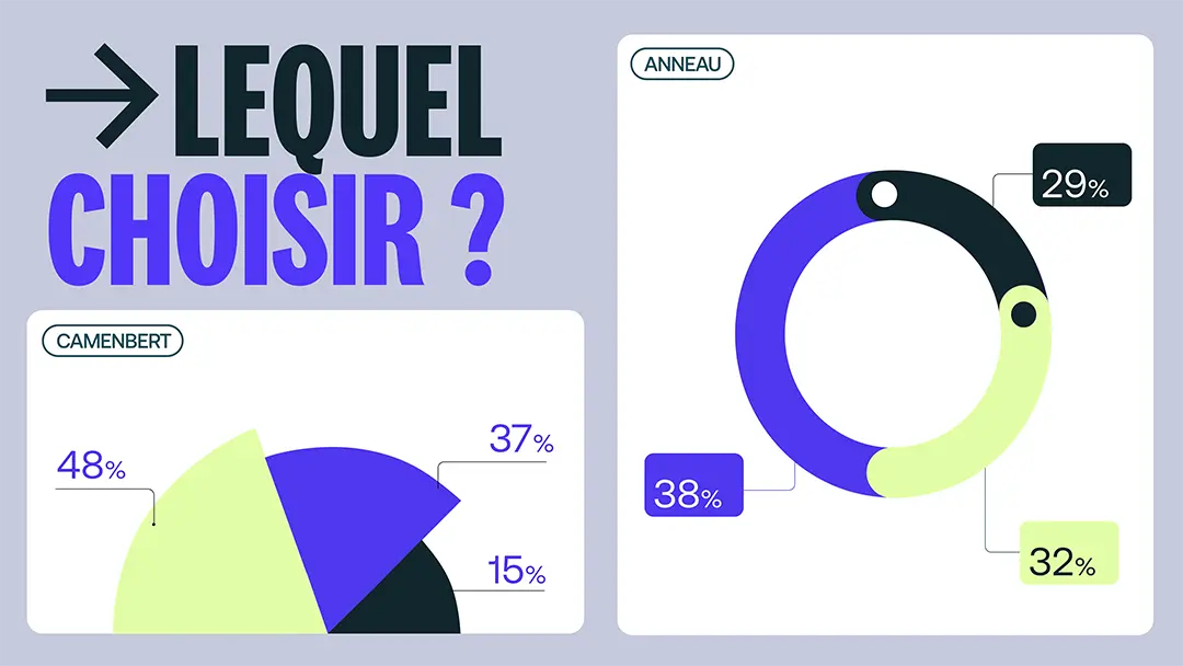
Les pie charts can be used in your PowerPoints presentations to represent parts of a whole. They are effective, but need to be clear and powerful to convey the Good message.
You want to improve your pie charts to represent your data in an efficient way ? This article is for you; we share our tips for turning your charts into visual communication tools.
Pie chart or ring chart: which to choose?
Choosing between a pie chart and a ring chart can influence how your data is perceived.
Camembert chart, for simplicity and efficiency
The pie chart represents the distribution of a set in distinct parts.It offers visual clarity and ease of reading when you have a limited number of categories.
Beyond five segments, the distinction is becoming complex. THESpace is limited, and add additional information will overload your chart.
Ring chart, for modernity and versatility
The ring chart, variant of pie chart with a hollowed out center, offers a more contemporary aesthetic.
It allows you to insert key information, whether it's a global percentage or an icon, in the central space. It also adds a A touch of sophistication to your presentation.
Information overload is easy, especially if you have several segments, or if you have a lot of information at the center.
When should one or the other be preferred?
- Camembert : choose it for simple data with few categories, where the proportion of each segment is essential.
- Ring : choose the ring when you want to add additional information In the center or for retrofit your presentation.
Example: If you present the distribution of sales by product and if you want to highlight the total turnover in the center, the ring chart is appropriate. On the other hand, to simply compare the market shares of three competitors, a camembert is enough.

Optimize the palette and design of your pie charts
You are not sure how Beautify your graphics ? We guide you through the choice of colors, effects and style.
Use the right color palette
Les colors convey messages, transmit emotions, and should be chosen with the greatest attention. A way to provide a graphics experience uniform and occupational is the optimization of your color palette.
Leverage custom color themes
PowerPoint allows you to create adapted color themes to your graphic charter. This feature allows you to guarantee one visual coherence throughout your presentation.
The steps to create a custom theme:
- Go to the tab Design > Variants > Colors > Customize colors.
- Define specific shades for your camembert segments according to your brand colors.
- Save the theme to be able to reuse in other presentations.
Consider including complementary colors for secondary segments in order to maintain good visual differentiation.
Use the color matching tool
To ensure a perfect match with your graphic charter colors, you can turn toPowerPoint Pipette tool.
How to use it:
- Select your pie chart.
- Click on a segment > Go to Fill > Pipette.
- Directly capture a color of an existing element (for example, your logo or a branding image).
This saves you the hassle of manually looking for color codes.
Change advanced settings for optimal contrast
When multiple segments are similar in size, it can be difficult to distinguish them visually. PowerPoint offers several options to adjust their appearance.
The various possibilities are:
- Outline and borders : add a light outline to each segment to better distinguish them.
- Color transparency : reduce the opacity of certain segments to visually prioritize information.
- Accentuation effectsn: add a texture or a slight effect of”filling with pattern” to differentiate segments without visual overload.
Create a pre-recorded palette to automate your designs
If you use Frequently the pie charts, you can create a predefined color palette to apply in one click.
To do this, you need to:
- Click on your pie chart once it is finished.
- Go in Chart Tools > Change Colors > Save as Chart Template.
- Save the file and apply it to other graphics for standardize your presentations.
Automate with macros for complex colors
You can also integrate VBA macros in PowerPoint in order to automatically apply your colors to your graphics, according to specific rules.
Macro example:
- Define a rule where the segments greater than 25% use a warm color (red/orange), while segments less than 5% use a neutral color (light gray).
Why does that make a difference?
These advanced features allow you to gain productivity And in graphic coherence. You create charts that Attract the eye while respecting your visual charter.
Banish unnecessary gradients and effects
To guarantee the clearness of your pie charts, you must avoid gradients and other effects that can harm the differentiation of segments. You can further improve readability by:
- opting for plain fillings ;
- removing 3D effects, shadows, and bevels;
- adjusting the contours to keep them fine, and in a contrasting color;
- using light textures sparingly.

An alternative to standard graphics?
To avoid the “deja vu” effect of standard pie charts in PowerPoint, and the make it visually pleasant, you can create creative alternatives by playing with surfaces And the shapes. Here are 4 options for making your graphics original:
Use custom shapes
Instead of traditional segments, you can use geometric shapes or icons that symbolize your data. The steps for inserting shapes are:
- Go to the tab Insert > Shapes.
- Choose one adapted shape (for example, a rectangle or a circle).
- Draw the shape on your slide and adjust its size to represent proportionally your data.
- Duplicate and modify the shapes to represent the different categories of your data.
The use of shapes allows customize your entire graphics, and to create more visuals adapted to your audience.
Overlay shapes
The superposition of shapes makes it possible to create dynamic charts. To do this, you can:
- Insert a basic shape (for example, a large circle).
- Add additional shapes on top to represent the different categories.
- Adjust sizes and positions to illustrate proportions.
- Apply distinct colors in every shape.
Integrate images
Adding images can reinforce the message of your chart and allow you to tell a story. To add them, you can :
- Go to the tab Insert > Images.
- Select an image that represents the data category in question.
- Place it next to or inside the corresponding shape.
- Make sure that theImage does not clutter the graph and remains legible.
Create infographics
The infographics combine text, images, and graphics to present information in an engaging way. The steps to follow to create one are:
- Plan it narrative flow of your infographic.
- Use shapes and icons to represent key points.
- Add arrows Or rows to guide the reader through the information.
Use tools like SmartArt in PowerPoint to make it easier to create infographics.
You now have all the keys to master and enhance your graphics In camembert! With these tips, your PowerPoint presentations will be clearer and more dynamic.
Do you want to go even further in creating presentations? Do Call to the Mprez team. Our experts are there to transform your ideas into tailor-made visuals. Contact us now to discover our solutions adapted to your needs.
More than 1000 customers have trusted our agency PowerPoint


