How do you make a beautiful PowerPoint?
We tell you everything you need to create the most beautiful PowerPoint presentations!


We often hear that you have to make a good impression and that the first meetings are decisive. So, would you want to give a sloppy first impression during a meeting with investors, during a pitch deck, or during the presentation of a seminar? We all know the answer is no.
In this case, to make a strong impression from the first seconds, we recommend that you create or have them produced an aesthetic, clear and concise slideshow.
Today, we're giving you the keys to making a beautiful PowerPoint and all our best tips and tricks for create beautiful and effective PowerPoint presentations, because giving a nice presentation is not enough and you especially need the slides to be striking.
Preparing and planning your PowerPoint
The first fundamental step to create a powerful slideshow (on Ppt, Google Slides, Keynote or Canva, whatever) and that gives weight to your argument is to Enter the message correctly that you want to transmit and the objective it supports. What do you mean by these slides? What do you want the audience to remember?
Taking time on the purpose of the presentation is necessary introspection in order not to lose sight of the intended target and to reach the audience. Speaking of audience, It is imperative that you know your audience : what are her habits, her desires, her expectations; in short, who is she? By knowing your audience, you can better adapt the style and content to their expectations and needs, which will make the presentation all the more compelling and memorable.
Finally, you must structure the presentation according to the expectations and requirements specific to your sector of activity and to your subject. Remember the importance of an introduction to quickly and clearly discuss the subject and how it will be addressed, so that everyone knows what will happen next, present yourself summarily to justify your position and move on to the body of the presentation, the most important and detailed part of the presentation, before concluding the presentation. Don't think that the conclusion is optional or something to be overlooked; it's actually the last image you give your audience, the latest information you deliver, and the last time you can make an impression.
Choose the template and layout
Creating an aesthetic slideshow can be difficult if you don't have artistic flair or graphic knowledge. To overcome these shortcomings, two solutions are available to you: be accompanied by a professional or use a template.
Be accompanied by a professional
We often lack the time and the drive to do activities that are boring or that don't reveal our full potential. If this is your case when it comes to making slideshows, then you can consider delegating the exercise. You have the choice between two professional “formats”: freelancers or agencies.
Freelancers are individual experts who specialize, most of the time, on a graphic typology. It is therefore necessary to target the ideal profile to solve your problem. On the contrary, PowerPoint agencies benefit from a panel of profiles that allows them to respond to any request. They rely on graphic designers and designers busy full-time on presentation issues, as well as on a team of account managers who will help you target your project and your expectations, for a result that is 100% adapted to your request.
In both cases, thanks to these professionals, your PowerPoint will be beautiful, fluid, and technical.
Use a template
If you want to create your presentation yourself, but you need visual support, you can turn to a template, also called a template. This option allows you to be autonomous in terms of visual creation; you can choose your model from a large selection of online libraries, or by ordering a custom one from a PowerPoint agency.
A template includes all the slides necessary for the complete development of a presentation: introduction slide, team presentation and organization chart, graphs and diagrams to modify, borders, slide to do list, conclusion slide, etc. In addition, most templates also provide a bank of assets and pictograms useful to schematically represent your points. If you select a template from a database, it will not be customized to your business as with an agency, but it is generally possible to change the colors of the elements provided.
A template allows you to maintain graphical unity and overall consistency. It is the assurance that your rendering will be professional and aesthetic. Thanks to this, you will be in a better position to harmonize your fonts, colors, and styles by relying on the slide masks, thus maintaining unity and maintaining a certain “beauty” in your presentation.
However, be careful, templates can quickly prove to be limiting and restrictive if they come from free databases - and therefore not very flexible. Indeed, they may not offer all the slides you need and that you may therefore be forced to create them from scratch, or they may not be faithful enough to your graphic charter. This is why the work of an agency is valuable, because it will be able to create a multi-purpose document for you that is ready to use and easy to use.
Customizing your PowerPoint document is essential, otherwise your presentation will have no identity and will in no way reflect the speaker presenting it or the company using it. In the end, a template is just a succession of lifeless slides if you don't put your personal touch and identity elements on it.
Design the visual design
Once the foundations are laid and you have a better idea of how you are going to organize your arguments, it is time to move on to the aesthetic aspect, i.e. visual design, which is itself quite similar to information design that makes multiple pieces of information digestible.
Maybe you need to follow a specific graphic charter, with a harmonious color palette and an assortment of clear and legible fonts. If that's the case, there's no secret: stick to these guidelines, they'll ensure easy and distinct consistency.
If, on the other hand, you are starting from nothing, without a clear guideline and previously established elements, you will have to determine the color palette that you are going to use, as well as the preferred fonts and sizes.
The choice of the color palette
The first thing you need to incorporate into your creation is the fact that these colors will not be visible on a computer screen, but projected via a video projector/viewer, which can alter the quality or the colors. Also, we can only recommend that you do the test beforehand, if you have a projector available; see what rendering the colors you are interested in offer and only take those that are visible and that maintain the chosen identity.
Generally, for graphics and computer graphics, we recommend creating a palette consisting of 5 colors. However, you can definitely incorporate fewer or many more, as long as they complement each other, as long as they are complementary, and they say something about who you are.
For a palette of 5 colors, it is estimated that the first color is the dominant color, used for the main title; the second color is secondary, for the body of the text; the third is used for the background (the background of the slide); and the last two serve to emphasize graphic or typographical details -they are mostly contrasting colors, because they are more visible according to the previous three.
To see how your colors combine, you can use Adobe Color, which will allow you to combine different shades and select the most appropriate ones. They will be presented in the form of a chromatic circle, that is to say an ordered representation of colors according to a circle of complementary and opposite colors. For the web, the 12-color color circle is used a lot.
Added to the palette, you must also take into account the fonts used, which must also correspond to your identity.

The choice of fonts
Typography, an aspect often considered more obscure than chromatic or visual choices, is essential in a presentation to transcribe emotions and messages and, above all, to be a visual marker of the chosen identity.
The aim of a presentation is to be legible and understandable, so the typography should support this objective and facilitate access to the information presented.
- Your typo should be clear enough to be read by everyone: avoid complicated visual effects and extravagant fonts that will distract the audience.
- Your font should be big enough to be seen everywhere, even by audience members at the back of the room, and fat enough not to get lost in the twists and turns of the visuals.
- It needs to reflect who you are. A presentation on luxury products? Choose serif fonts and not thick fonts with no pads. Are you a company focused on new technologies? Avoid dated or classic fonts and use futuristic, non-serif fonts.
Your typography speaks for you and accessorizes your words. It contributes to the aesthetics of the final result and carries your ideas; do not neglect it.

The choice of visuals
Nobody likes to attend a monotonous presentation that is supported by a slide and has no visual or graphical representation. Nobody likes to see long lines of text on a slide and disheartening explanations.
The key is to insert quality, representative and explanatory visuals that really mean something. There is no point in filling an empty space with an image that has nothing to do with your subject or with a pixelated visual that stings the eye.
To be relevant and effective in your choice of visuals, do not hesitate to opt for graphs and other diagrams that give concrete information while ventilating the slides. They are useful for making your speech reliable and serious, illustrating your words and helping to remember information thanks to the principle of Datavisualization.
As for the images, choose them carefully so that they communicate important aspects of your pitch, such as the faces of your collaborators when you present your team or the prototype of your new product, and that they are of good enough quality so that their appearance does not interfere with a clear and simplified reading of the slideshow.
Remember that Less is more and that it is better to have few visuals, but visuals that are 100% relevant, rather than a multitude of photos positioned one on top of the other to “fill the space” or a background image that would interfere with reading.
Finally, to add dynamism to your presentation without distracting listeners with unnecessary elements, consider adding animations and transitions within your slides. They allow for a smooth, smooth progression and capture the viewer's attention. Thanks to animation effects, you increase visualization and create an interactive document. A dynamic presentation will in fact be more attractive and pleasant.
As a reminder, an animation is positioned on a slide when a transition joins two slides.
PowerPoint offers a range of animations and transitions that are easy to use (go to “transitions” or “animations” in the main menu and test the effects to select the most suitable ones); just be careful not to abuse them and to use them sparingly. Excessive animated formatting on illustrations can indeed damage your overall message.
For example, we recommend that you use the same transition between all the slides to maintain unity and a professional effect, and not a collage of crazy effects that would serve your purpose.
Take care of its content
Now that your PowerPoint is aesthetically appealing to look at and that you've captured the attention of your audience visually, it's time to make it beautiful from the inside out.
Indeed, you may realize that your arguments are empty and/or difficult to understand, which will have the effect of disengaging those who listen to you.
To take care of your content and make it intelligible, Simplify your text : highlight key points, for example by means of Bullet Points or other fleas. Keep sentences short and simply constructed so as not to confuse your audience.
In addition, to establish your position as a specialist in the subject, do not forget toincorporate reliable and clear data and statistics, for an effective presentation of your information. Indeed, people like to be comforted in their ideas by tangible and numerical proof of reality, so don't miss your chance to convince them.
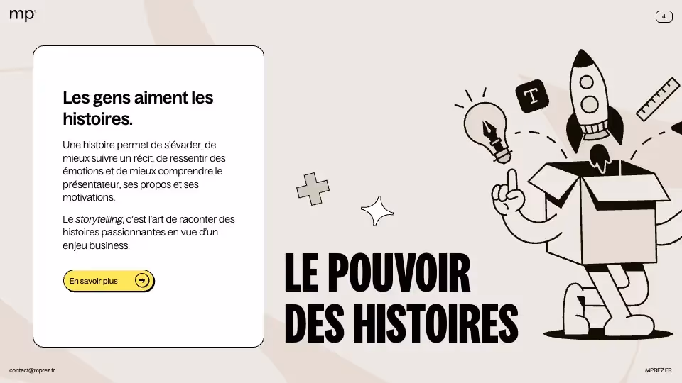
Finally, Use storytelling to create content with certain value: tell a story to your audience to captivate them, play with its intrinsic representations, make their imagination and dreams speak for themselves, in short, take them into a new universe, yours.
Use the right tools and resources
To enrich your presentation and make it appear more professional and prepared, do not hesitate to use all the tools at your disposal, such as plugins, in other words, software and extensions that can improve your slides. Some plugins can add comprehensive features to your presentation tool and others can make your life easier. Add Power BI to build more advanced tables and diagrams, Brightslide for harmonious presentation, or Toolbar - which is added to the ribbon of native tools and whose handling is intuitive - to optimize functionalities and simplify the steps.
You can also use image and icon banks, whether internal to the presentation tools or not, and which will allow you to find quality visual resources.
Finally, if you want to go further in your knowledge of these systems, you can watch tutorials on YouTube or Instagram, or even join specialized training. mprez, for example, offers a PowerPoint training 100% adapted to your needs, whether you are a novice or more experienced, fundable by the OPCO and Qualiopi certified. We teach you practical methods for the shape and content of slides, for new skills that can be adapted to all your future situations.
Check and repeat
Your PowerPoint is now sensational, both in its form and in its content. There is only one thing missing: the correct posture of the speaker.
Indeed, the slideshow will ultimately be only a support during your presentation and will be in the background of your speech, which should take center stage. So you have to Revise your posture, which is the way you hold yourself, And your speech, which is how you express yourself. Be confident, speak clearly, pause between sentences, watch the audience, ask open-ended questions, smile.
The best way to be comfortable during speaking and other oral experiences is to reread yourself to correct errors and adjust the content and test the presentation, repeat the flow, adjust the timing and check the proper functioning of the multimedia elements. Put yourself in slideshow mode and become the perfect presenter.
Do not hesitate to do your rehearsals in front of family members or colleagues to get their feedback and constructive opinions to improve the presentation.
Conclusion
The key to a beautiful PowerPoint - and especially to a PowerPoint that interests its audience - therefore turns out to be preparation. At the beginning, it is a long and tedious exercise, because your slides will not suit you 100%, and you will notice visual inconsistencies and weaknesses, but gradually, your eye will get used to it and your graphic reflexes will improve. You will be more methodical and spend less time on graphic design or on the development of your speech; the goal is obviously for the business to become routine and simple to do. With patience and practice, everything will work out very well in the end. So, practice regularly and experiment with new techniques to improve continuously.
Ce qu'il faut retenir
- Prepare and plan the creation steps
- Choose or create a template
- Create the visual: visuals, colors and fonts
- Use storytelling and highlight your speaking skills
- Work out!