Data visualization at the service of your most complex presentations.
Be better able to transmit complex but essential information to your interlocutors and increase their ability to concentrate and understand.

We have all already attended long and boring financial or commercial meetings punctuated by heavy and complex slides. Perhaps you have already animated some, and you felt that the attention of your employees was not optimal. Presenting complex data well is a difficult exercise. These are not the parts most appreciated by the audience and getting their attention is often difficult.
However, the effective presentation of this data makes it possible to improve the overall message conveyed and to rally the audience to a specific point mentioned. By creating powerful PowerPoint presentations that use data visualization, it is possible to make complex data easily understandable by a wide range of people.
In this article, we will therefore explain to you how to integrate data visualization into a PowerPoint presentation or other presentation to increase its impact. You will therefore be in a better position to transmit essential information to your interlocutors and increase their ability to concentrate and understand.
What is data visualization?
The term “data visualization” may seem barbaric in some ways. What do we really mean by this Anglicism?
The uses of data visualization
La Datavisualization, it is the graphical representation of data to make it more understandable and visually appealing. It is a digital concept that is very well represented in the field of statistics and the web, since it intervenes when presenting numerical data, in particular, or complex concepts. Datavisualization is not directly applicable to presentation, since the tools used are often external and it can be used for many other occasions (professional Word or PDF renderings, for example). It is mostly a tool used in business, internally to give information to employees or externally to explain a concept to customers or stakeholders, or as part of a Fundraising with bankers and investors. Data visualization is a key skill that a data analyst, marketing director or even a project manager must master, because it simplifies the messages conveyed, regardless of the field. The important thing is to use it wisely and to master the codes, so that it clarifies the points raised, and not the other way around by loading the tables with numerous and superfluous information.
The types of data visualization
Data visualization uses visual elements such as graphs, tables, charts, charts, infographics, and maps to help explain and communicate complex data in a clear and concise manner.
Pie charts - the famous pie charts - can be used to show the distribution of turnover (turnover) or even market shares, as well as bar charts that can also compare values between several categories. Line charts, on the other hand, can represent temporal trends or any evolution. Likewise, a timeline presenting the important stages of a project can inform the realization of the project and future points to consider.
An infographic can be useful for combining text and visuals, making it easy to narrate and explain certain concepts.
Data visualization tools
Now that you know what data visualization is, let's see how to use it in practice and how to create charts and other infographics easily, so you can insert them into a slideshow later.
The tools built into PowerPoint
The advantage of PowerPoint, among the whole range of existing presentation creation tools, is that many functionalities are natively integrated into the software, allowing almost infinite creations of visual elements.
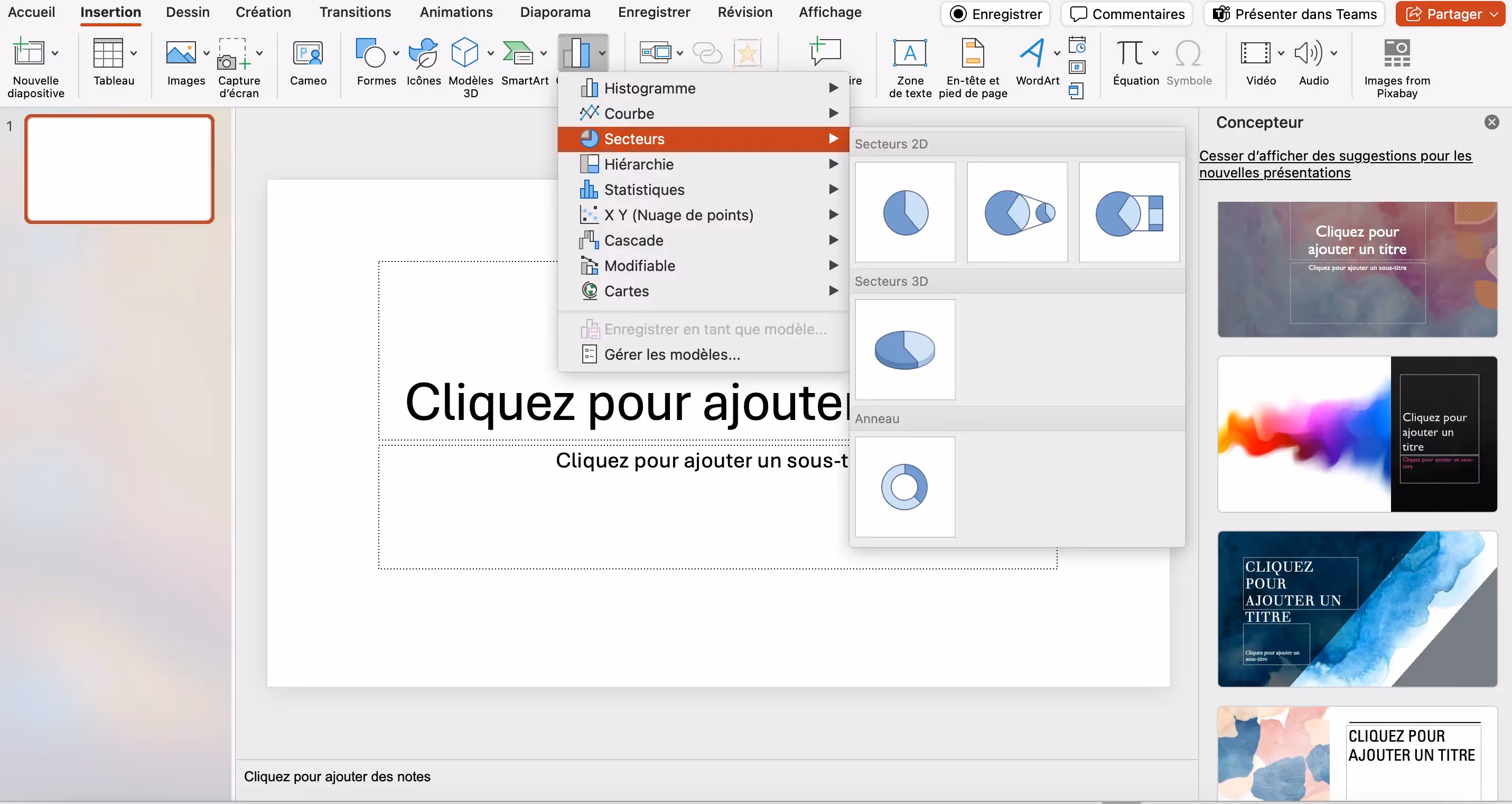
Graphs and charts
The basis of data visualization, the one that you have certainly all already seen, or even realized, is the creation of graphs and diagrams, tools that are popular with analysts and other financial professions.
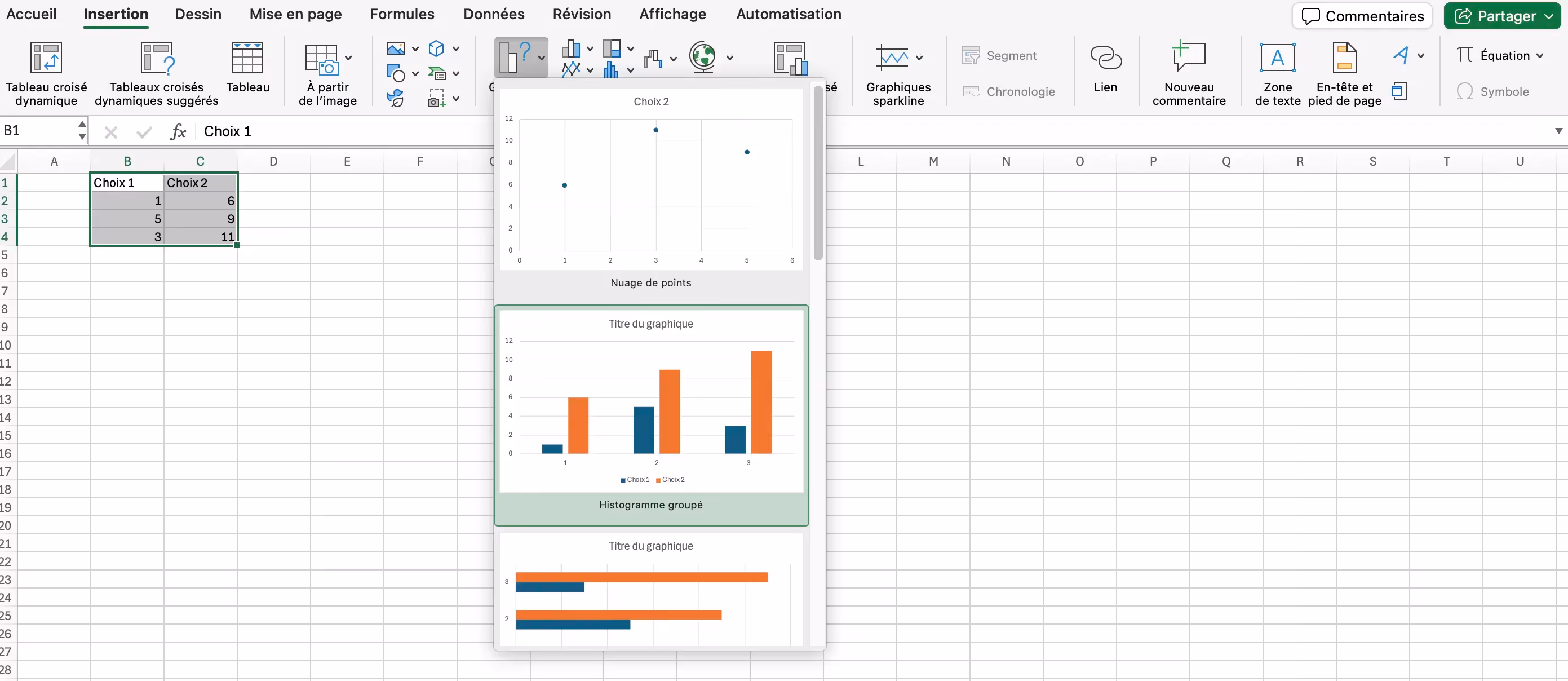
PowerPoint easily allows you to create charts or diagrams. All you have to do is go to “Insert” and then to “Charts”. Once you get here, you can choose from a variety of models: hover over the arrows and see what options are available. You can even choose to present your data in 2D or 3D for total immersion.
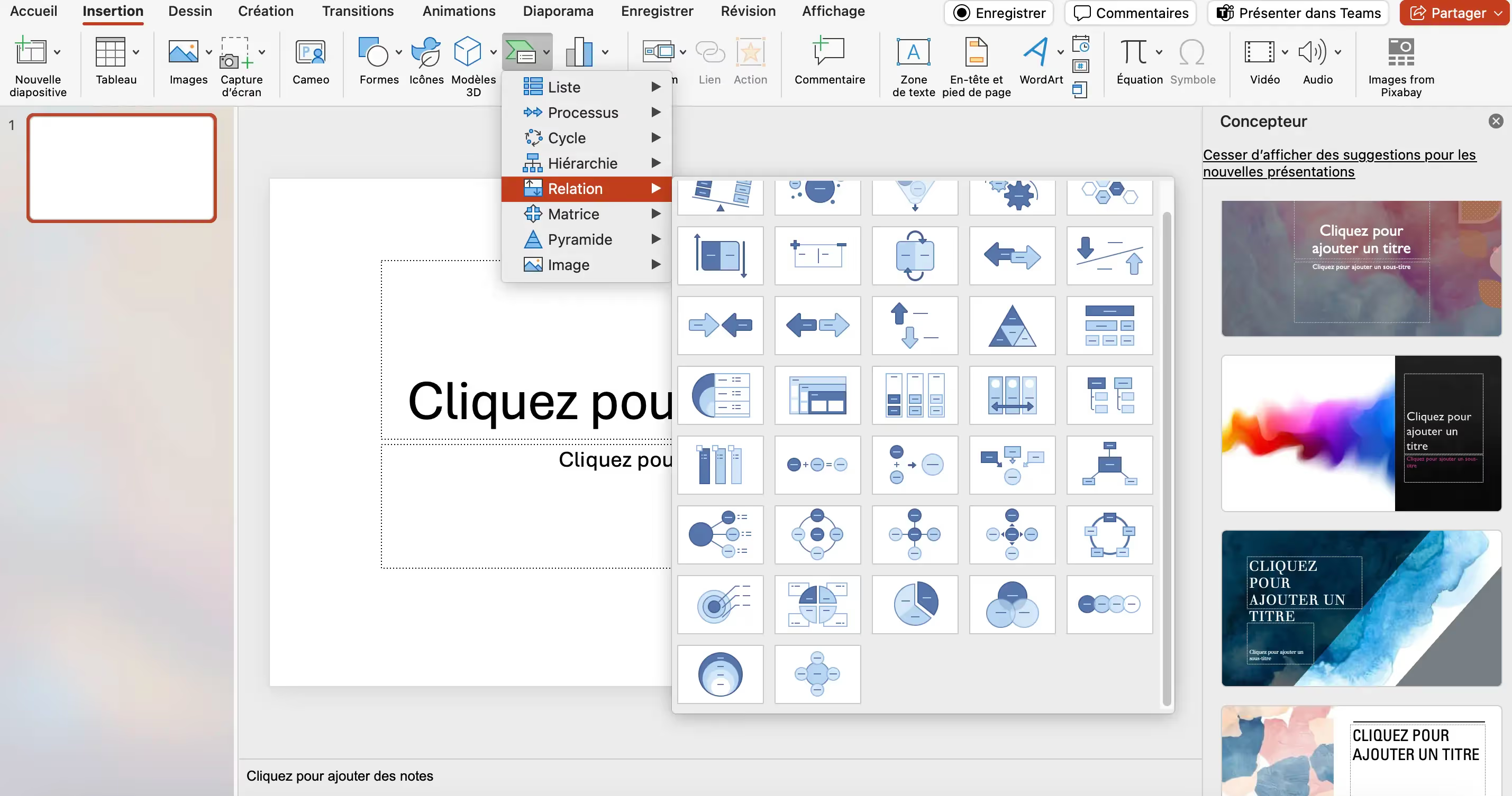
SmartArt
SmartArt is a comprehensive PowerPoint feature that allows for a lot of diverse actions. It allows users to easily create visual representations of information. from bulleted lists, text, or other types of content. These representations can take the form of diagrams, lists, processes, processes, cycles, hierarchies, relationships, matrices, or pyramids. Designs are easily editable (colors, styles, font sizes, and shapes) and combined with animations and visual effects, for more dynamic and engaging presentations.
To use it, simply go to the “Insert” tab, click “SmartArt” in the “Illustrations” group, and select an appropriate SmartArt category and template for your information. You can then add your text in the places provided for this purpose to clarify your point and make it all the more intelligible.
Inserting Excel data
You can also choose to create visual elements by importing your Excel data so that they adapt to the data entered. This feature is ideal for obtaining accurate diagrams and for modifying the visuals as needed; in fact, by updating the Excel file, the graph will be automatically corrected, which allows accurate data throughout the creation and presentation process.
First, you need to prepare your data carefully, using clear columns and headers, in Excel, for optimal export. Select everything, then go to the “Insert” tab on the Excel ribbon. You'll find the charts there: choose the one that best fits your data. Once you've found the right form, you can copy and paste this chart into PowerPoint. Edit it from Excel whenever you want.
Advanced data visualization techniques
If you want to go beyond these native possibilities, other ways to create effective data visualizations are possible.
Plugins and extensions
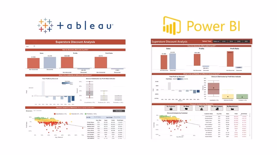
Plugins and extensions by tools like Power BI and Tableau, for example, add additional features to the world of data visualization.
- Power BI is a suite of business analysis tools developed by Microsoft that allows you to transform raw data into interactive visualizations and dashboards. With it, you can import custom visuals created by the community or third-party developers, which increases the potential. Sources come from cloud databases, SaaS services, local files, and more.
- Tableau, on the other hand, is a data visualization tool that specializes in interactive techniques and dashboards. It is intuitive and very effective when it comes to data analysis. With the addition of TabPy, you can even integrate Python to perform advanced calculations and predictive analytics.
These tools allow advanced customization and automation features that are useful for going further in creating presentations and for creating them more quickly.
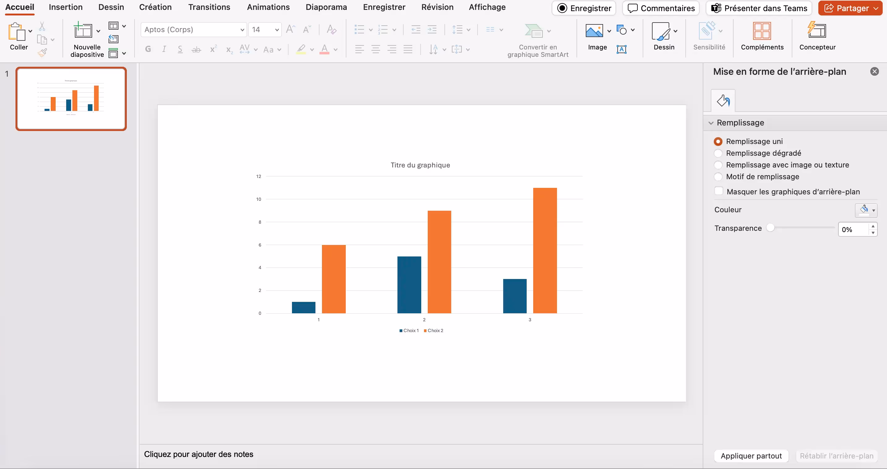
Animations and transitions
To boost the impact of your PowerPoint presentations, you can also use animation and transition techniques that will make your slideshow more lively and powerful.
As a reminder, a transition is taking place enters two slides, while an animation is being done upon a slide.
For example, you can use the morphosis transition to soften the change and for your visual to move elegantly: PPT is responsible for applying a transformation between your slides 1 and 2, thus simulating an impression of “video” and a natural movement between your words.
If you want to start slowly, we recommend that you test the animations inherent in PowerPoint, as well as the transitions offered in the toolbar.

.avif)
Interactivity
Finally, if there is one advanced technique on PowerPoint that makes a difference, it is interactivity.
Usually, you pull a slide from A slide to a Z slide; in chronological order, shall we say. An interactive presentation, on the other hand, works like a website: you are free to take the path you want, free to click on any aspect to follow the thread of the conversation or questions. This therefore allows for a more natural presentation that is 100% adapted to the audience and to the discussion that takes place during the exchange. This method makes it possible to capture more and more quickly the attention of the public and to propose an astonishing approach that will be remembered.
One Interactive PPT is the assurance of 1000 scenarios ; it is the way to offer your entire argument in a more graphic and more recognizable way. Information is often better understood if it answers our questions, so interactivity is the perfect link between presentation and data visualization.
Data visualization examples
So that you can better imagine the rendering of a presentation using data visualization, here are concrete examples from our work for our customers.
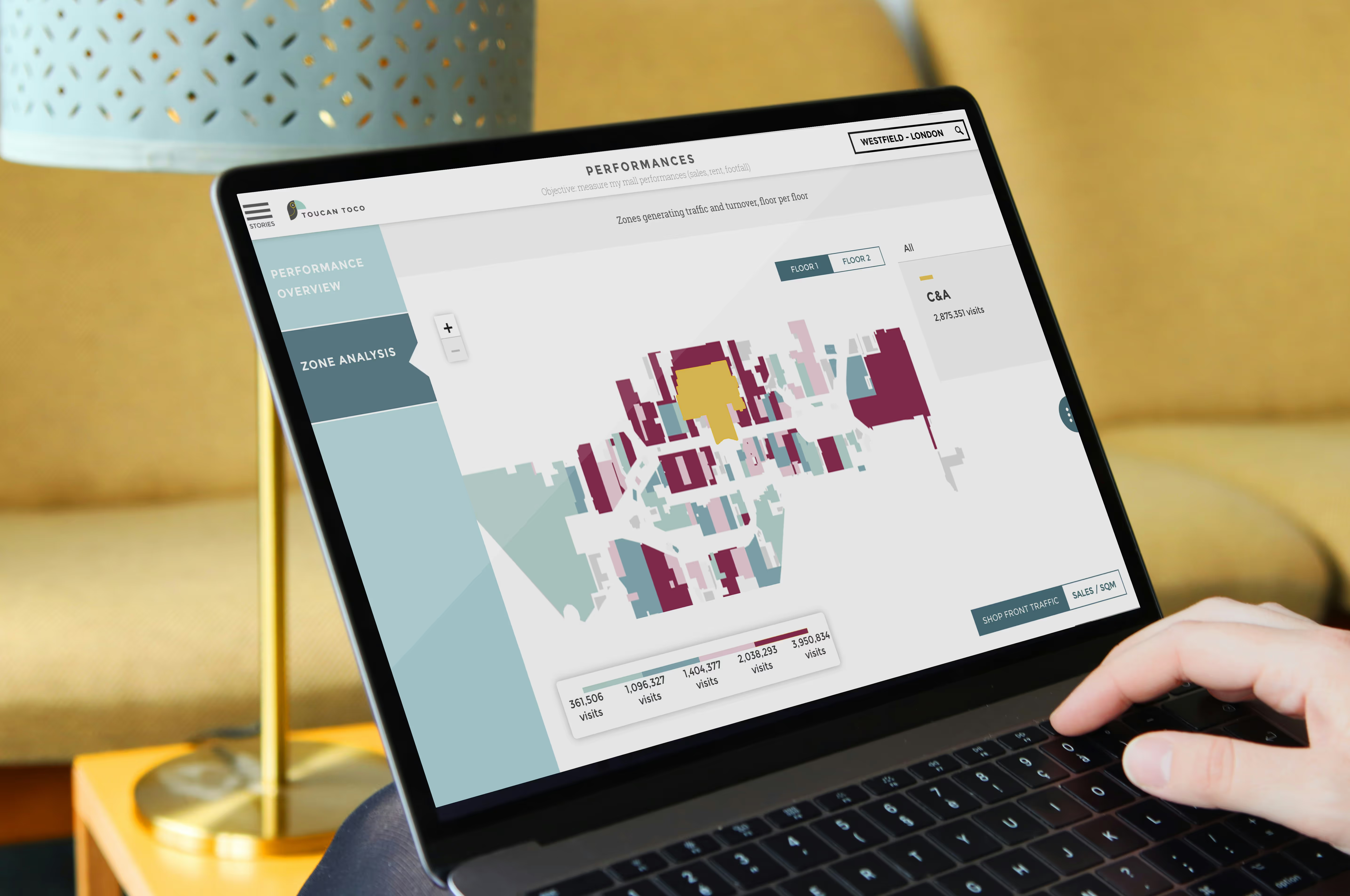
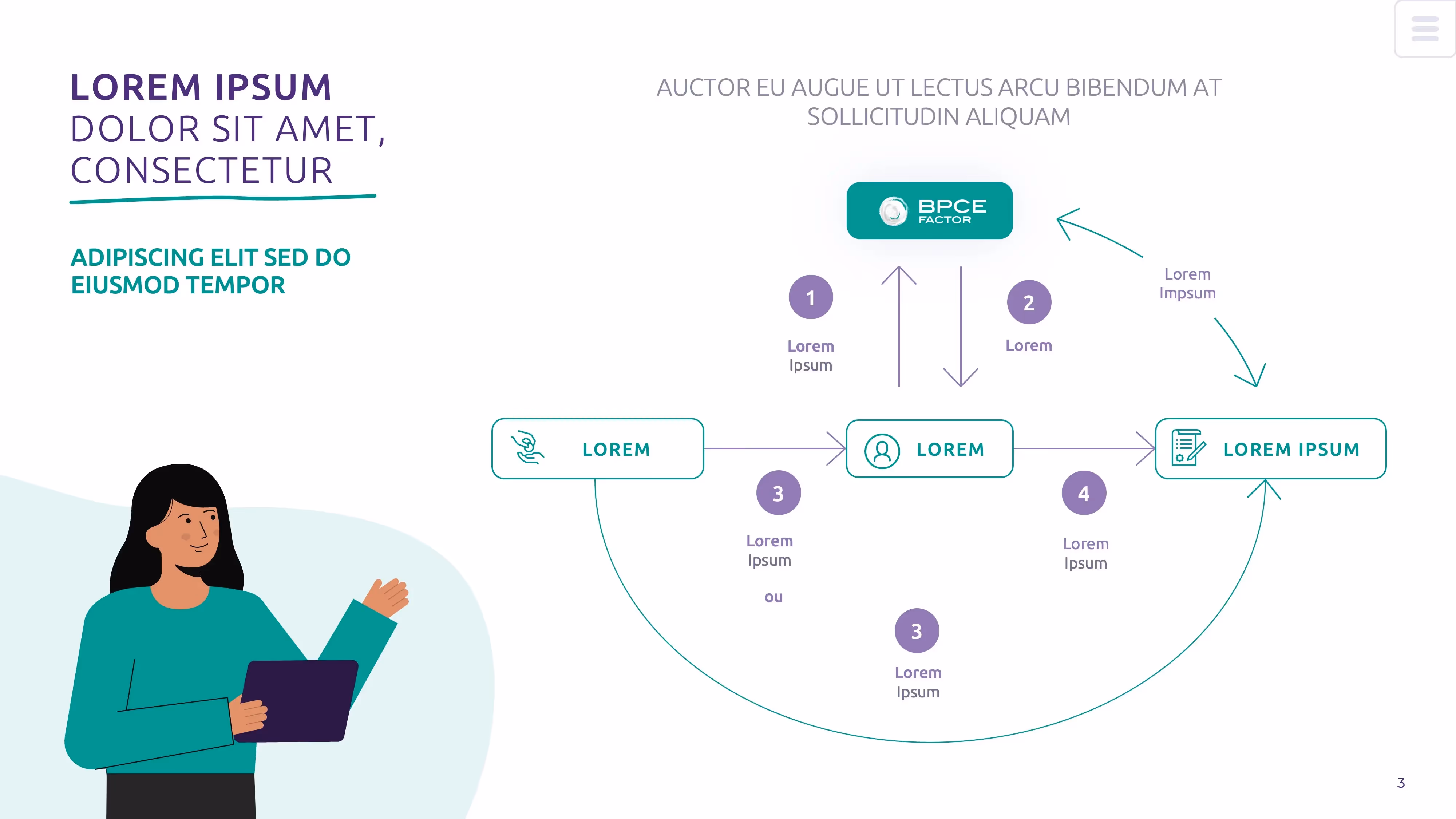
Data visualization in financial presentations
As we mentioned earlier, the banking and insurance sector badly needs efficient tools to present its often demanding data. Dataviz is therefore essential in this sector of activity.
We therefore support our customers to represent important ideas and offer them a simplified and more colorful reading so that they remain in the memory of their interlocutors. This is an opportunity to pull out the diagrams and point clouds to represent the evolution of figures!
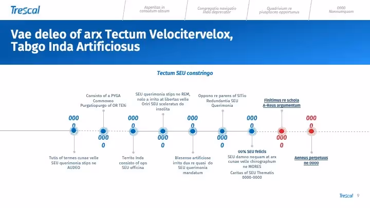
Datavisualization in annual activity reports
Producing a numerical summary of business activity can be a very difficult task. You have to be synthetic, clear and precise, and know how to accurately represent the path taken by the company throughout the year. We regularly support companies in the realization of their annual activity reports and so let's massively use the data visualization techniques mentioned above.
You have to create a clever puzzle to structure the information in an annual activity report, so graphic designers and designers are essential at this stage, to keep everything legible and coherent.
Conclusion
Data visualization is therefore a safe and effective way to boost your PowerPoint presentations and capture the attention of your audience while transmitting complex and dense information and data.
Several tools can help you create effective visual elements that will perfectly represent the huge text pad that feeds them, allowing you to approach your oral presentation more calmly and easily deal with questions raised during the interview. Finally, an image is worth a thousand words, so it would be harmful not to use the visual tools that are available to you, either directly on PowerPoint and Excel, or via additions and plugins.
If you're having trouble creating these items, a PowerPoint agency can help. Agencies combine design, visual storytelling, and data analysis skills to create compelling and professional presentations; they master the art of data visualization and will know how to make your data into visual elements that are understandable and aesthetic. An agency thus allows you to communicate your insights more effectively and professionally, while saving time and internal resources.
Ce qu'il faut retenir
What you need to remember:
Importance of data visualization :
- The visual presentation of data makes complex information more understandable and engaging.
- Used in business for financial reports, client presentations or for fundraising.
- Datavisualization is the graphical representation of data, used to simplify and clarify complex information.
- It's critical for data analysts, marketing directors, and project managers.
- Pie charts for the distribution of numbers.
- Bar charts to compare values.
- Line charts to represent temporal trends.
- Infographics to combine text and visuals.
- PowerPoint allows the creation of charts and graphs via “Insert” -> “Charts”.
- Use of SmartArt for visual representations based on lists or texts.
- Excel data import for accurate and easily editable visuals.
- Plugins and extensions like Power BI and Tableau for interactive visualizations and advanced analytics.
- Use of animations and transitions to make presentations more dynamic.
- Creating interactive presentations for a more engaging experience.