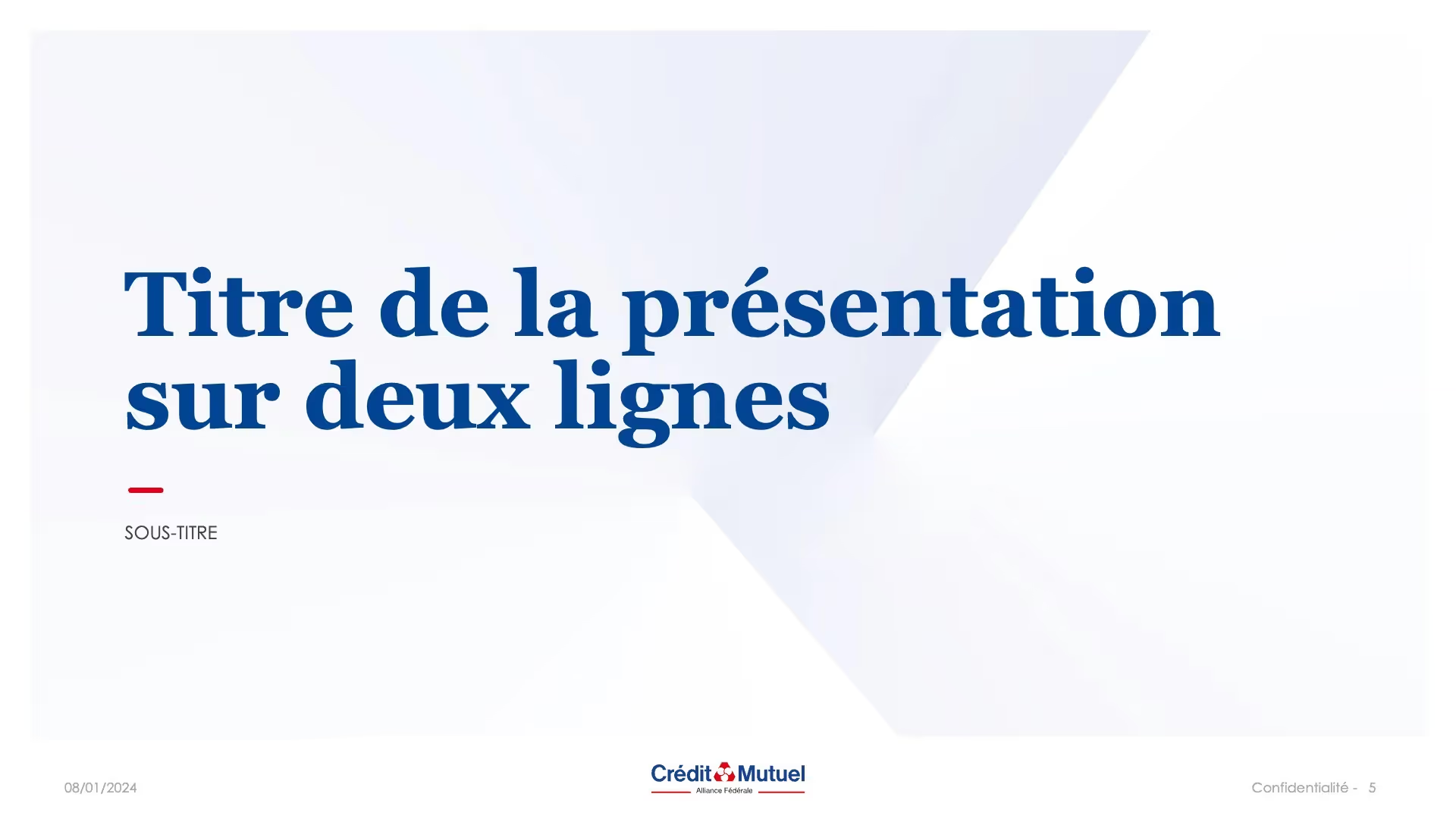
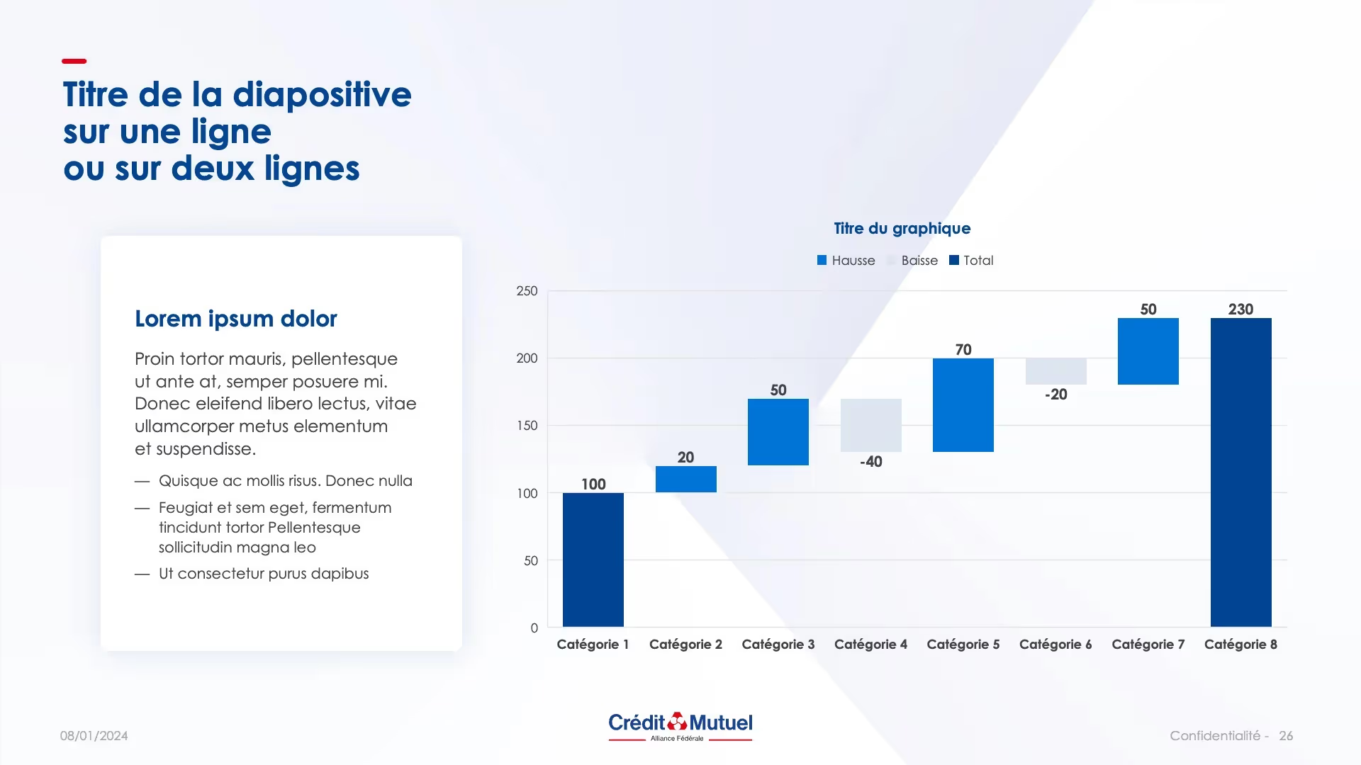
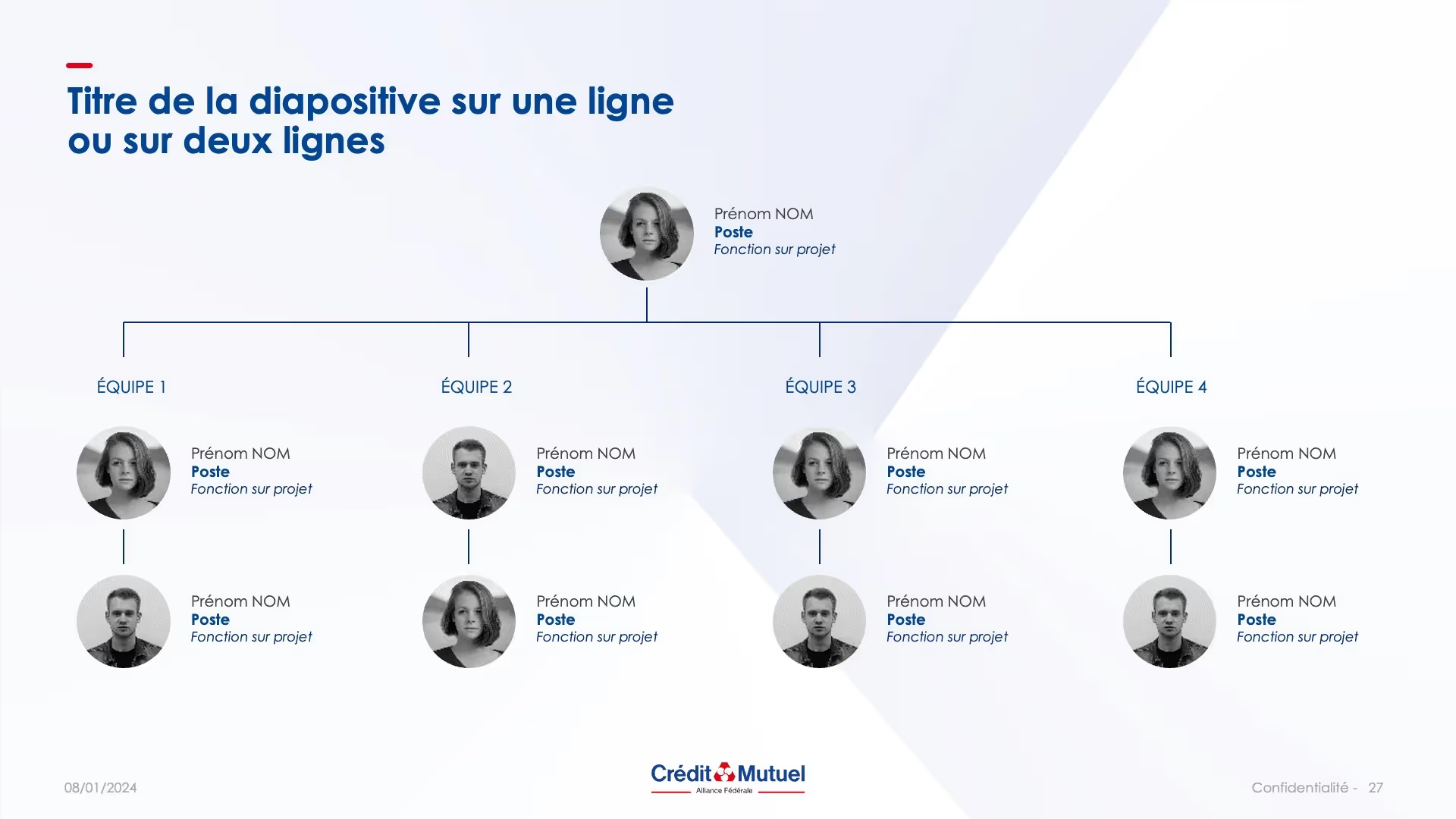
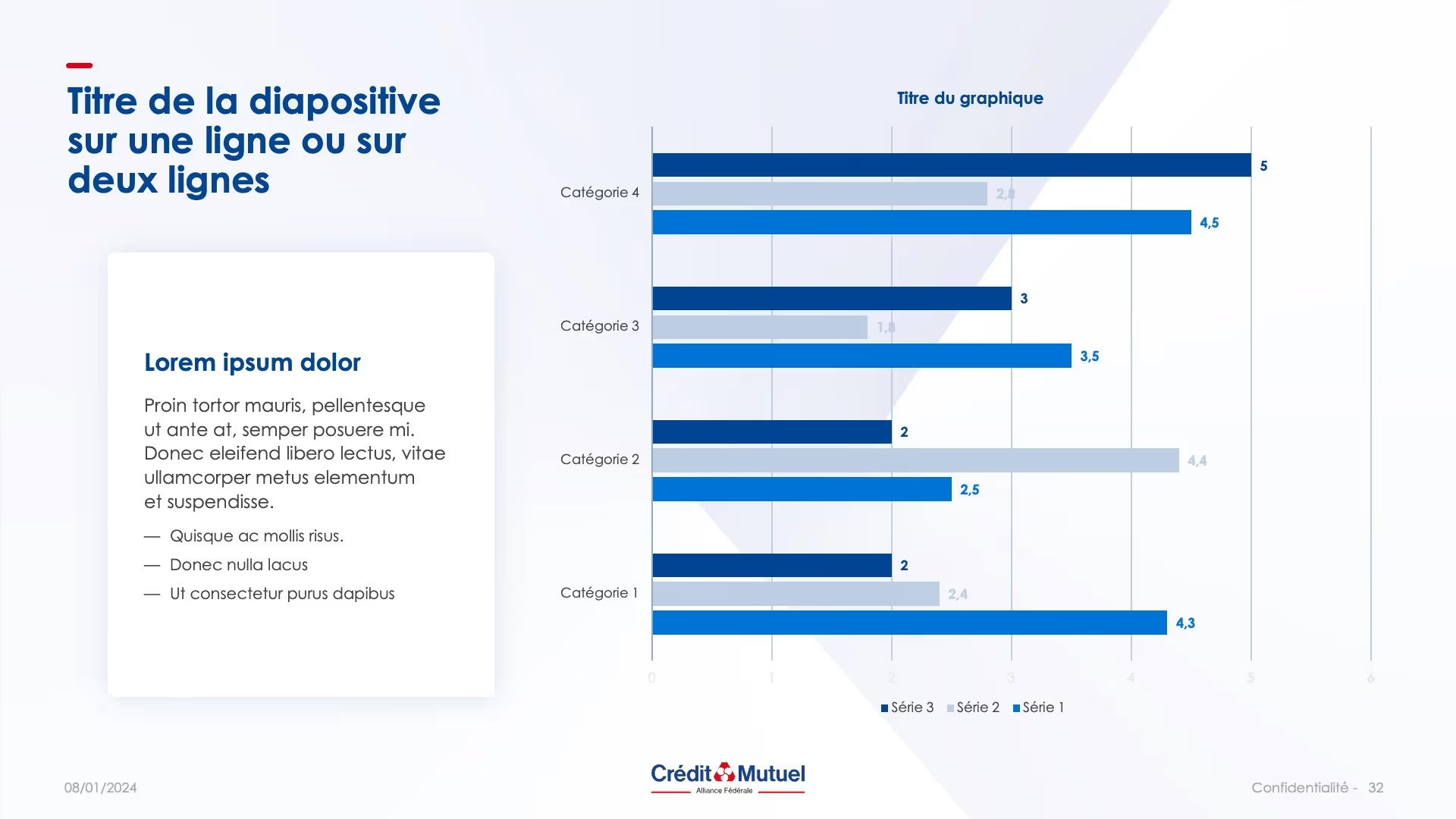
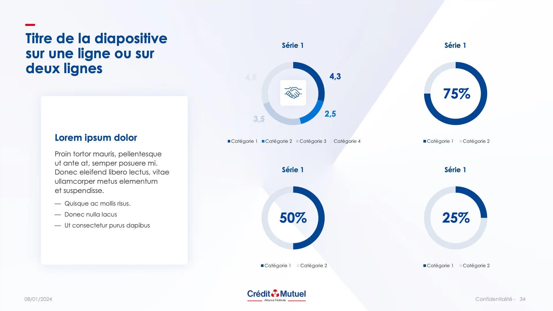
Crédit Mutuel Template - Alliance Fédérale
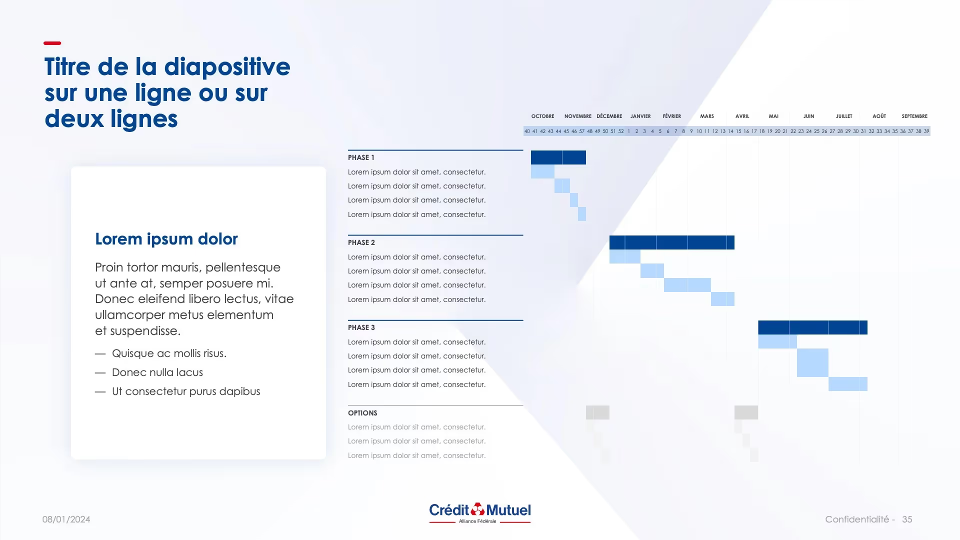
The marketing teams at Crédit Mutuel-Alliance Fédérale asked us to create an internal template that could be used by everyone.
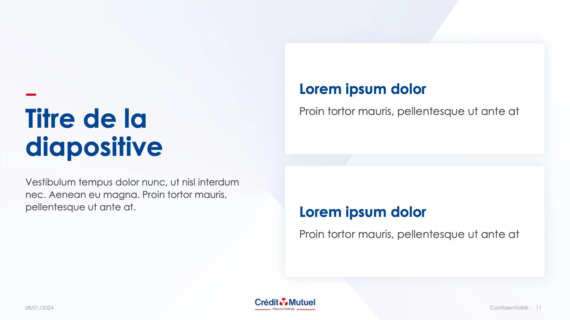

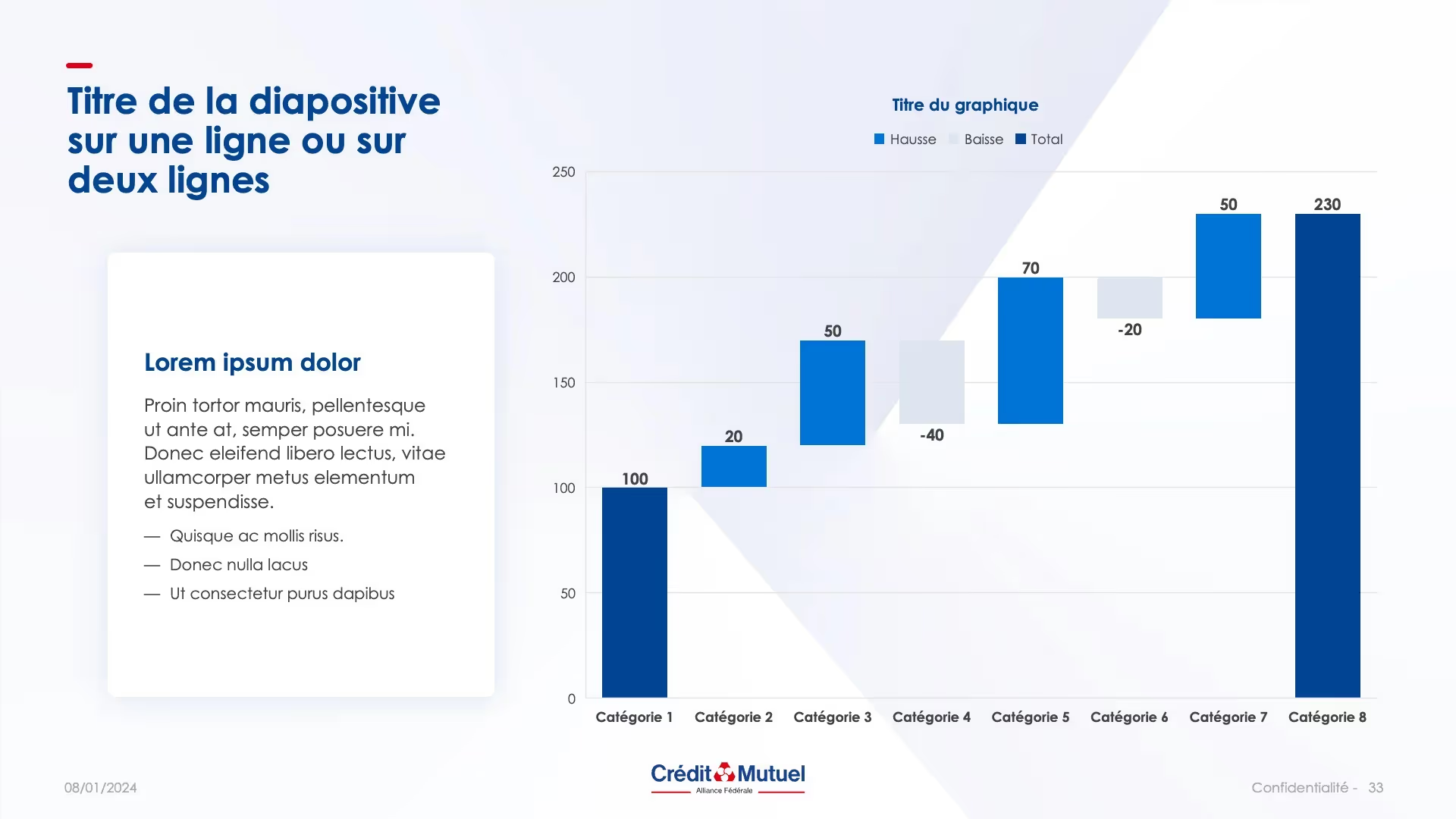
Above all, we wanted to offer them a tool that was easy to use. What's the point in offering a template, no matter how beautiful it is, if no one is in a position to use it? We therefore asked the customer about their recurring needs in order to offer them provisions based on their use.
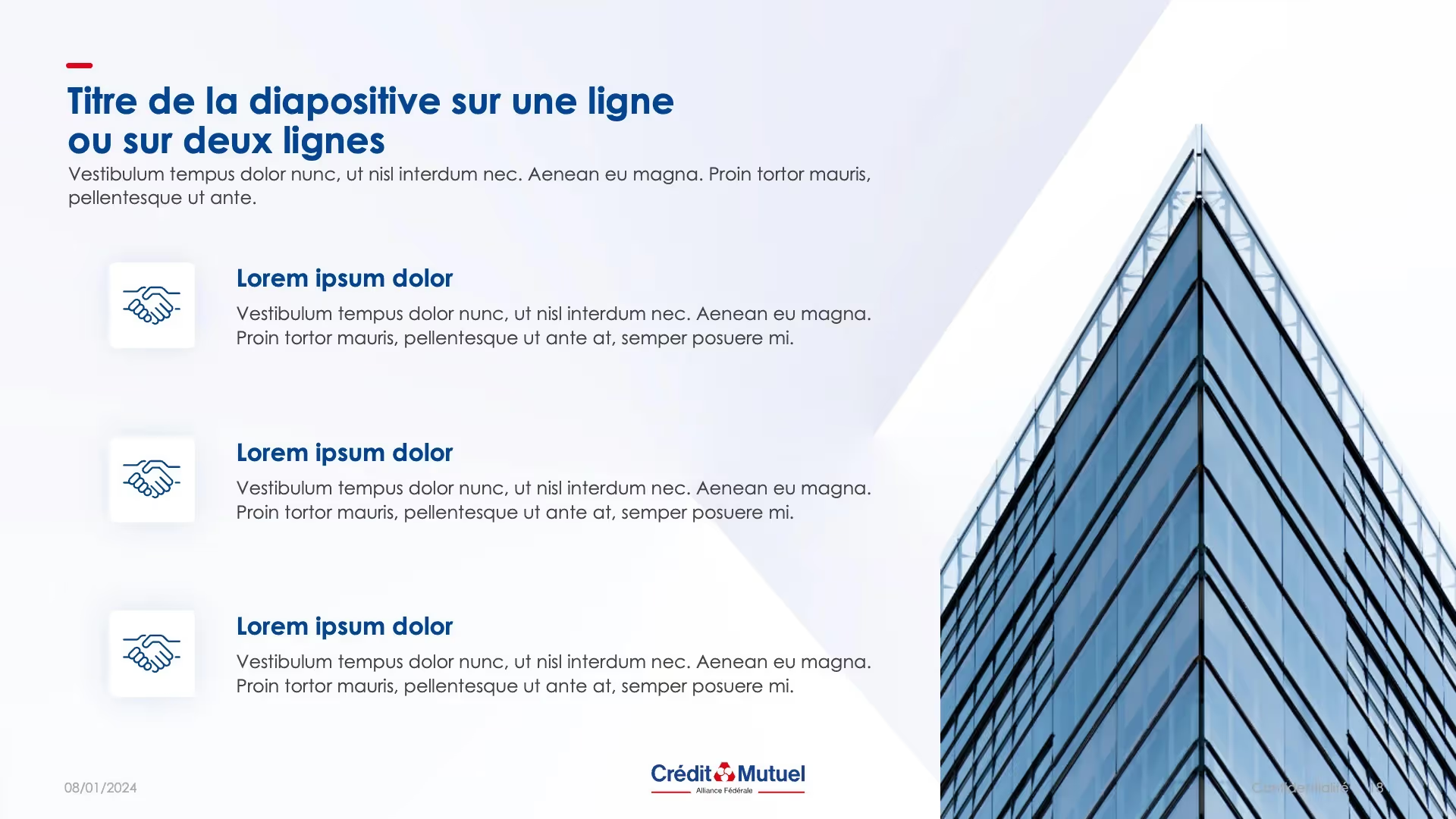
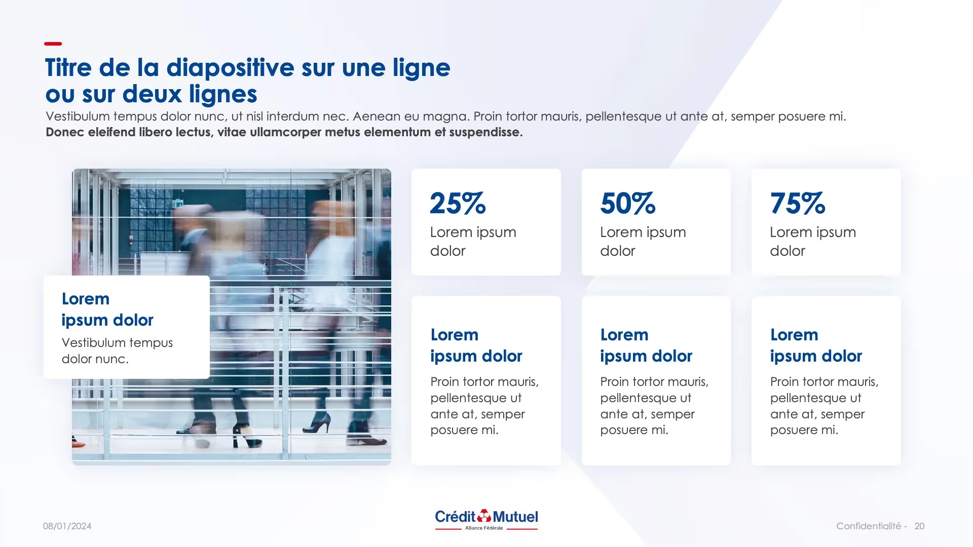
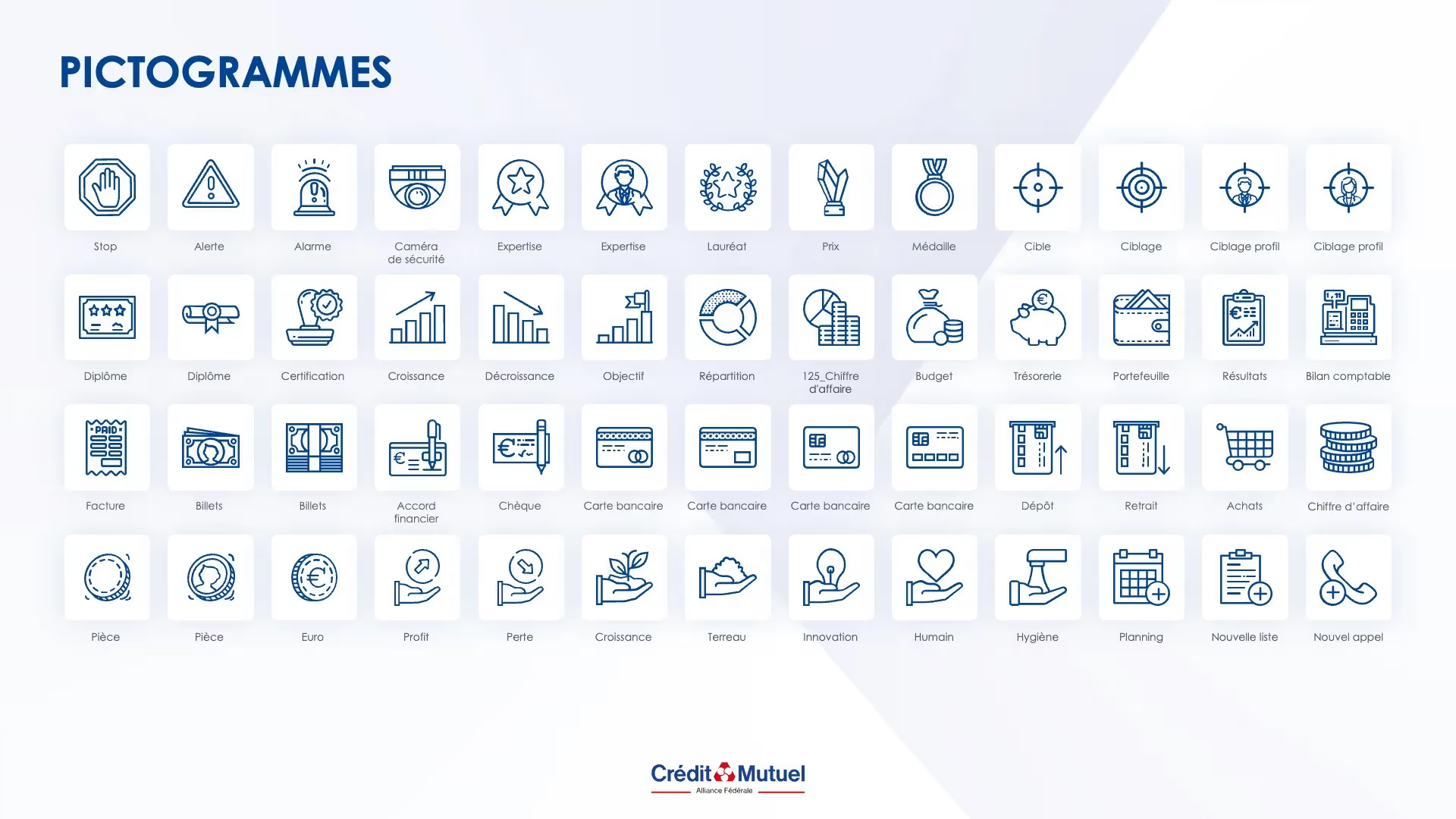
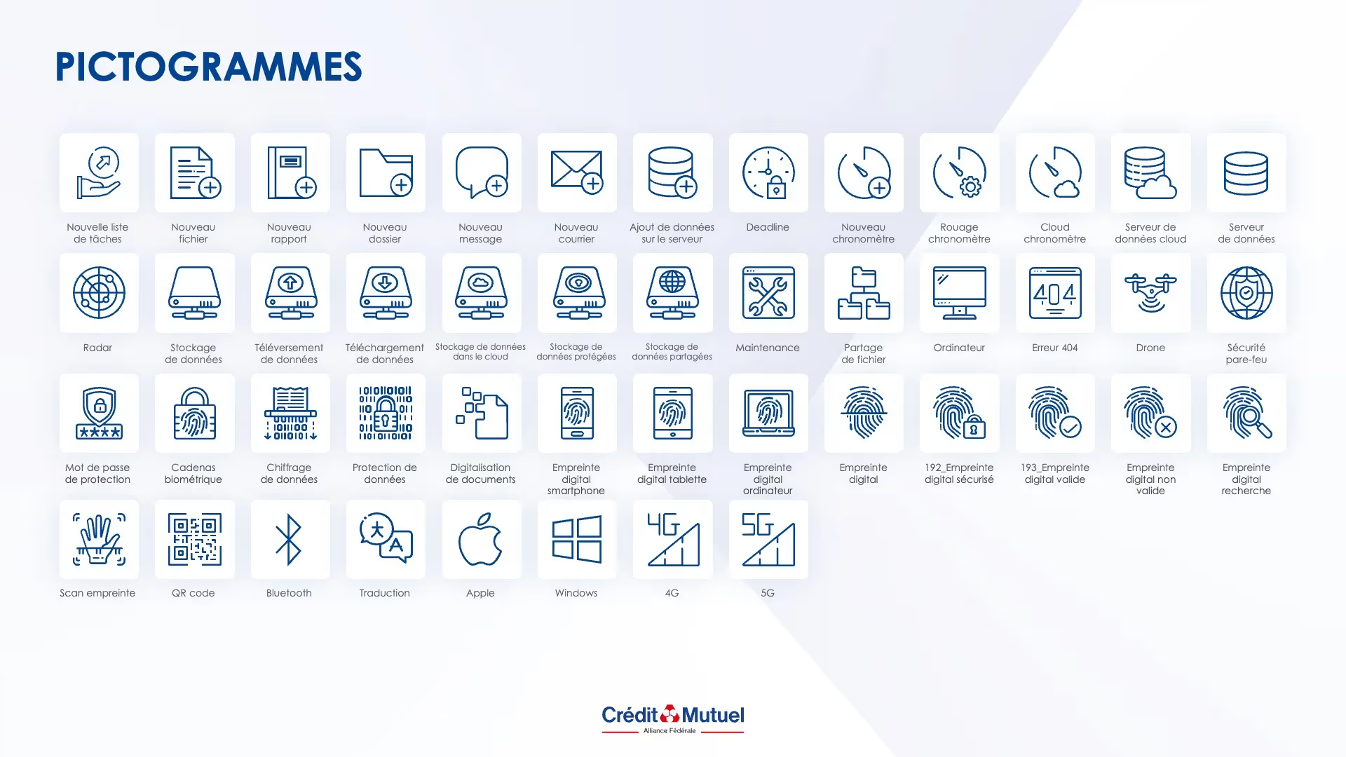
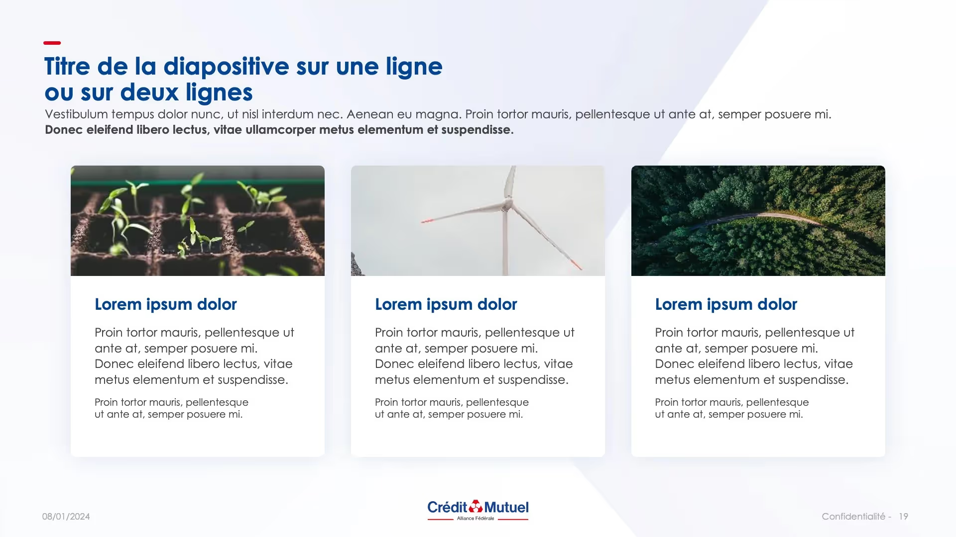
Stock of pictograms and photos, nothing has been left to chance
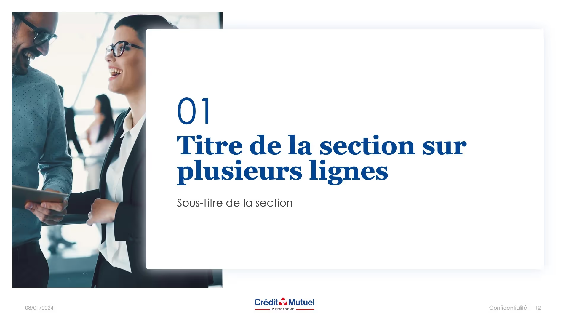
The visual worlds of banking and finance do not always offer the necessary margin for artistic expression and the codes are strict and corporate. However, our designers came up with several strategies to make this presentation stand out from the crowd. Through this template, we wanted to give pride of place to human and architectural visuals. Thus, the presentation is differentiated by its graphic assets, while respecting the imposed guidelines.
We have also developed a system of angular shapes to dress the background of the slides. The shapes were worked on Photoshop, before integrating them into the slides.
At the same time, we made an effort of iconographic and photographic research to ensure the graphic coherence of the entire presentation.
The client is now 100% autonomous in creating PowerPoint presentations
Our other Achievements
Those that hit the mark, those that rained, those that sold, those that convinced, those that may inspire you.

FAQS
Because a professional PowerPoint presentation goes beyond a simple aesthetic layout. It requires a clear narrative strategy, visual coherence, and flawless graphic execution. A PowerPoint agency like ours offers you an outside perspective, a mastery of professional design codes and above all a considerable amount of time for your teams, who can thus focus on what really matters.
Learn more about the reasons for use a PowerPoint agency.
We work on all types of content and regardless of the audience in order to achieve your goals, in the language of your choice:
- Corporate or institutional presentation
- Commercial presentation
- Pitch deck for investors and fund raising
- Event presentation (conferences, trade shows, webinars)
- Strategic or financial presentation
- Tender response
- Internal presentation (reporting, onboarding, committee)
- Customized PowerPoint template
Our team is made up of professional designers and storytelling experts. mprez can therefore support you throughout the entire value chain of your presentation, according to your needs:
- Project framework and understanding your challenges
- Creation or redesign of editorial content (key messages, structure, adopted tone)
- Optimizing storytelling to help you convince your audience
- Art direction and graphic design
- Slide animation and technical integration on PowerPoint, Google Slides or Keynote
Our deadlines adapt to your constraints. On average, allow 2 to 4 weeks to arrive at a final version of a deliverable. If necessary, calendar adjustment options are possible to deliver certain projects expeditiously or to allow more time for collaboration.
A precise schedule is subject to validation from the start of the project.
After you contact us, we plan a launch meeting to dive into your world, understand your challenges and lay the foundations of the project. It is also an opportunity to introduce you to your project manager, your dedicated contact person throughout the mission.
Based on your brief and our expertise, we design a first version of your presentation. A phase of exchanges follows to refine the design, layout and visuals according to your feedback. Once validated, the final presentation is delivered to you, ready to use, on the software of your choice.
Our PowerPoint agency is based in Paris, but we support companies all over France (Lille, Lyon, Nantes, Bordeaux, Marseille...) and internationally.
With offices in São Paulo and Lisbon, and a digitized organization, we guarantee smooth and effective collaboration, regardless of your location or time zone.
The cost depends on:
- Number of slides to produce
- Level of complexity (content provided or to be created, data integration, animations)
- Desired delivery times (express or not)
- Additional options (translation, training, template...)
A typical project at mprez generally includes 20 to 30 slides and requires around 1 to 2 weeks of collaboration, with an estimated budget between €1,900 excluding VAT and €2,800 excluding VAT.
A detailed and personalized quote is offered to you after an initial exchange. Our services are non-binding.
Yes, we design tailor-made templates adapted to your graphic charter, your internal uses and your objectives:
- A library of +150 slide templates
- Integration of your fonts, colors, pictograms and visuals
- Customized animations and transitions.
- A user guide for successful adoption among your employees.
These templates guarantee the visual consistency of your brand. Delivered in a turnkey manner, they are ready to use and allow your teams to save precious time.
Of course. We support you in the formatting of your tendering responses, from the structuring of the document to its graphic presentation, including storytelling. Our express production deadlines (less than 48 hours) and our expertise allow us to respect the time constraints and specific requirements imposed by the exercise, while highlighting the assets that distinguish you.
Yes, we offer professional PowerPoint courses, remotely or in person:
- Mastery of tools: PowerPoint, Google Slides, Keynote
- Learning best practices in PPT design and animations
- Message structuring and visual storytelling
- Personalized coaching on real cases
These courses are aimed at everyone, whether marketing, sales, HR or even management teams.
Absolutely. We have a varied portfolio with projects from sectors such as finance, luxury, tech, real estate or industry. For reasons of confidentiality, some achievements are not displayed. Do not hesitate to request it via our contact form to find out more.
No We also work on Google Slides and Keynote, according to your internal tools. We adapt our deliverables to the platforms you use daily, and advise you on The best presentation tool according to your uses (collaboration, offline use, Mac/PC compatibility...).
Confidentiality is a contractual commitment for us. All of your content is stored and processed securely. On request, we sign an NDA (confidentiality agreement) before any exchange of documents.
Any deliverable made as part of a service is the full and entire property of the customer, as soon as the amounts indicated in the quotation have been paid in full.
The editable source file (.pptx format) is given to you at the end of the project. You have all the rights to modify, export and reproduce without time limit.
We are present in the following cities
