Everything you need to know about information design
Discover how information design helps you change the organization of your graphic visualization!
RSuccessfully explaining a concept or a product is an art in itself. Making that explanation pleasant to read and visually appealing is even more complicated.
Named “graphics” or more particularly “information design”, this method of visualizing elements is a discipline in its own right and requires solid qualifications. Learn exactly what information design is, how it has been used before, and how it is used today.
What is information design?
Information design is a method of prioritizing information linked to digital technology.
Information design is therefore sometimes included in the large graphic design family because of its relationship to graphic processing of information. This is what we talk about graphic design.
In other words, it is a form of visual communication that presents information, products or services on a digital platform (websites, Powerpoint presentations, social networks, etc.). By taking the subject from this angle, we can easily link it to that ofUI and UX designs and the need to improve the interfaces of all communication media in general.
Designing information well means ensuring the understanding of the receiver by offering him well-ordered quality information, presented with creativity and mastery of the basic rules of web design. It is therefore necessary to be able to link form and function well to obtain an efficient design and who Will capture attention. To do this, it is necessary to present the information visually so that it can be easily understood by all.
Information design is like this transmit information as simply as possible for the user.
This concept is sometimes materialized in the form of graphs, infographics, illustrations or other visuals to facilitate data visualization important. These visual creations allow you to be brief, but striking when it comes to delivering fundamental elements in a Powerpoint presentation or a website.

The origins of information design
The term appeared in the 1970s and means both drawing and project based on the idea of transmitting clear and direct information.
It was primarily used to put complex information in order and to return them intelligible for the greatest number of people. Since then, its field of action has expanded to become a fundamental element of graphic communication through its use in graphic design and web design.
Several other disciplines come into play when talking about information design, such as Color psychology, the rules of symmetry, sociology, Gestalt theory or even semiology. All of these areas serve to better understand users, their needs, and the means used to satisfy their desires. They are also used in all parts of graphic design, from the development of the visual identity to the complete creation of the website. Associated with notions of graphic design, motion design or creative expansion, they are the unstoppable elements of good information design.
What are the 3 types of information design?
Information design includes several other types of design and is mainly inspired and based on three of them:
- The graphic design, to give substance to its message.
In other words, it is the art of sublimating visual creation with a capital C. The specialist? The graphic designer who handles the graphic charter with expertise to produce a solid graphic design.
- The web design (or web design), to transmit its information on contemporary media.
Whether using simple layout techniques or motion techniques, the web designer will know how to highlight creative briefs so that they become the easiest and most pleasant to use. In particular, he uses UX processes and UI designs.
- The space design, to adapt to new presentation tools.
Although normally reserved for architects and other “field” professions, space design is now extending to the digital kingdom to bring its notions of space, ventilation and breathing into texts and visuals. The graphic designer uses this type of design to coordinate information and create the most engaging result possible.
These three forms of design make it possible to shape information, to make it intelligible and useful to users and other audiences.
⚠️ The thing not to forget!
The origin of design in general is linked to art and is therefore rooted in all its particularities. Since The art is the source of all design, the creativity plays a major role in the development of all types of design. So don't be afraid to be creative in the way you bring your information and design it into your sites or visual presentations!
Structuring information
Information design is above all a question of efficient and coherent structuring. Indeed, if the basis of the given elements is flawed, the whole design is threatened and may not be efficient in the eyes of the users and audiences affected.
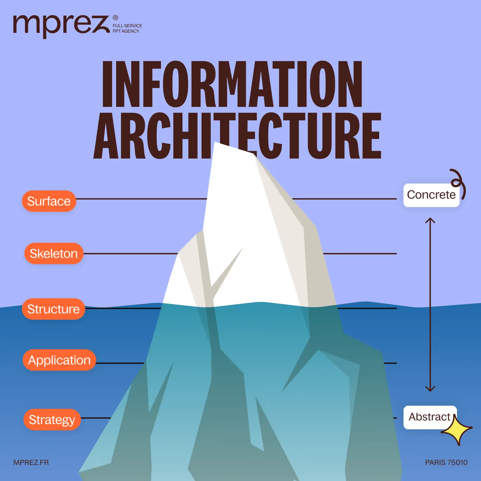
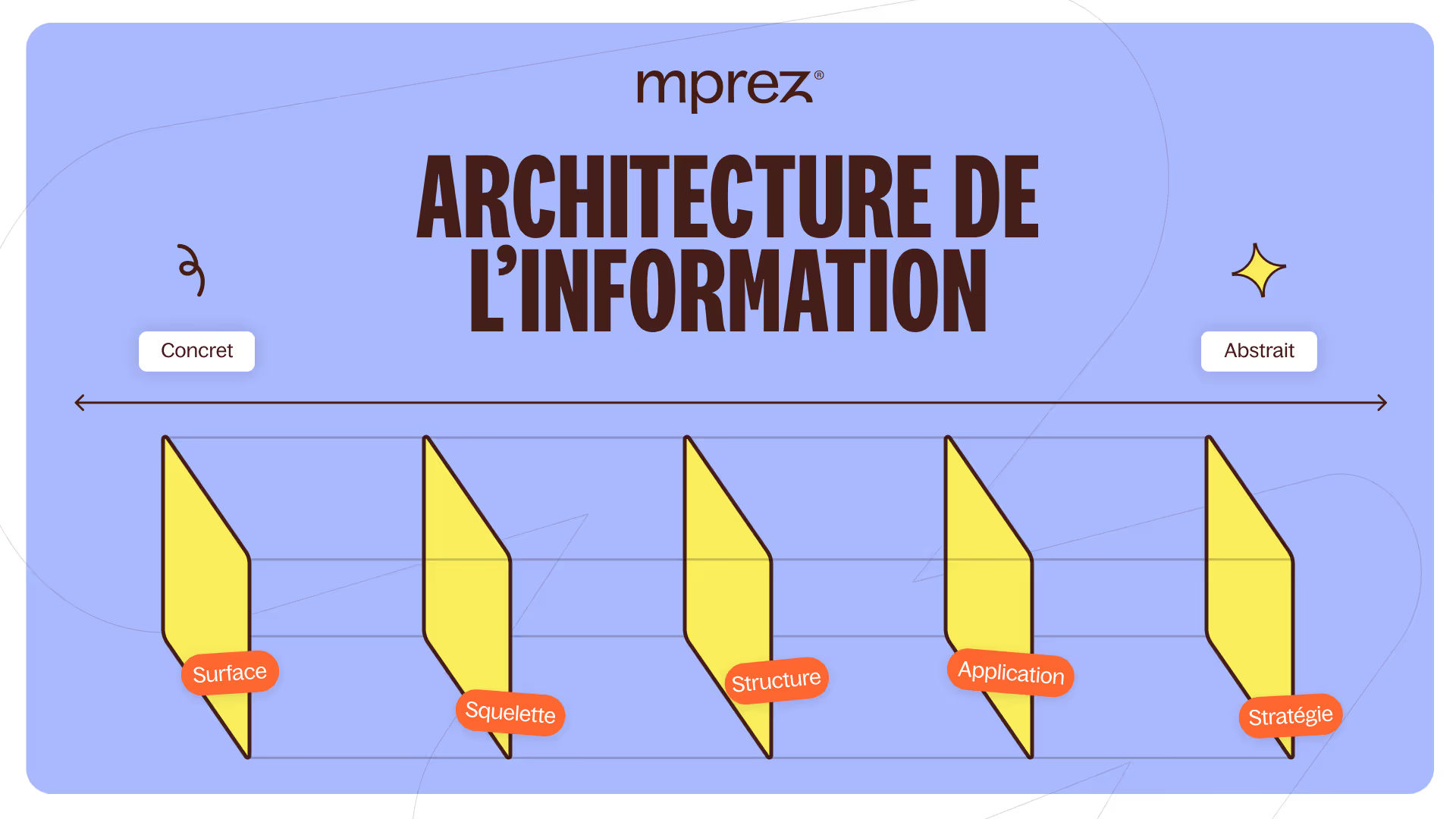
The design of information is a assembling several layers of elements. Some layers are very concrete and are the tip of the iceberg and others are more abstract and require digging under the surface layer to be understood and assimilated. Information is therefore an iceberg made up of concrete and abstract; to float, it needs all these elements, because otherwise, the whole becomes flawed and the iceberg sinks just right.
Thus, before presenting information, several steps are essential for the quality of the final result to be optimal:
- The strategy : your information must above all meet a strategic objective: what is it used for? What more abstract and global message do they support?
- Application : then, the use of this information must be defined: what is it trying to highlight? How can I justify them? Through what channel and method?
- Structure : When you know on which channel you want to communicate, you have to determine how: is it better to use a text, a diagram, a video, a diagram?
- Skeleton : once you know what you want to say, why and by what means, you need to find a skeleton to your information. You need to dissect it: what is the essential point, what are the underlying and secondary elements, what should be understood first?
- Surface : finally, once all these steps have been completed, you can move on to the surface, to the tip of the iceberg. That's what your audience will see.
Through this visual that he will have in front of him, he will be able, if your information is well structured, to understand all the underlying issues. That is the strength of information design.
Moreover, information design is structured both by what you are going to say and by the way you are going to say it, which is the result of your information added to its graphic processing. The design of information is therefore also the design of a graphic design. One does not go without the other and both parties must live together.
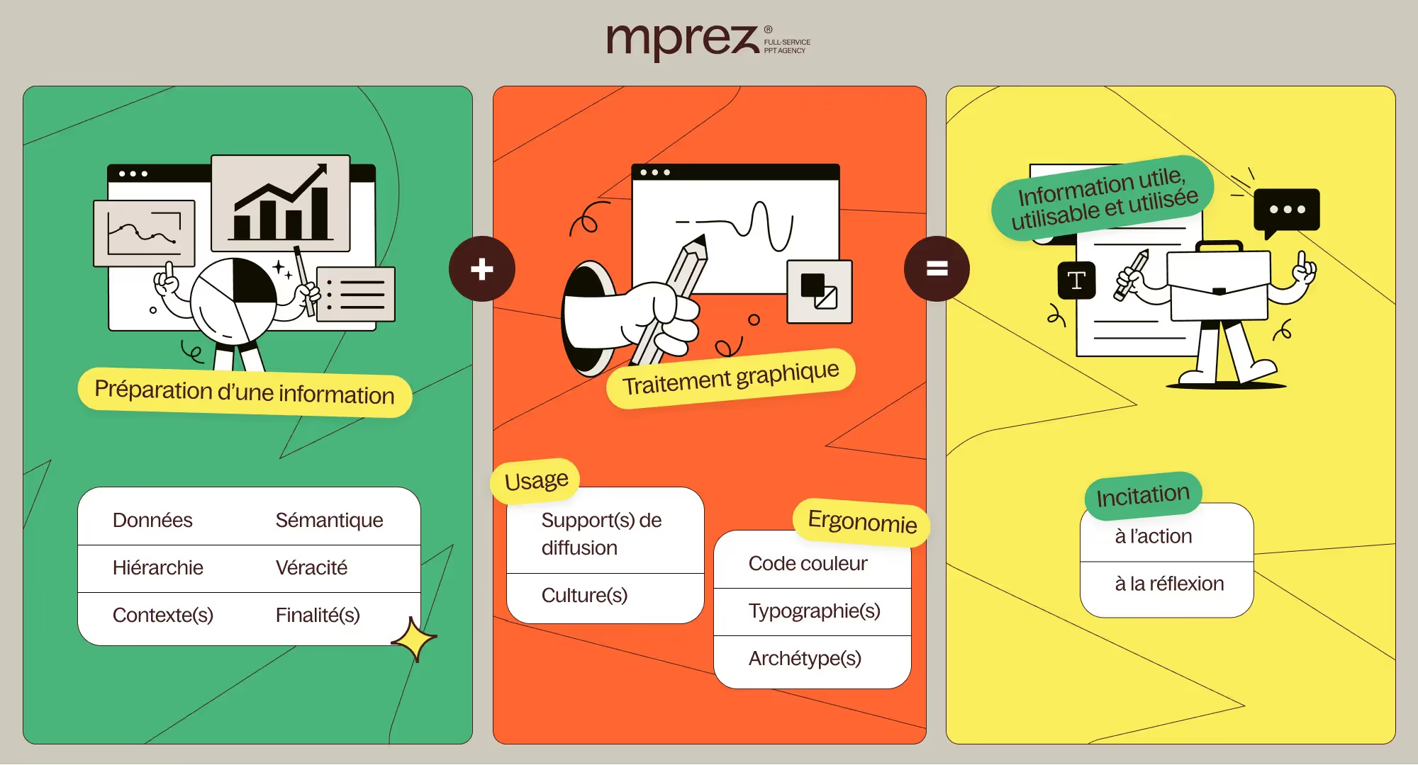
The background + shape allow you to obtain information to use with your targets in order to make it salient.
Your information, in addition to its need to belong to a larger strategy than it, must answer questions of correct and verified data, a particular context, studied semantics, and a hierarchy that offers a logical purpose. To this, you must add an adapted graphic treatment based on the use you will make of your information (for what media, for what audience, etc.), as well as on the ergonomics provided (your colorimetric and typographic charter, and the readability of the information).
All of these elements put together offer an effective and useful information design that encourages action.
In other words, to ensure that the public who will perceive your communication medium Act and Take action (whether he makes an appointment, buys your product, signs up for a subscription, etc.), you must present him with information thatWill be of interest in its background by means of a shape that will capture his attention.
We'll see you next time for more tips!
As you will have understood, the term “information design” is ambiguous and twofold, and it invites us to focus on two aspects.
- The “design” aspect: the form chosen, the way in which the message is transmitted, the visual and structural organization of the information.
- The “information” aspect: the background chosen, the way in which ideas are articulated and how to interest someone.
If you master both aspects, you have won: your graphic charter will be remarkable, your communication tool will be unstoppable, your website will be essential and your Powerpoint presentation will be memorable.
We hope that this explanatory article has interested you and that you have understood the challenges of information design a little better. This is an area that should not be overlooked in your visual and digital creations, as it makes it possible to leave an unforgettable memory in the mind of the audience and to simplify the explanations of certain data.
If you still have questions or want to learn more, we are available to help!
See you soon at the Kings of La Prez 👑
Ce qu'il faut retenir
What you need to remember:
- Information design is a form of visual communication that presents information, products, or services on a digital platform
- Information design includes three sub-branches of design
- Information is an iceberg that must be broken down

