Is redesigning the visual identity of the giant Deezer a risky bet?
It certainly won't have escaped you: Deezer, a French audio streaming platform, has completely reoriented its visual identity.

What do we think of the graphic redesign of Deezer's visual identity?
It certainly won't have escaped you: Deezer, a French audio streaming platform, has completely reoriented its visual identity.
Since its creation in 2007, Deezer had only changed its logo once, in 2019, to change the font and colors of the musical equaliser that was its emblem. The redesign was therefore partial and did not shake users too much. “The old logo was strongly linked to sound, with its easily identifiable sound wave (in color), but had nothing to say, with its bland characteristics and simple personality.”, believes Romulo, lead designer in Brazil for mprez.
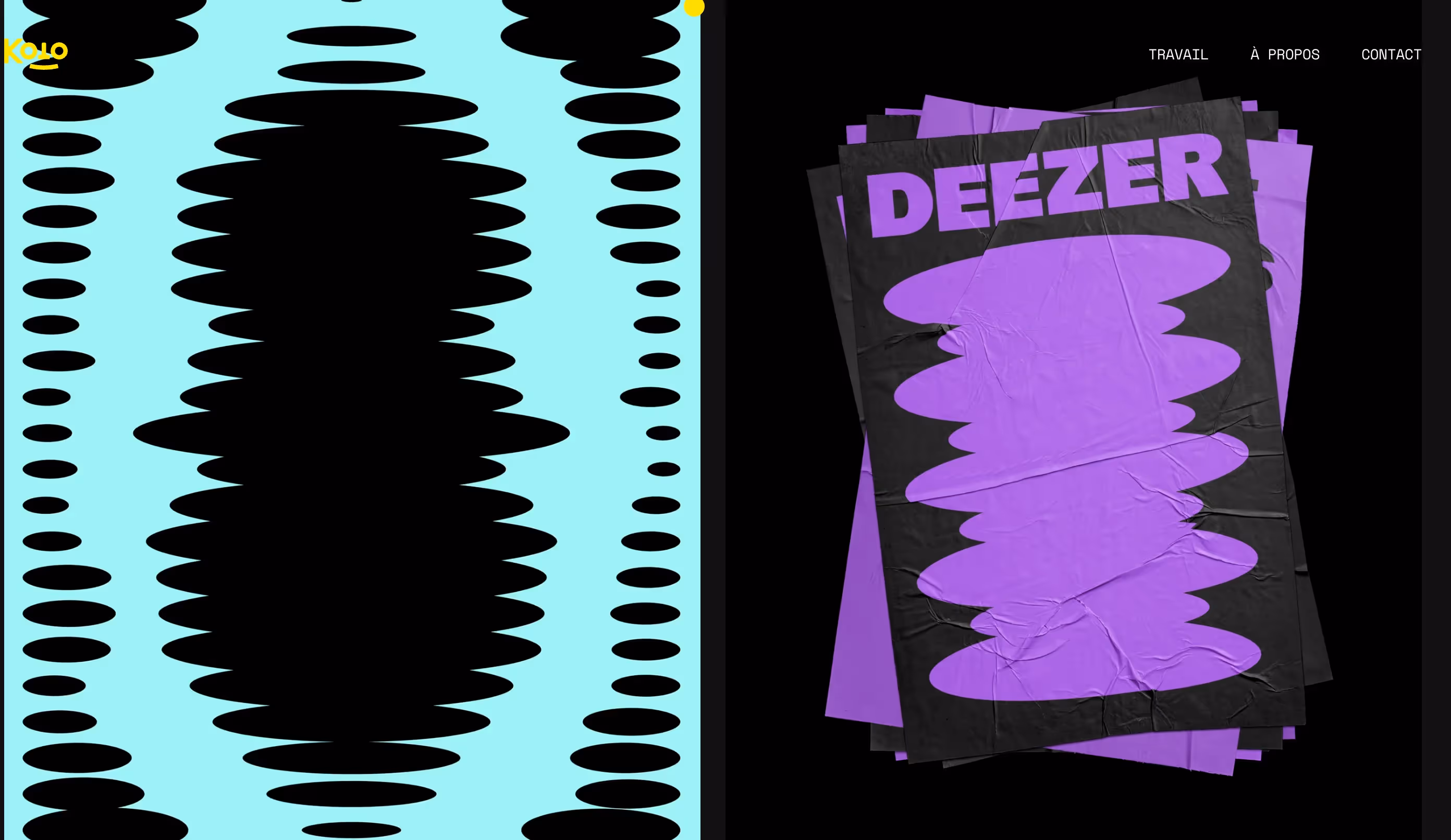
Since November 2023, on the other hand, Deezer's new visual identity has been in the news. This time, the redesign is complete: the music listening platform has been given a makeover by sporting a new logo, a new color palette, new variations and a new entrepreneurial vision. “The new logo, while maintaining this feeling of connection with sound waves, is more aimed at the music community, by engaging in something they already love: music.”, continues the graphic designer.
You only get along well with your heart
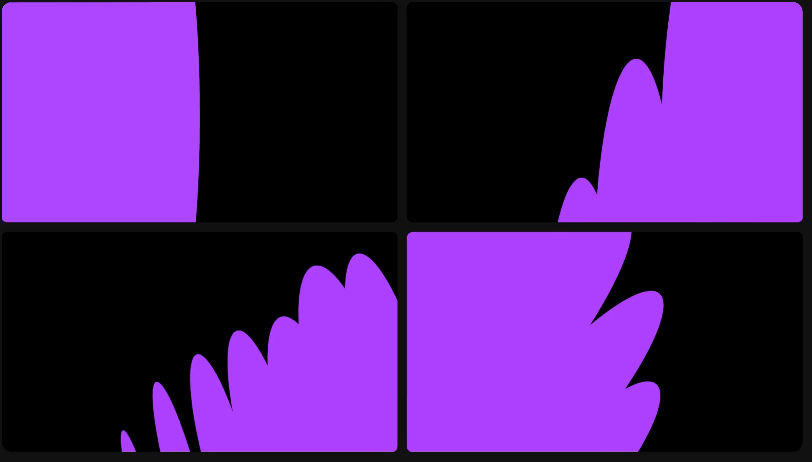
Deezer's new graphic charter is based on moving shapes that, around the heart logo, create a real ecosystem in full breath.
This new logo is a love ode to music: the heart only beats for the musical pulsations, it is in accordance with them. The other forms, which are more diffuse, represent beats and rhythms in music. They can be metamorphosed at will according to the songs.
The aim of these very particular forms is to offer an immersive experience, rooted in music.
For Romulo, “The 'beating heart', as Koto (the design team responsible for redesigning the brand) calls it, has a lot of movement and personality, which reinforces the connection to the audience's purpose when listening to music: the connection with the artists.”

The Deezer ecosystem
- The colors, too, are brighter and deeper, bolder: we go from purple to orange and yellow to reflect the life and dynamism associated with music.
- A new font is entering the Deezer universe: it's Deezer SANS, a font 100% created for the brand's application and visuals.
These innovations form the new energy released by the brand, its desire for movement and its attachment to a younger, more dynamic target. The result is intended to be fresh and bright. “The rebranding is energetic and dynamic, with current codes that will appeal to a young audience, certainly the core target of this new positioning.”, Gauge Bessy, lead designer in Paris for mprez.
The whole thing forms a new iconographic style that is immediately recognizable, which imposes Deezer's identity at a glance. “It is now possible to identify the brand from miles away without the need to display a real logo. The font is also completely new and exclusive to the brand, which further strengthens its communication capabilities.”, adds Romulo.
.gif)
Welcoming the public
The web ignited following this identity revelation and everyone had their own little comment.
Many people were disappointed, finding the result inconclusive. Some compared the app to a dating site because of their heart, others thought it was a Branding for Halloween because of the unusual shapes and the heart that can be reminiscent of a bat.
Graphic designers have taken advantage of this phenomenon and this emulation to offer their own rebranding by Deezer, creating a real creative wave on the net.
“It's important to note that this type of rebrand always comes with a backlash, as it's mostly unexpected and very dramatic. Human beings tend to dislike changes, no matter how big they are, so it's hard to expect them to be welcomed when it comes to such big changes.”, explains Romulo.

The opinions of our experts
On our side, we find the new Branding quite successful; he exudes a certain energy and a daring and daring detachment from his 2019 younger brother.
Romulo was very excited about the graphic proposal and added that: “Despite the initial reaction from the public (at least from what I saw online), I personally think the rebrand is very positive. Although controversial, I think this rebrand was necessary and will certainly be useful if the brand wants to rise to the level of its competitors.”
For his part, Bessy believes that “The variations are full of life, but are based on current trends that lack sustainability. Let's see if Deezer will achieve its goal of bringing a new lease of life to its brand with an artistic direction that is more of an electric festival than a music platform.”
The final word is therefore to know if this identity is sustainable and will still be appreciated in a few years, in the hope that the choices are not only based on fashion effects, but on innovative and future-oriented visual elements.
Ce qu'il faut retenir
In the end, this rebranding was successful in every way. We find the new Branding quite successful; he exudes a certain energy and a daring and daring detachment from his 2019 younger brother.