Succeed in your financial presentation
Writing powerful slides for finance is not easy, but quite possible! We share with you all our tips for getting the best presentation templates in the financial world.

Writing powerful slides for finance is not easy, but quite possible!
We Give You All Our Tips for Getting the best presentation templates in the financial world.
To build a captivating PowerPoint, you will need:
- Find out how Powerpoint can help you on a daily basis
- An infallible method of creation (chromatic palette, typography and iconography on the menu)
- Magnificent examples (we don't say that at all because they're ours 🙃)
- From a zoom on the purpose of the operation, aka “What is the point of talking about accounting and company on Powerpoint?” ”
Shall we start?

Financial Presentations: Why and for Whom?
Finance is a field that deals with money management and includes the activities of lending and borrowing money, as well as investing in various financial projects or instruments. In other words, the main players in finance are banks, insurance companies, investment funds, private equity firms, venture capitalists (VCs), and asset management companies. Of course, we also work with many companies that are not professionals, but that offer extensive financial services and need assistance with their slideshows.
Financial directors, CEOs and all the people who work in financial departments (CFO, treasurers, analysts, etc.) are regularly called upon to produce Powerpoint presentations. These may be corporate presentations or relating presentations to asset portfolios, in particular in connection with financial topics such as investor days (public announcements of funding searches), or even presentations by Annual Activity Reports Which happens once a year.
A study by Upslide revealed a striking reality: finance professionals spend too much time on low-value-added tasks, including document creation and Microsoft 365 reporting.
86% of respondents felt that these tasks had a direct impact on their engagement and satisfaction.
In addition, Powerpoint agencies such as ours are often confronted with confidentiality issues encountered in financial circles, so we observe strict and efficient confidentiality policies to provide financial structures with the trust and attention they expect.
So, if you are a financial player, regardless of your scale, and you have renderings to produce, the rest of this article is for you!
Create Financial Presentations
The Graphic Style Regroups the Typography, the chromatic palette (the colors), the shapes and the iconographics (the visuals) That plays a central role in the visual communication of a brand. When designing our prez, our designers use these four principles to create striking slides.
The Financial Color Palette
Generally, financial funds are recognized by their Graphic charter Tending towards blues or greens. In fact, the Bruise Is the color of seriousness and the Unripe, that of financial ease, which is perfect for banks, insurance companies or other financial companies.
Increasingly, too, these bluish shades tend to come in dark purples, in particular to make the link with the sector of New Technologies Which is now important in financial uses.
Our customers generally use the Ruddy As a highlight color, which goes well with the chosen blue. The other color that is regularly chosen is yellow, which can remind us of gold and wealth in the collective imagination. It also goes very well with blue and offers effective contrasts.
On the other hand, some new structures try to overthrow financial monopolies and stand out through flashy colors and playful designs. This is the case of Tundr or Money Walkie, which have focused their graphic design on bright and unconventional colors such as yellow, pink or electric blue.

Typo & words in finance
Two scenarios can be observed concerning the typography and the use of words in finance.
The first case encountered is a search for modernity and adequacy with the rise of new technologies, which leads to the use of dynamic and clear Sans Serif fonts, inducing concise and precise messages that use a technically comprehensive vocabulary that demonstrates the firm's certain expertise. The use is serious and professional and seeks to inspire confidence. Everything is weighed and standardized to appear as smooth as possible.
The second case is a more humanized trend with a certain search for proximity between the entity and the customer. The fonts are round and quite impressive, Sans Serif, adaptable to all purposes. They are often colored to best fit into graphic charters and encourage trust and understanding: entities want to be close to their customers and seek to show that they understand each other's problems through these daring and unconventional fonts.
Today, customers who ask us for Serif fonts are content to apply them to their titles, but the body text is mostly in Sans Serif fonts, which are rather round, to encourage complicity.
Iconography in finance
The key to creating memorable visual presentations is to carefully assess colors and use them wisely.
But it's not easy to capture the attention of an audience when all you have to present are a bunch of numbers and charts to sleep outside!
Indeed, financial channels highlight tangible evidence supported by infographics and numerical illustrations. The use of percentages is very widespread and allows the sector to easily and simply illustrate the information provided, so that it speaks to as many people as possible. La Datavisualization Is therefore an essential component of presentations, in order to highlight the figures mentioned clearly and immediately. The use of pictograms, in addition, is marked, as well as that of human models inserted into whole photos or cut out to be inserted on the slides and which promotes proximity. To continue to show the human aspect of financial structures - which may frighten more than one at first glance -, visuals are, most of the time, photos where you can see extras illustrating the point or illustrations of personified elements. This makes it possible to put friendly faces on information that is sometimes hard to digest or understand and brings lightness to important subjects. There's nothing like a smiling face for a financial statement presentation!
In addition to faces and pictograms, financial presentations also include overlays of financial monuments to recall symbolic places in the field of activity, such as Defense, Wall Street, etc. These visuals are often modern and use typical architectural elements. Close-ups can also be preferred, i.e. the focus on a part of the building, and not the entire building, which brings an abstract aspect into the concrete nature of the sector.

The iconography in finance is therefore, against all expectations, rather diversified, between tables, graphs, diagrams and other chaotic figures and photographic or illustrative visuals that allow a Datastorytelling Effective and pleasant to read.
Our Favorite Finance Presentations
We love all the presentations we make and choosing is a real challenge! So, instead of really answering the question of our favorite presentations in this field, we opt for another axis, namely to sequence the strategic presentations of the templates and to present you some of our greatest successes.
Strategic Presentations
Many financial companies, such as banks, insurance companies or investment funds, ask us to make strategic presentations for them, whether they are internal presentations, presentations for investors, commercial, financial or managerial strategy presentations, etc.
These are important slideshows that require a lot of application since they are intended for a large number of people, sometimes even for the entire company.
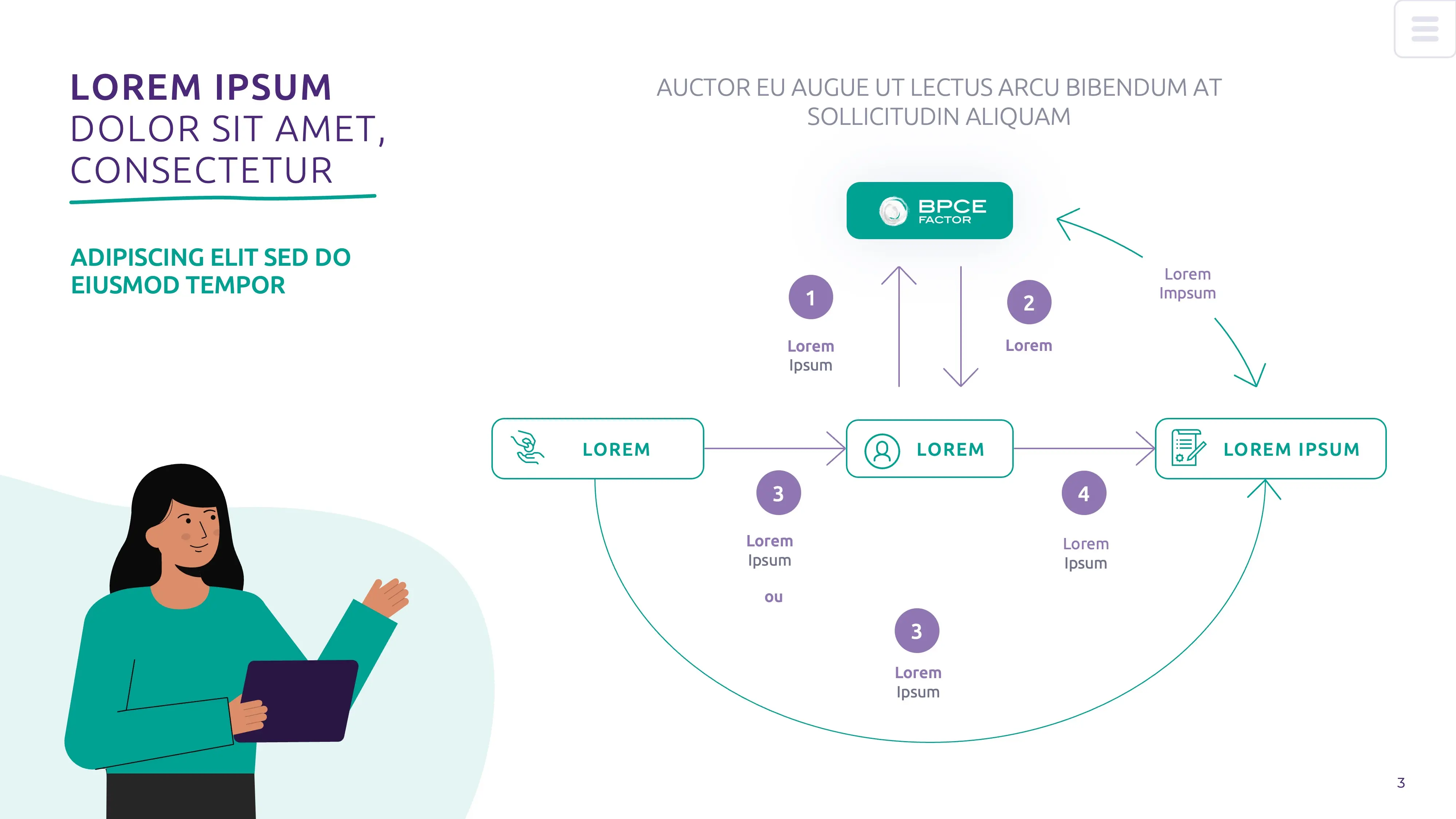
- For BPCE, we created a Interactive presentation In order to meet an internal communication need. We based on the company's graphic charter and adapted their color palette and illustrations to make a clear and colorful slideshow. To make numerical information more easily stand out, we created simplified and arrowed illustrations to represent a given reading path.

- For Primalliance, we designed a presentation for a commercial pitch. The artistic direction is very clear and human-oriented thanks to the multiple photographs on the slides, in particular representing pleasant extras. The colors are bright and the typography is obviously airy to create perfect legibility.

The templates
Sometimes our customers are looking for a Document That Will Follow Them Over Time and can be reused for new opportunities. In order to meet their demand, we design reusable templates using modular elements based on the Slide mask And thanks to the banks of pictograms or visuals that we leave at the end of our presentations. This way, customers are ready for any eventuality!
- For Meeschaert, we designed a Corporate template To promote the Datavisualization. This document is therefore ideal for presenting all their numerical data. It is a very clear slideshow with airy slides in which we have arranged numerous graphs and tables that can be modified in order to meet any need for data visualization.

- For Swen Capital Partners, we carried out a Multi-purpose template In blue and white tones. We have adapted each page to offer endless possibilities during the daily activities of the company. In the same way as for Meeschaert, numerous graphic layouts are possible, with bar and pie charts or even tables.

Finance and Powerpoint: Focus on a Winning Combination
In short, Powerpoint is a An essential tool in the world of finance, because thanks to the tools of Datavisualization Such as diagrams, graphs or numerical tables, it makes it possible to shape an effective hierarchy of information and to promote global understanding. Thanks to this way of structuring figures, it is easier to analyze them and to report them effectively, or even to create a story around strategic data: this is datastorytelling.
Powerpoint highlights the work of analysts and offers a greater understanding of each data, by a Information design efficient. No more excuses for presenting your future financial statement! You can easily capture the attention of your employees or investors if you optimize the information presented.
Whatever your problems on PPT, we can help you!
See you soon at the Kings of La Prez 👑
More than 1000 customers have trusted our agency PowerPoint
Ce qu'il faut retenir
- The main players in finance are banks, insurance companies, investment funds, private equity firms, venture capitalists (VCs), and asset management companies.
- Financial Funds Are Recognized by Their Graphic charter Tending towards blues or greens.
- Today, customers who ask us for Serif fonts are content to apply them to their titles, but the body text is mostly in Sans Serif fonts, which are rather round, to encourage complicity.
- Datavisualization tools, present in PowerPoint such as diagrams, graphs or numerical tables, make it possible to shape an effective hierarchy of information and to promote global understanding.


