Graphic styles by business sector
Graphic style includes typography, colors, shapes, and images. It plays a central role in the visual communication of a brand and allows it to be integrated into a sector of activity.

While the choice of colors or images can be perceived as a matter of individual taste, in communication it is not the case. Each sector of activity has its own codes that allow it to be recognized quickly and simply by users.
The design Graphic is defined by four inseparable elements that, when linked together, give shape to an idea and represent the chosen universe.
The graphic style includes the Typography, colors, shapes and images that play a central role in the visual communication of a brand.
(Interested in the role of colors in the collective unconscious? Check out our article on the subject The Psychology of Colors)
All brands and businesses use these elements to include themselves in a larger whole, that of their entire industry. And each sector of activity has developed a common image, supported by similar components that are responsible for delivering a specific, unique message.
Also, never forget that today all business presentation materials are digitized, which means adapting the formats so that they can be processed by all digital tools. Thus, you must be careful of non-universal fonts or colors that are poorly exported and therefore no longer have the same visual upon arrival.
Let's take a look at a few business sectors and study their graphic style.
Luxury
Luxury, an elitist sector that is rather closed, attracts crowds and excites imaginations. Its actors nourish the myth that encompasses this sector and also transmit, in addition to the sector itself, intrinsic codes that arbitrate the identity of initiates.
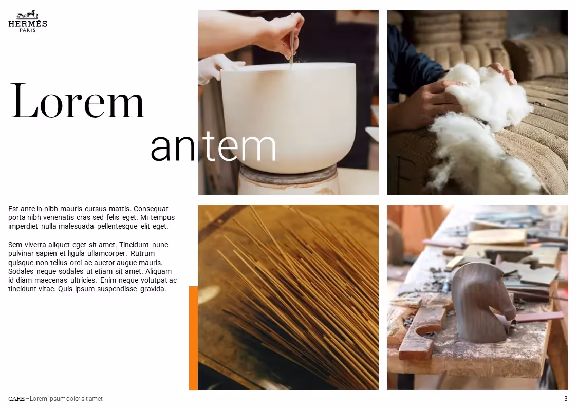
Luxury has a sparkling and mysterious image, which is first and foremost reflected in the graphic charters of the companies that comprise it. Luxury businesses, to cultivate mystery, display very refined styles, with simple and timeless lines. The fonts are devoid of frills, often without serif to avoid superfluous details, like Balmain or Louis Vuitton. Some, on the other hand, choose classicism by using skid fonts, such as Hermès or Dior. In both cases, the fonts chosen remain very classic and refined, almost minimalists.
Still to corroborate this mysterious aura, luxury companies use black as the dominant color, most often combined with white for purity and minimalism. We maintain this idea of the timeless, timeless classic.
Because of these elements, luxury companies broadcast messages of sobriety and solidity. Their know-how seems to be millenary and they are a model in a changing and unstable society. They inspire a myth and do not mix with ordinary people. Most do not do public communication or advertising, they remain sober about their external image.
All the luxury presentations we have produced have one common feature: the minimalism required. Each Slide had to present an idea and an element in a refined universe with very light tones. Only the product or the emotion conveyed is highlighted, nothing superficial tarnishes its image.
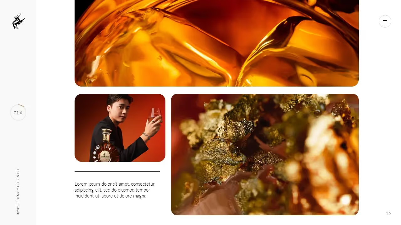
Spirits
Spirits - this being due to French regulations on communications to the general public for products related to tobacco or alcohol - have a more unknown graphic style than other sectors authorized to communicate their offers.
Let's give back to these shadow companies their letters of nobility by highlighting the graphic style that arbitrates them, but let's focus, given the myriad of possibilities in the sector, on rather high-end spirits, and not on the first prices whose graphic style would be less representative, because they are more similar to a discount and rowdy style.
This type of spirit is similar to the world of luxury and adopts a number of codes, such as the choice of fonts. Indeed, there are a lot of serif fonts with skates that recall the classical universe to which businesses want to belong, in a genre that is quite different from the previous ones mentioned. Like luxury fashion companies, spirits companies seek to evoke a clear history of activity and borrowed traditionalism. The supports Print such as bottle labels appear to be aged, sometimes featuring ancient coats of arms and dated mentions. In terms of colors, the world of spirits is often inspired by nature, history and traditions, so it is mostly green - often dark - and brown colors.
We have had the opportunity to work with several major spirits brands and we can notice that their requests were less refined than for luxury fashion brands; the Slides are more loaded, with larger fonts and more detailed details. They wanted their interlocutors to really dive into their history, so the emphasis was on heritage and the transfer of know-how and crafts. The colors chosen were dark, often in deep greens and browns accented with black.
The construction
Construction is a sector that is not often promoted through advertising or external communications. The actors in this sector are people of action, and this is reflected in their graphic style. The typefaces chosen, for example, are coarser and more striking, more striking. The fonts are generally sans serif with bold lines. Construction and architecture firms don't bother with unnecessary details and prefer to get straight to the point; their communications are generally very graphic, in order to represent the reality on the ground. The visuals chosen are therefore concrete and are not based on convoluted concepts or abstract forms; they know where they are going and show it. Regarding colors, in the same way, the choice is on bright and deep colors such as orange, which brings vitality and energy, or blue, which recalls large spaces, such as the ocean and the sky.
The messages conveyed by this sector are often related to know-how and innovation, because construction tends to surpass itself and test its technical capabilities. Communications are therefore generally linked to new technical and technological advances and play on human emotions linked to this point, namely hope and desire.
We had the opportunity to work with several major brands in the sector and observed a desire to make their daily work a reality in the presentations requested. Each prez was enriched by photos of the teams and the achievements made, to recall the strength and action of man in the foundation of our societies. Many diagrams have also been requested and integrated into Slides in order to convey a clear visualization of the projects.

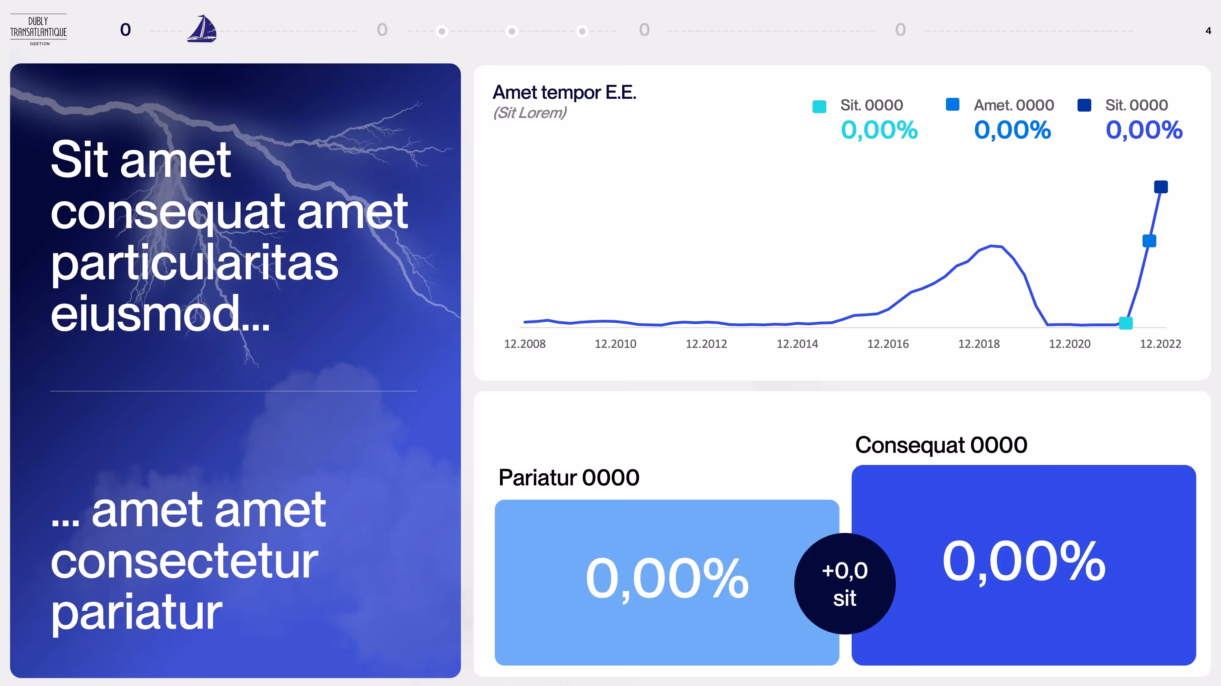
Finance
Finance includes several sub-sectors that have common characteristics, such as banking, insurance, and financial and accounting firms. Their color is mostly blue, to recall the serious side, as well as green, which evokes financial health.
Finance bases its communication campaigns around two central pillars: financial profitability and people. Humans and the contributions they can make are put at the center, so visuals are, most of the time, photos where you can see extras illustrating the point or illustrations of personified elements. The emphasis is on proximity, which means that there are a lot of round and quite amazing fonts, sans serif, adaptable to any purpose. These fonts are often colored to best fit into the graphic charters, far from the classic and neutral fonts of the luxury worlds seen previously.
These channels also highlight tangible evidence supported by infographics and numerical illustrations. The use of percentages is very widespread and allows the sector to easily and simply illustrate the information provided, so that it speaks to as many people as possible.
The presentations we were able to make for the financial sectors were colorful, with an emphasis on dynamism and technological innovation. Data visualization was an essential component of the presentations, in order to highlight the figures mentioned clearly and immediately. The use of pictograms, in addition, was marked, as well as that of human models inserted into whole photos or cut out to be registered on Slides.
Art and culture
Sometimes considered inaccessible, the artistic and cultural sector has its own graphic style. This sector is the holder of knowledge and knowledge and is part of a significant transmission of heritage, which obviously influences its design.
Evolving between respect for traditions, elegance, exploration and discovery, the sector finds a point of support in a refined and profound image, where the spotlight is given to knowledge. Les Designs are simple, not made to sell, but to promote. The evocations made by the images and illustrations are grandiloquent, we evoke powerful emotions and not bland material elements. For this reason, the dominant colors are purple (a symbol of mystery, as we mentioned in our article). The Psychology of Colors), black and green, which evokes a return to the roots. In this approach of elegance and purity, the fonts used are similar to those of luxury, because generally in serif, with skates, therefore. Some institutions are trying to get rid of these aging representations by adopting sans serif fonts in order to rejuvenate and revitalize their image.
In this sector, visuals are generally photographs, not illustrations or Designs artificially created, always with this desire to transmit and share.
We have worked with several major cultural institutions seeking to boost their image and content. They wanted to challenge their presentations and adopt a more current tone, as well as less classical visuals, with few texts. In order to present their expertise from a new perspective, they opted for an animated presentation and opted for clear communication without superfluous details; the essential was said.
Health
Health, an essential sector in our society, is communicating more and more to the general public, especially since the Covid-19 crisis. External contacts are increasing and the sector is tending to become more humane and to facilitate exchanges concerning new medical techniques or scientific advances.
The sector wants to be transparent and a guarantee of quality, innovation and progress. Les Designs are simple and clear, with a few strong colors to highlight certain important data and information. The colors of the sector are therefore white for purity and transparency, green for nature and well-being and blue for balance and relaxation. Laboratories often use elegant and fine skid fonts to integrate a high-end image of their products and solutions, but large pharmaceutical industries for common tablets more easily use large sans serif fonts, often uppercase and imposing, with impressive tendencies.
The main thing is to convince people of effectiveness, hence the inserts of scientific studies or the results of the tests carried out. As a result, the industry frequently uses numerical data, supported by clear data visualization techniques.
The companies and institutions in the sector that we have already worked for were looking for clean and technical presentations in which data was important. We therefore used numerous data visualization techniques to allow a simplified reading of the given results. Les Slides sought to highlight institutional progress, as well as evidence of effectiveness.
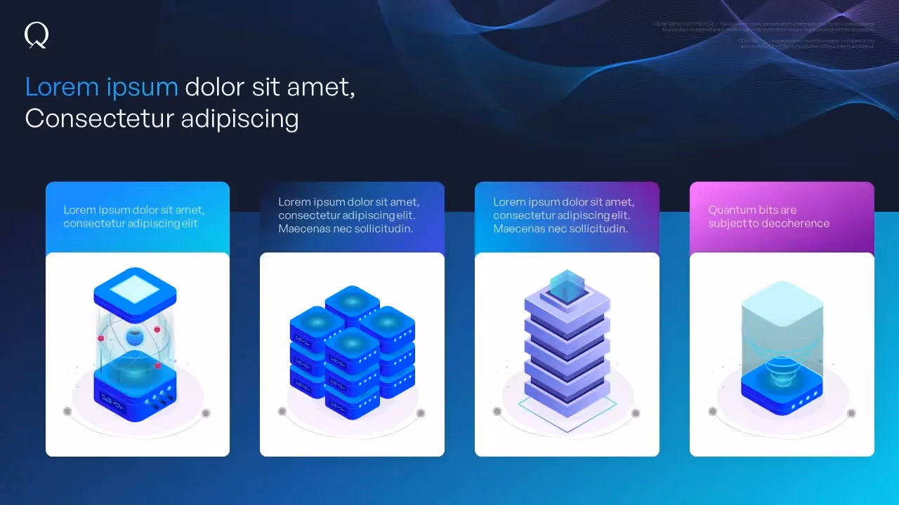
La Tech'
New technologies have opened the way to new graphic charters following their advent and have created their own and unique identity. Their strength lies in the multiplicity of their characteristics and specialties. Moreover, because of their relative novelty, new technologies adopt a dynamic and current graphic style, added to a desire for purity and technical elevation. To do this, the main color of tech is black, a symbol of elegance and mystery - what could be more appropriate for ever more impressive progress? -, to which more intense, daring and sometimes garish colors are combined. This duality of message through the use of colors is the correct representation of technological advances and their ambivalence. When it comes to typographical choices, most tech companies choose sans serif fonts that are fairly round and legible from far and near with the same ease. In addition, this sector likes to use pictograms to illustrate its words and facilitate the reading of information, whether on a website, an application or a presentation. A clear understanding of ideas is fundamental for her, and the messages are therefore often very synthetic to speed up the reading of information. You have to prove, but prove quickly and clearly.
We supported some major tech brands in the creation of ambitious TPPs; they were committed to putting audacity and clarity at the forefront, thus combining the form of the message with the substance of their company and what they offered. The dominant colors were white or black, combined with brighter or more original colors, ranging from an energetic orange or green to a soft but evocative pastel mauve.
Travel and leisure
The travel and leisure tourism sector is thriving and always looking for dynamic and inspired communications. This sector encourages dreams, hope and desire, and its graphic style represents these ideas very well.
The color of travel and transport is blue, which recalls the ocean or the sky and therefore invites you to great and colorful excursions. Entertainment, on the other hand, is represented by the orange of dynamism and vivacity, while tourism is covered in a sparkling, creative and luminous yellow. This sector being so multiple and diverse, the typography choices are often twofold: businesses can choose to keep their brand image classic and elegant thanks to a fine and slender serif font, which tends towards dreams and pleasure, or opt for a sans serif font, which is more rooted in the present, although still fine and slender. Thus, the sector agrees to move towards fine and light fonts, whether serif or sans serif. In addition, there are evocative images of wide open spaces or great adventures, in order to make everyone shine a more beautiful and colorful reality. Beautiful wide-angle photos are therefore often preferred in order to demonstrate the extent of the possibilities and the beauties that the world has to offer, as well as personified illustrations, useful for including all people in the narration, which serve as a foil to situations and places, always displaying happy expressions. So joy is the order of the day in this sector of positivity.
Our collaborations with companies in the sector have always been rich in human encounters and projects that are just as personified; the watchword was fantasy and the representation of a flourishing society, which involved clear and sunny images, animations of adventurous and curious characters, as well as shimmering colors to illuminate the statements made.

The sport
Sport is a sector for surpassing oneself, fighting and challenges. Courage and success are the prerogative of it, as is mastery of body and mind.
In almost all sports, red is the dominant color, because it insinuates a competitive soul and a champion position. In his TEDx, Jean-Gabriel Causse said that an athlete dressed in red has 67% more chance of winning. As a result, the colors chosen by sports teams, clothing or equipment brands and other sports-related companies cannot choose the color that will carry their graphic charter lightly. As far as fonts are concerned, they are mostly sans serif, with a high impact. In this way, they maintain attention and leave consumers on the alert. The use of capital letters is also widely acclaimed, which adds to this fiery atmosphere. There is also a wide use of dynamic and animated pictograms and shapes that seek to inspire movement in communications of any kind. Other visuals, more photographic, are often used. In particular, we find the figures of well-known athletes posing as models in order to represent the energy of a brand or a club; the brand is thus personified by these figures of excellence and is made more human in the eyes of consumers.
We have been fortunate to work with several sports-related companies, and the words that well define our collaborations are certainly high standards and energy. The presentations requested are full of dynamism and attractive colors, applied to shapes in constant movement or on striking fonts. Sport and action are now one!

The advice
Companies and consulting agencies put themselves at the service of others to provide them with the expertise they need and to help them progress in specific areas.
They want to provide informed opinions and that is why the predominant colors in this sector are white and beige, i.e. light and bright colors. There are a lot of allegories and relationships with the sun or light, in order to highlight the skills required. On the typography side, the companies of Consulting highlight the sans serif fonts, which are very simple and comprehensive. The message should not be about form, but about substance in order to adjust requests and encourage in-depth listening to the advice provided. To complete this information, let's add that the visuals chosen are also very simplified. The use of pictograms or illustrations representing the situations described is preferred, although some photos, especially in the background, can be used to make communications more lively. The aim remains to provide eloquent information that is not subject to interpretation, in order to remain clear in the eyes of counsellors.
Our presentation work with consulting agencies uses these indications; our proposed prez are always carried out in clear and harmonious tones, with a lot of information within them. We try to insert every message, from the most complicated to the most obvious, with unparalleled accuracy. To do this, we use data visualizations, original illustrations and clear, colorful shapes that draw attention to the most important elements.
Government and other institutions
Public institutions are governed by strict and often unwavering rules, in order to maintain a coherent charter, regardless of the subject being dealt with.
Institutional communication requires strong respect for the effort of general understanding that it is responsible for. This type of communication must be understood by everyone, quickly and without much effort, in order to avoid population discrimination. Therefore, the choices made in graphic styles for this sector are very important and must be carefully considered.
The colors chosen are often bright and invite reading; although the communications are very rich in information, the colors help to find meaning in reading, facilitating its assimilation. The colors are often intense: they are dark blue, fir green, bright yellow -and not garish-, etc. These colors are used at the header or at the bottom of the page and form categories that stimulate general reading. In the same way, the fonts chosen are as simple and legible as possible, so frequently sans serif fonts, which are fairly fine and with measured letter spacing to avoid forming “blocks” of words or, on the contrary, words that are poorly divided between them because of too large a gap.
The use of diagrams, pictograms and illustrations is encouraged to facilitate everyone's understanding and visuals must be universal and not cause confusion. Their choice is therefore meticulous.
Our collaborations with the government or other related institutions have been very rewarding and demanding. It is an important work that deserves special attention. We have tried to condense a large amount of information in order to clarify and present it in the best possible way in our presentations. The fonts, like the visuals, have been carefully chosen in order to be legible and clear for everyone.
To conclude
As we have seen, each sector is determined by a specific graphic style, whether in terms of colors, fonts or shapes and visuals. This allows everyone to instantly recognize a sector thanks to its common elements. These graphic habits thus guarantee the timeliness of information and a shortened comprehension process, which is interesting to note in our society where attention time is considerably reduced (to find out more about our overall decrease in attention, see our article The template for your business presentations).
However, this also limits the creativity of actors in each sector, as any deviation could mislead consumers and tarnish the image and communication of the company in question. Creatives are then obliged to comply with the codes to be well referenced and we are now dealing with a blatant uniformity of communications, whether digital or materialized. The same techniques are used, the same messages and the same thoughts are conveyed, leaving little room for originality and inventiveness.
Ce qu'il faut retenir
- Each sector is determined by a specific graphic style.
- Graphic styles make it possible to recognize the universe and sector of a company
- The specified graphic styles may be encumbering.
- The main thing is to be understood by your target and to be in accordance with your brand identity.