Powerpoint presentations for luxury
Discover all the characteristics of PPT presentations for the luxury sector

Each Powerpoint presentation has its codes, habits and customs. Some areas require particular visual adjustments, animation additions (yes, some sectors are more interested than others in Motion or 3D), transitions or interactions.
Depending on the audience, the layouts or visual supports will change, as well as the entire organization of Slides.
Today, we are taking a particular look at the luxury sector: how can we capture attention in Haute Couture?
The definition of luxury
Le Larousse speaks of the “character of that which is expensive, refined, sumptuous” and associates it with abundance and the superfluous.
In the common mind, luxury refers to the Avenue des Champs-Élysées and its beautifully decorated shops, to endless fashion shows, to receptions in grandiose palaces or to items at unaffordable prices. Luxury attracts, seduces, and also revolts, and, in the end, is only revealed to a very few elected officials.
Luxury can be everywhere: in perfumery, fashion, cosmetics, cosmetics, cars, alcohol, furniture or even real estate. Its main codes are financial and manufacturing: luxury is expensive, inaccessible and precious. The materials must be worked and cared for, the details, cared for, the products, exceptional. Luxury customers seek rarity and the unexpected, a jewel that rises in the midst of common horrors.
But luxury is also and above all a particular representation. It is a particular colorimetric and typographic choice, it is a clear global atmosphere, it is a refined iconography.
This aspect is more intriguing to us than any other, as it allows us to gradually draw the contours of this particular universe. Let's dive into the heart of the graphic choices of the brands we supported.
The historical graphic codes of luxury
Do you know where luxury comes from?
Historically, during the Renaissance, luxury referred to goods that were accessible only by the nobility and most of these objects were imported from Italy. It was Louis XIV who finally decided that he wanted to put France back at the center of artistic and luxurious considerations and who encouraged “made in France”, shall we say. Colbert, Comptroller General of Finances among other state functions, proposes measures to modernise the French economy and creates the Manufacture Royale des Mirrors at the castle of Saint-Gobain. At the time, glass was precious and expensive, and France then became the world's leading producer of mirrors, making it the first French specialization in “luxury”.
Faced with this success, a second Manufacture was created, that of Crown furniture which produces furniture, tapestries, engravings and silver objects, among other things. Surpluses were sold abroad, but most of the books were bought by the French nobility, then by the bourgeois who wanted to look like them and who really established the influence of luxury in France.
Indeed, if previously, the nobles made their orders directly from the artisans and sought rarity, the bourgeois, for their part, are overwhelming the market and forcing artisans to abandon personalized creations in order to produce standardized objects that they can resell more quickly.
Why is luxury the symbol of France?
If the historical origins have not convinced you, then know that the first “official” luxury house is French. It is in fact Hermès, founded by Thierry Hermès in the 19th century. At the time, he created products for horseback riding, then the business diversified into all leather goods.
The next one? Louis François Cartier who creates jewelry and watches that are still as well known and luxurious today.
After him? Louis Vuitton, creator of luxury trunks.
When it comes to fashion and “Haute Couture”, you could be outraged by saying that it was an Englishman who founded the first fashion house. You would be right, except that he established this house... in Paris. Following him, the brands Chanel, Dior and Balenciaga were launched, all in Paris. It was really during the second half of the 20th century that Haute Couture houses took on their full importance, after the war and economic crises.
And although other foreign brands, often Italian, English or American, try to compete with the French luxury empire, they are frequently blocked by the Colbert Committee, a lobby set up by French houses to preserve the interests of French brands in the field. With around 113 members today, the Colbert Committee has a certain weight on governments when it comes to the legal protection of its sector.
In addition, to avoid any foreign competition, major French groups buy brands to assimilate them into the heritage of their empire, such as LVMH, which owns Dior, Givenchy, Fendi or Tiffany.
Thus, the main codes of luxury can be summed up in two words: Know-how and French.
And for the codes linked to Powerpoint presentations? We'll tell you more just here 👇
Create Powerpoint presentations for luxury
The graphic style Regroups the typography, the chromatic palette (the colors), the shapes and the iconographics (the visuals) that play a central role in the visual communication of a brand. When designing our prez, our designers use these four principles to create Slides salient.
The luxury color palette
The key to creating memorable visual presentations is to carefully assess colors and use them wisely.
Three types of colorimetry were requested from our graphic designers during our collaborations with luxury brands.
The most common is certainly the request for purification. Brands such as Jacquemus, Hermès, Prada or Cartier favor clean pallets in sober and soft tones. Often monochrome, these palettes revolve around the variation of a shade specific to the brand in order to highlight the nuances that will highlight the scattered information in the document.
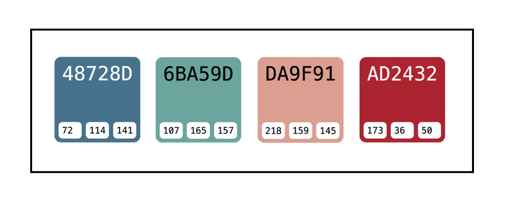
On the other hand, other brands are opting for colorful and dapper palettes that bring out vivid and dynamic emotions, in order to captivate the Powerpoint Viewer in the proposed universe. Some brands choose remarkable shades such as cyan-blue #48728d and cyan #6ba59d from Uriage or red-orange #da9f91 and pink-red #ad2432 from Charlotte Tilsburry to accentuate their communications. This brightens up the visuals and boosts the fitness. We thus leave the austere atmospheres that we can expect to find in luxury to bring a touch of modernity and “pep”.
Finally, some houses remain very traditional in their colorimetric choices and opt for classic black&white, like Dior or Chanel. We often associate these two shades with a cozy, classic and rich universe. However, Haute Couture houses now dare to add to the eternal black and white touches of color, quite light and discreet, to brighten up their communications and highlight certain details.
Luxury is therefore a multi-faceted field. Although original houses prefer to choose sober colors and refined communication media, more recent brands, on the other hand, do not hesitate to dare to wear bright and eye-catching colors. This makes it easier for them to capture attention among monochrome competitors.
Typography and words in luxury
In the world of luxury, there are few biases or extravagances when it comes to the fonts chosen and the words used. The language choices are simple and tend towards elegance in order to reflect classical values linked to wealth.
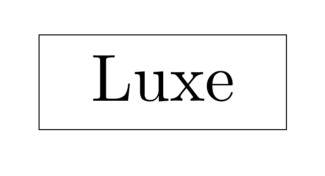
The typos encountered? Serif, that is to say, skid fonts, which conveys ideas of tradition, respectability, comfort and reliability. Luxury is meant to be authentic and unique, so fonts must highlight this expertise. The letters are fairly spaced between them, the text areas are very airy and the houses seek to get their messages across in the most gentle and pleasant way possible for their audiences.
In luxury, typography itself becomes a graphic element in its own right and takes the place of possible visual supports.
As far as linguistic uses are concerned, the watchword is The evocation. Products, just like communications, must reveal a particular universe linked to the house that produces them. A classic and elegant universe that shimmers wealth and power.
Haute Couture uses metaphors and allusions to invite dreams; there is a great use of Storytelling among communications, in order to humanize the content and get closer to the target. We don't sells No, we're telling a story.
Iconography in luxury
Overall, luxury graphic codes are quite strict in terms of iconography. All brands and houses agree on visuals of the same ilk that favor photos of muses, products or nature, and deny pictograms or colored illustrations. We then favor graphic elements that are very simple in their nature, but which in themselves constitute the bulk of the slideshow.
The aim is to follow Designs simple and representative while maintaining a part of creativity and originality; the DNA of each brand is preserved and enhanced by the visuals chosen.
The aim remains to represent the origin or beauty of a product and the sentiment which will be declared to its purchaser.
Luxury therefore avoids all animation effects or Motion which could alter the nature of the products presented or the purity of the emotions conveyed. This sector also does not use infographics or other numerical visuals -except for internal presentations in which there are also confidential organization charts and visuals linked to previews-, but favors original and dynamic presentations, increasingly using interactive slides and careful transitions. PPTs are being modernized thanks to these original techniques that fascinate audiences; the interactive powerpoint allows you to provide the line that energizes the most refined presentations.
Our favorite luxury Powerpoint presentations
We love all the presentations we make and choosing is a real challenge! So, instead of really answering the question of our favorite presentations in this field, we opt for another axis, namely to sequence the strategic presentations from the product presentations and to present you with some of our greatest successes.
Strategic Powerpoint presentations
Many luxury brands and houses ask us to make strategic presentations for them, whether they are internal presentations, Templates, presentations for investors, presentations of commercial, financial or managerial strategies, etc.
These are important slideshows that require a lot of application since they are intended for a large number of people, sometimes even for the entire company.
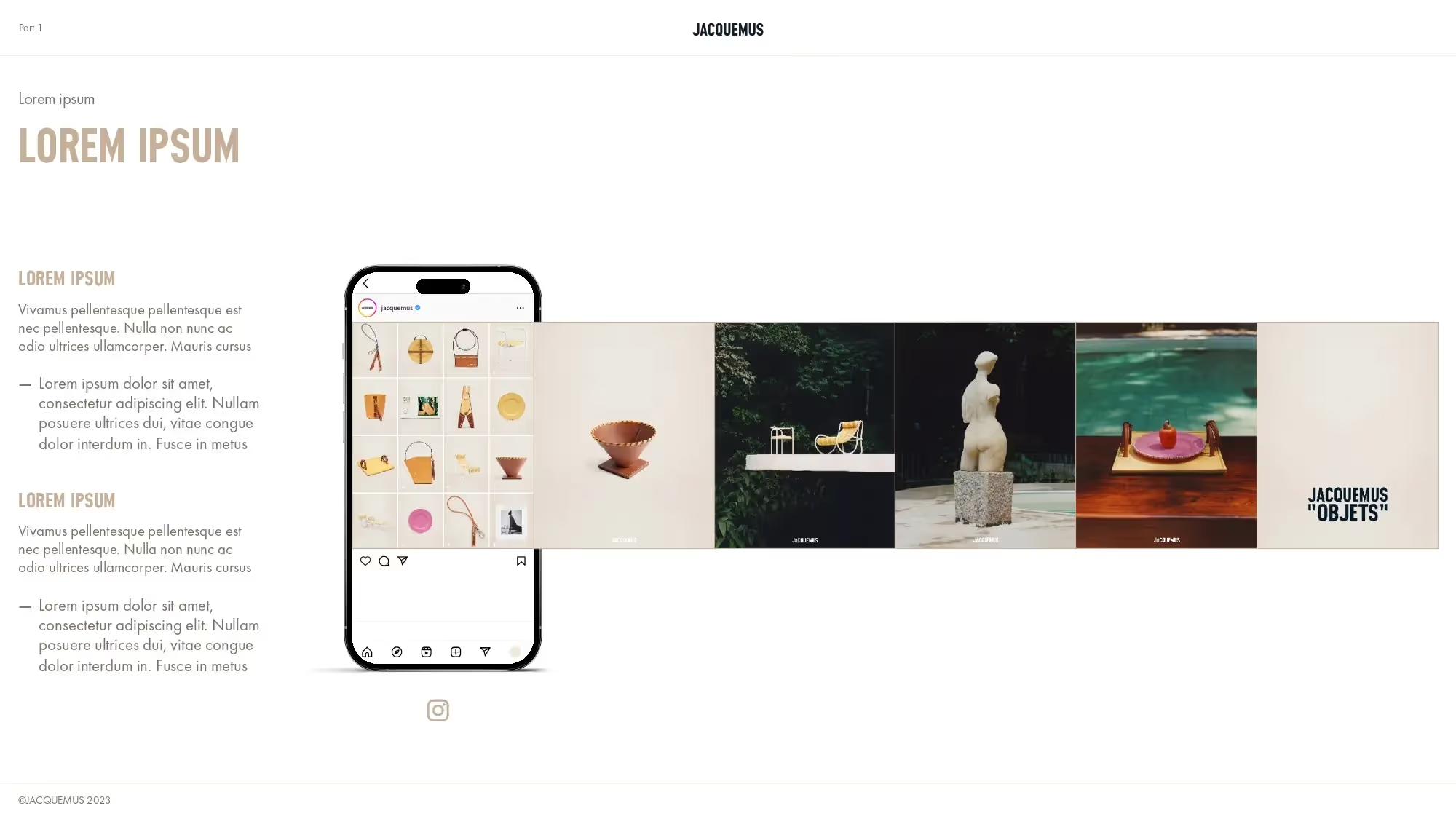
> For Jacquemus, we made a Template reusable for all their internal communications. Ce Template follows the artistic direction of the house's graphic charter through the use of natural colors and Designs streamlined and can easily be modified according to future needs.
> For Chanel, we created a lively and interactive event presentation for 500 people. The artistic direction was a major challenge since we had to renew Chanel's identity without altering it; the graphic representation was therefore a real challenge for our designers.
Powerpoint presentations products
Sometimes, our graphic designers are also responsible for designing Powerpoint presentations that reveal new products, innovations or services. This exercise is similar to advertising and seeks to highlight the qualities of the brands we work with; we seek to enhance the products and captivate the Powerpoint. Viewer.
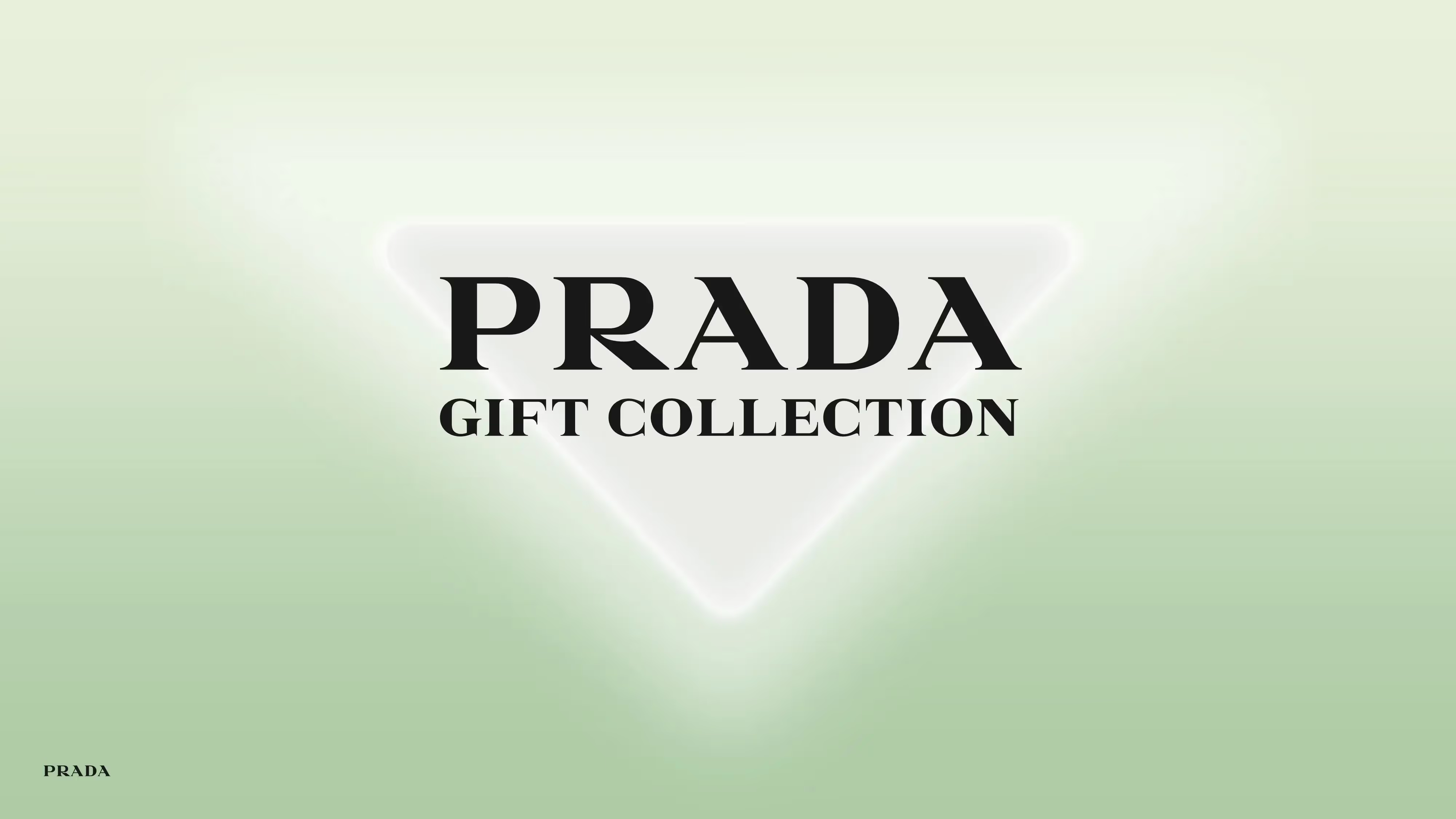
> For Prada, we designed an animated presentation with elements of Motion Design to highlight their new items. The presentation is minimalist so that only the new products are remarkable; the decor is simple (but that's not why it was easy to create), as evidenced by our Lead designers), in a unique and solid color, with some details of perspective and depth to give substance to the background and the support.
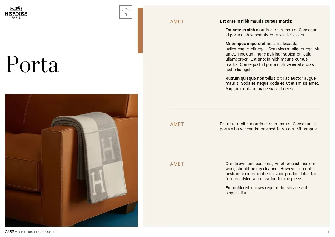
> For Hermès Maison, we created a booklet presenting their flagship products. This “booklet” is based on the house's iconic colors, namely brown and orange. It is a dense and explanatory document that summarizes the characteristics of each object and presents it in a situation. This booklet combines elegance and simplicity for a refined and classic result, just like the famous house.
Thus, between fun and formal presentations, the requests of our customers have surprised and delighted us, and we are happy to have worked with them on these ambitious projects.
Luxe and Powerpoint: focus on a winning combination
In short, Powerpoint is a powerful presentation tool in the luxury industry for many uses. This type of software is the perfect ally for professional presentations for colorful results, regardless of the initial request. From a presentation, you can present a product, seduce crowds, host an internal speech or a conference for the general public. Luxury presentations are rich in visualizations and powerful images, but above all, they are rich in originality and creativity to disseminate the values of the brands that wear them.
Presentations related to luxury are demanding, but exciting and allow you to explore new techniques and horizons. We really like to discover with our customers new ways of transmitting a message or an emotion and of developing the universe of their house.
Do you want to learn more about specific layouts? We wrote a item which brings together, in general terms, the graphic particularities of each sector of activity!
See you soon at the Kings of La Prez! 👑
Ce qu'il faut retenir
What you need to remember:
- Birth of luxury during the Renaissance
- Three types of color palettes: clean, black & white and bright touches of color
- Serial typefaces
- Simple iconography, preference for photography

