Set the pace for the PowerPoint presentation with a navigation system
Optimize your presentations, thanks to a professional navigation system between your slides.

In order to optimize your presentations, it is possible to use on PowerPoint a technique that is now common on the web to pace reading and give a visual indication of the progress of presentations: we are talking about navigation system between the slides.
Web navigation systems
Web browsing is the process of navigating pages, applications, and websites on the Internet; and involves setting up Of a navigation system. The use of navigation systems is therefore common on the web and is particularly present on all websites.
In order to optimize the success of a website, in addition to high-quality content and an attractive design, an optimal navigation structure is crucial. Indeed, well-thought-out web navigation allows its visitors to navigate from page to page easily, in order to find the information they are looking for. Offering clear and fluid web browsing is therefore imperative and contributes to improving performance indicators such as bounce rate, average length of visits, website traffic... etc.
Our agency's website MR PREZ offers, for example, a navigation system that allows visitors to easily navigate the agency's projects and services through various categories and sub-categories.
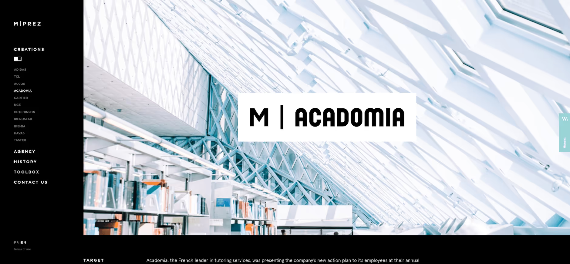
The idea on a PowerPoint presentation is going to be to recreate the same thing, but adapted to slides and for a wide variety of cases. Our mprez interactive PowerPoint presentation also uses the design and the navigation system that was present on our old website, but in a simplified version.
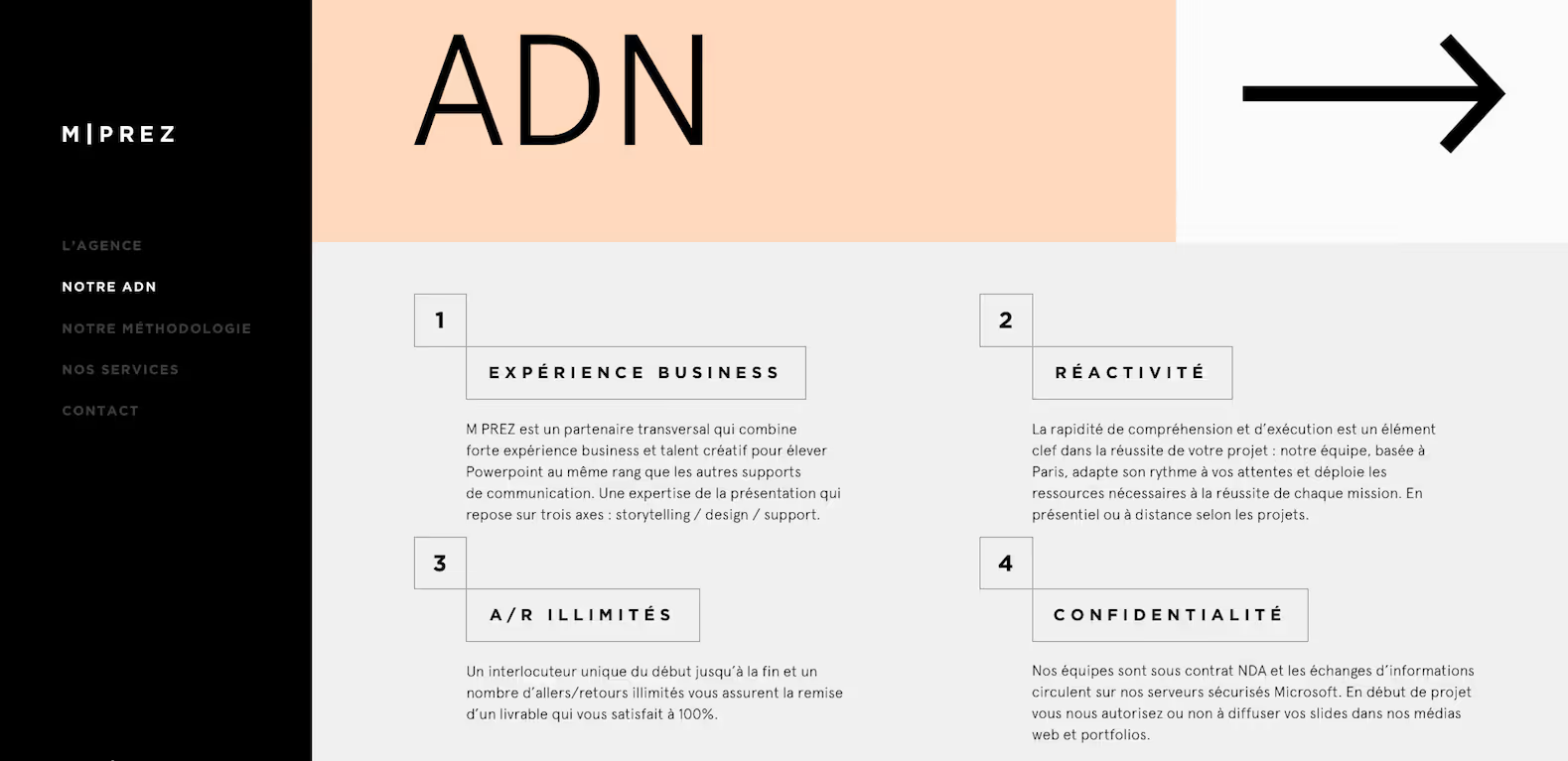
The navigation system set up in our presentation allows you to move from one category to another with A highlight of the slide we are on (this thanks to a opacity and transparency system on the fonts) which gives the effect of setting the content apart from that which is put forward. This structure format is also found in the navigation menus of many websites.
<div class="button-icon_wrapper"><a href="https://blog.mprez.fr/wp-content/uploads/2020/09/mprez_agence_powerpoint.ppsx" target="_blank" class="button is-link is-icon link-transition w-inline-block"><div class="button_text">Download our interactive presentation</div> <div class="button_round-icon"><div class="button_arrow w-embed"><svg xmlns="http://www.w3.org/2000/svg" xmlns:xlink="http://www.w3.org/1999/xlink" aria-hidden="true" role="img" class="iconify iconify--bx" width="100%" height="100%" preserveAspectRatio="xMidYMid meet" viewBox="0 0 24 24"> <path fill="currentColor" d="m11.293 17.293l1.414 1.414L19.414 12l-6.707-6.707l-1.414 1.414L15.586 11H6v2h9.586z"></path></svg></div></div></a></div>
A useful solution on PowerPoint
The navigation systems adapt very well to cut a slide and a reasoning, which makes it possible to give visual impact to a PowerPoint presentation.
For example, instead of presenting three points on a single slide, dividing the information by preferring three slides with only one point per slide makes it possible to improve the content of the slide and to give more visual impact to each message by individualizing them one after the other; and the fact of using a navigation system in this case makes it possible to make the information more impactful while maintaining homogeneity between the slides.
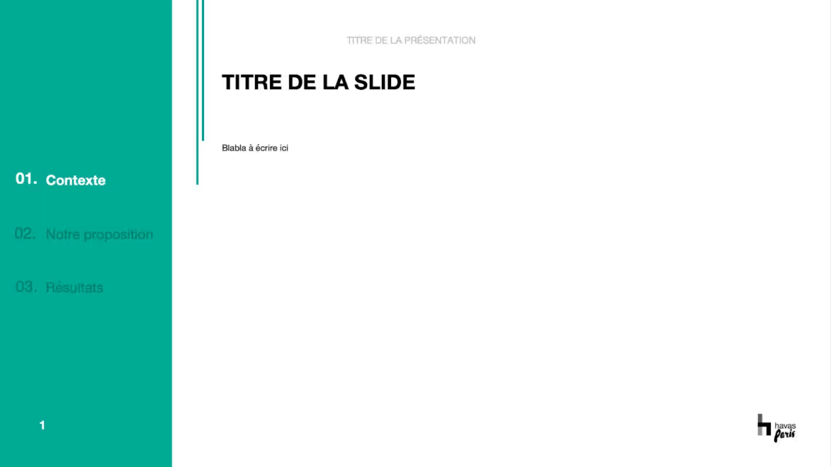
Indeed, division makes it possible to lighten the content per slide, and to highlight key information more clearly (enlargement of visuals, relevant figures, etc.) while the use of a navigation system brings linearity between the various slides.
Give free rein to your creativity to imagine original navigation systems
Navigation systems allow you to give free rein to your imagination, as the possibilities of creation are very numerous.
Presentation comprising the use of a navigation system that divides the presentation into several parts, with a black line (top left) moving to the right as the presentation progresses and an emphasis on the presented part (title and numbering), thus giving a visual indication of the progress of the presentation.
The web also constitutes a real source of inspiration offering interesting graphic systems that are completely reproducible on a PowerPoint presentation.
Presentation with a design and navigation system similar to a classic navigation menu (this widely used menu style is placed in the header of the website, usually in the form of a horizontal list).
Integrating a navigation system into a PowerPoint presentation also gives the possibility to adapt to different graphic worlds.
Presentation in a graphic universe strongly inspired by the maritime sector, with a representation of a level system (over the entire length on the right of the presentation) similar to boat dashboards, to indicate the progress in the presentation.
Presentation including the creation of a graphical interface inspired by the Netflix platform, with a navigation system that includes the three parts of the presentation, a small red dot (at the top) indicating which part we are on, and the creation of menus and sub-menus as well.
The use of a navigation system between the slides of a PowerPoint presentation makes it possible to give visual impact and dynamism to a presentation, making the information more impactful while maintaining homogeneity between the slides.
The web is also a great source of inspiration, offering endless possibilities for creating original navigation systems.
Our agency is at your disposal for any advice on the content and format of your presentations.
See you soon for more tips for your Prez'.
Ce qu'il faut retenir
What you need to remember:
- Optimization inspired by the web, adding a navigation system to your PowerPoint presentations allows you to pace reading, improve the fluidity of presentation and give a visual indication of progress.
- The navigation systems adapt very well to cut a slide and a reasoning, which makes it possible to give visual impact to a PowerPoint presentation.
- Navigation systems allow you to give free rein to your imagination, as the possibilities of creation are very numerous.

