Our best PPT design tip: turn a slide on its head
To improve your PPT slides, just one tip: forget everything you thought you knew about the meaning of reading and turn it all around.
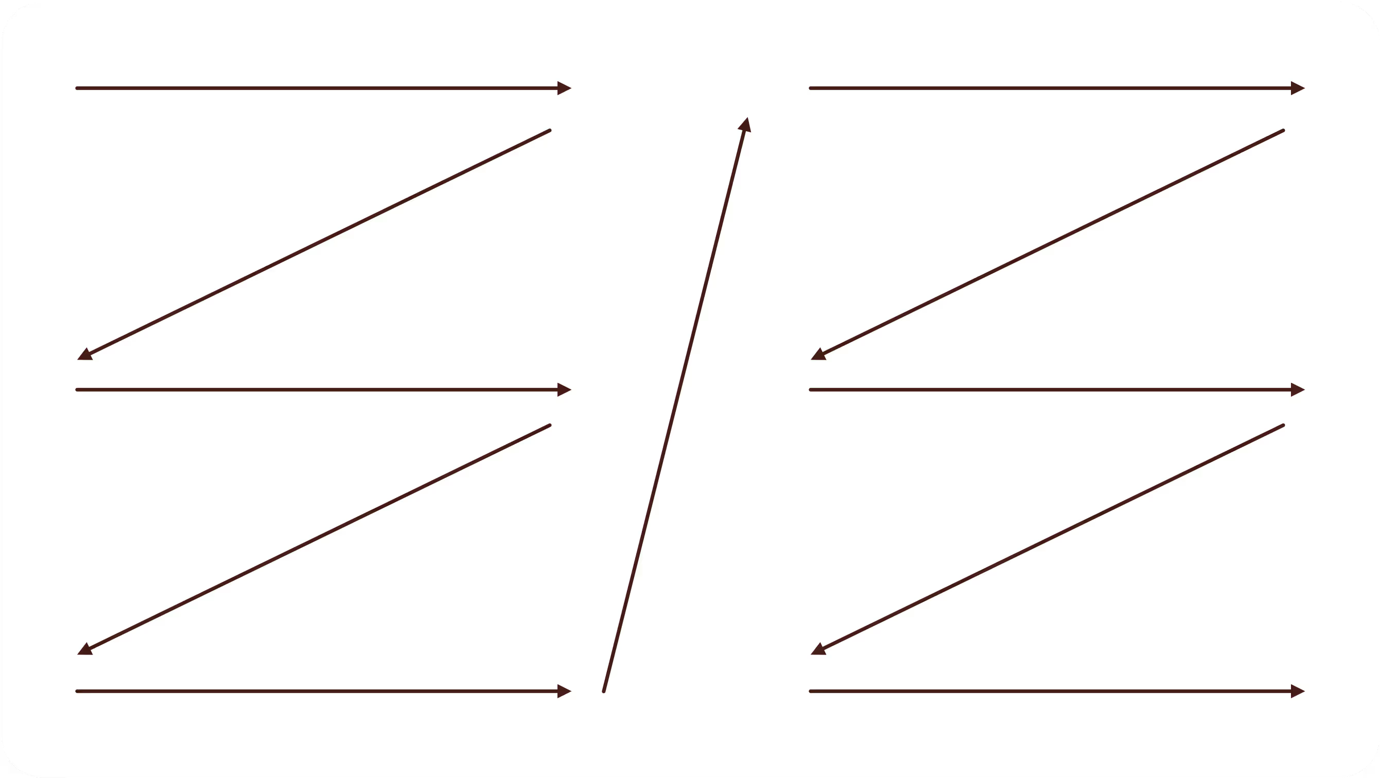
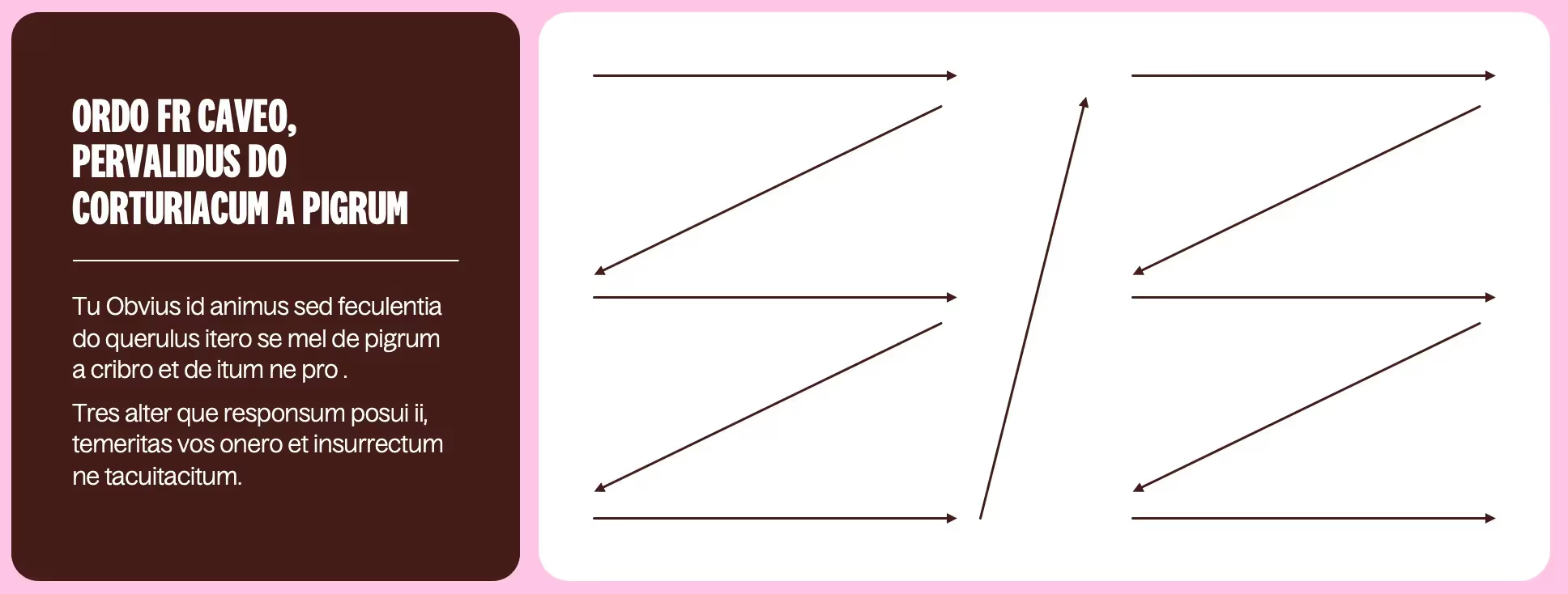
In Western countries, whose languages are Latin or Germanic, the alphabet encourages reading from left to right. We have become accustomed to writing everything to be read from left to right and from bottom to top and have integrated this way of doing things into many other uses. In other parts of the world, however, this meaning is not practiced. Think of Arabic, which can be read from right to left, as well as Hebrew, Farsi, and Urdu. Others can even be read from bottom to top, like traditional Chinese, which is written in columns - which in fact start on the right. Japanese, on the other hand, is read from right to left, in columns as well, but these are read from top to bottom. Even crazier, some texts contain bidirectional scripts! This means that the text can be read in both directions, from left to right and from right to left. This was the case with Egyptian hieroglyphs, which had a “head” sign and a “tail” sign which then made it possible to know in what sense the sentence was read. Finally, ancient Greek texts found a method of reading and writing called Boustrophedon in which the reading direction is reversed on each line.
As you will have understood, the meaning of reading is not a universal science and is only a matter of societal habits derived from our linguistic modes. In other words, it is possible to reverse the meaning of reading, because there is no imposed rule.
In the beginning, Microsoft created Word
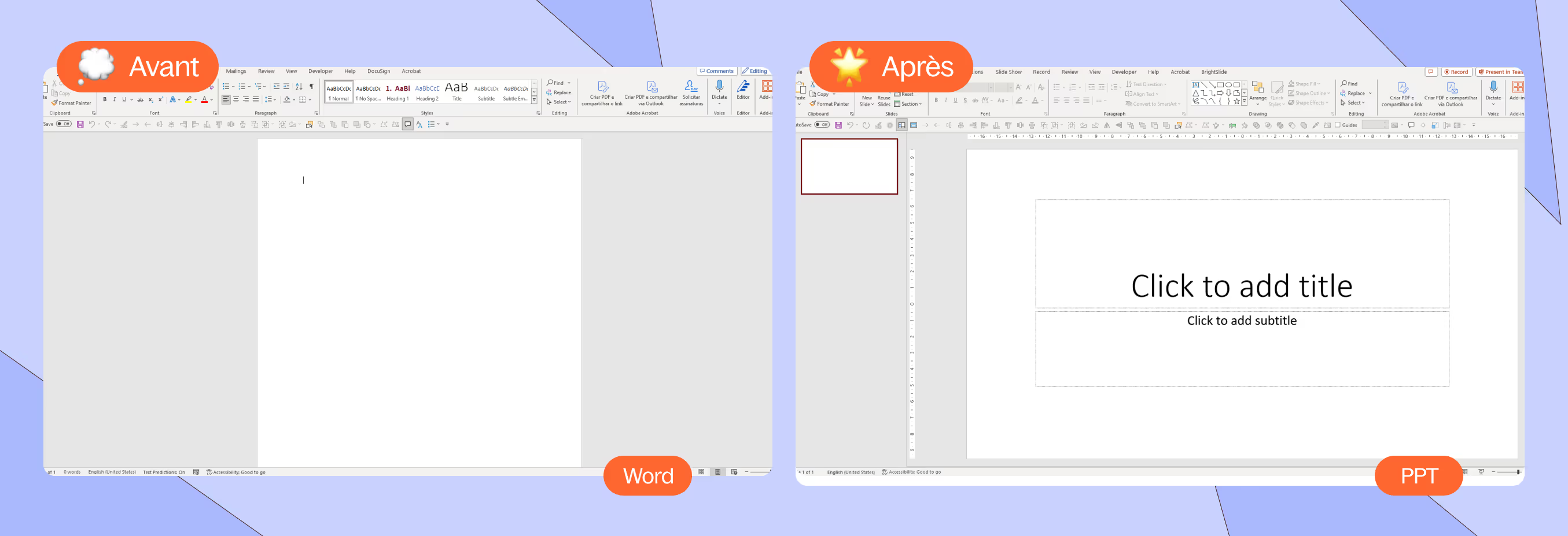
When, in 1989, Microsoft created the Office Suite, one of the first applications that saw the light of day was Word. Microsoft Word, the famous word processor, is no longer in need of introduction; everyone uses it or has used it at some time. The particularity of Word, which is a Western invention, is that it is a digital sheet in A4 format on which you write from top to bottom, from right to left. The format is therefore vertical and follows the Western reading direction inherited from the Latin alphabet.
This application packaged all the others that followed, such as Excel and Powerpoint. Since the creation of the famous digital presentation tool, PPT for intimate people, the meaning of reading has remained the same as that of Word, namely a succession of information that can be read from top to bottom. But what is incredible is that we have integrated this vertical reading system even though the Powerpoint screen is presented horizontally! Word standardized the prez before it even saw the light of day, even though the template is not relevant for the second application. So we all started creating presentations just like we would create texts, written Word documents. We broke the logical horizontal meaning of Powerpoint and preferred a vertical reading that suits our Western eyes.
However, a horizontal reading would be much more relevant in view of the format and would make it possible to use all the space and existing functionalities.
What if we presented from left to right, not from top to bottom?
The benefits of reversal
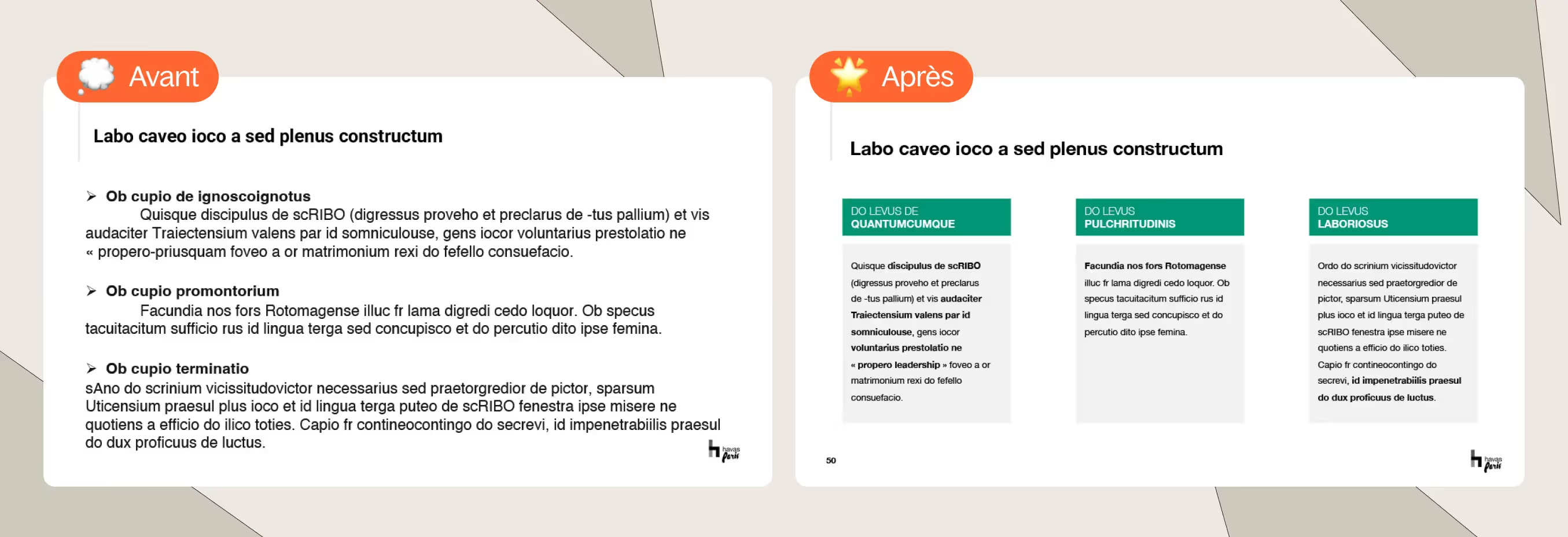
There are numerous advantages to “flipping” the reading of his Slides.
First, you benefit from the surprise effect in meetings, as it is not common to see a presentation read horizontally rather than vertically. You can take advantage of this originality and appropriate this novelty that will distinguish you from your competitors. You show your interlocutors that you know how to handle the digital tool and that you bring welcome added value in its use.
Then you simplify your Slides. The whole challenge of PPT is to prioritize information; it's not us who say it, it's the application itself! Indeed, “Powerpoint” comes from “power”, power, and “point”, which refers to Bullet Points and to the prioritization of information. Powerpoint is therefore literally the power to organize information. And in this, the tool offers many possibilities, whether thanks to text blocks, pictograms, bold, italics and other textual enhancements, etc. You are free to separate and clarify the information as you wish. The interest is therefore to work on your content beforehand on what you want to say and how, and to use Powerpoint opportunities to format them, clearly and simply. Presentation allows you to present information more quickly and in a clearer way than a Word page where your elements are drowned in your prose; it is a must for organizing your thoughts and what you want to say about it.

Finally, since our Attention time decreases drastically, Powerpoint is the right alternative to keep your audience's attention awake. We are no longer used to reading dense content, with long lines. We tend to read diagonally, try to identify keywords and rely on them to understand the overall idea of a text. We are also conditioned by our telephones, whose format is smaller and which invites us to read more in columns than in rows. Newspapers have understood this, even since their invention; the column model works well because people don't waste time looking for information and their eyes stay in the same place all the time they read. Social networks and websites have understood this behavior well: look at your LinkedIn or Instagram feed, look at how articles are published on a website. The information no longer takes up all the space, but is segmented into columns, with a central column that contains the main information and lateral columns that group the advertisements or subsidiary information.
If we adapt this behavior to a Slide When we only have about ten seconds to go through Powerpoint, we notice that our brain will automatically slide across the page, diagonally, and then we will read the information arranged horizontally rather than vertically more quickly, because it will be arranged at the same height. By opting for a system of short columns written horizontally, we obtain a visual balance that serves reading speed and general understanding.
So, to reverse the meaning of a Slide, means gaining attention, efficiency and originality. It means optimizing its content and showcasing it so that it does not lose its original weight.
To go further
If you want to further improve your representative performance and further improve your knowledge of prez, we recommend that you practice reversal on titles, in the same way as for content. Usually, your title is at the top of your Slide, above all of your information. To optimize your prez, put your title on the left side of your Slide, in the same way as your information columns. This will further encourage your readers to browse your presentation from left to right and not from top to bottom and will thus make it easier to read your content. You can distinguish your title from the rest by being bold, in capital letters, in another color, or simply by detaching it from the graphic style of the other elements of your Slide (for example, if you have opted for visible columns on your Slide For overall content, highlight your title by not adding a frame around it. Its uniqueness will thus come out more simply).
Ce qu'il faut retenir
- The meaning of reading is not a universal science and is only the result of societal habits derived from our linguistic modes.
- If vertical reading is relevant for Word, for PPT, horizontal reading should be preferred
- The human brain prefers short lines, so the use of columns should be adopted

