Metamorphosis of customer needs, from a summary report to the redefinition of their identity
Undertake the redesign of a company's identity and transform a brand image

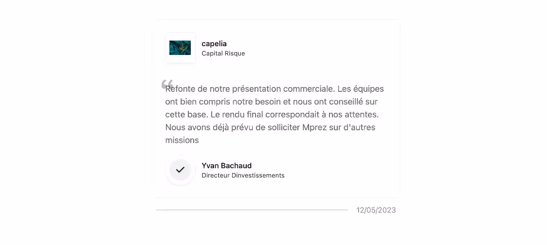
Capelia, an investment company in search of modernity
An independent investment company founded in 2008 and specialized in supporting SME managers in their growth and transfer initiatives. Their involvement is reflected in the concrete contribution of their skills, networks and entrepreneurial perspectives to business leaders.
A long-standing partnership
Our first collaboration dates back to 2022, when we had the opportunity to support Capelia's investment directors on several graphic redesign projects, including:
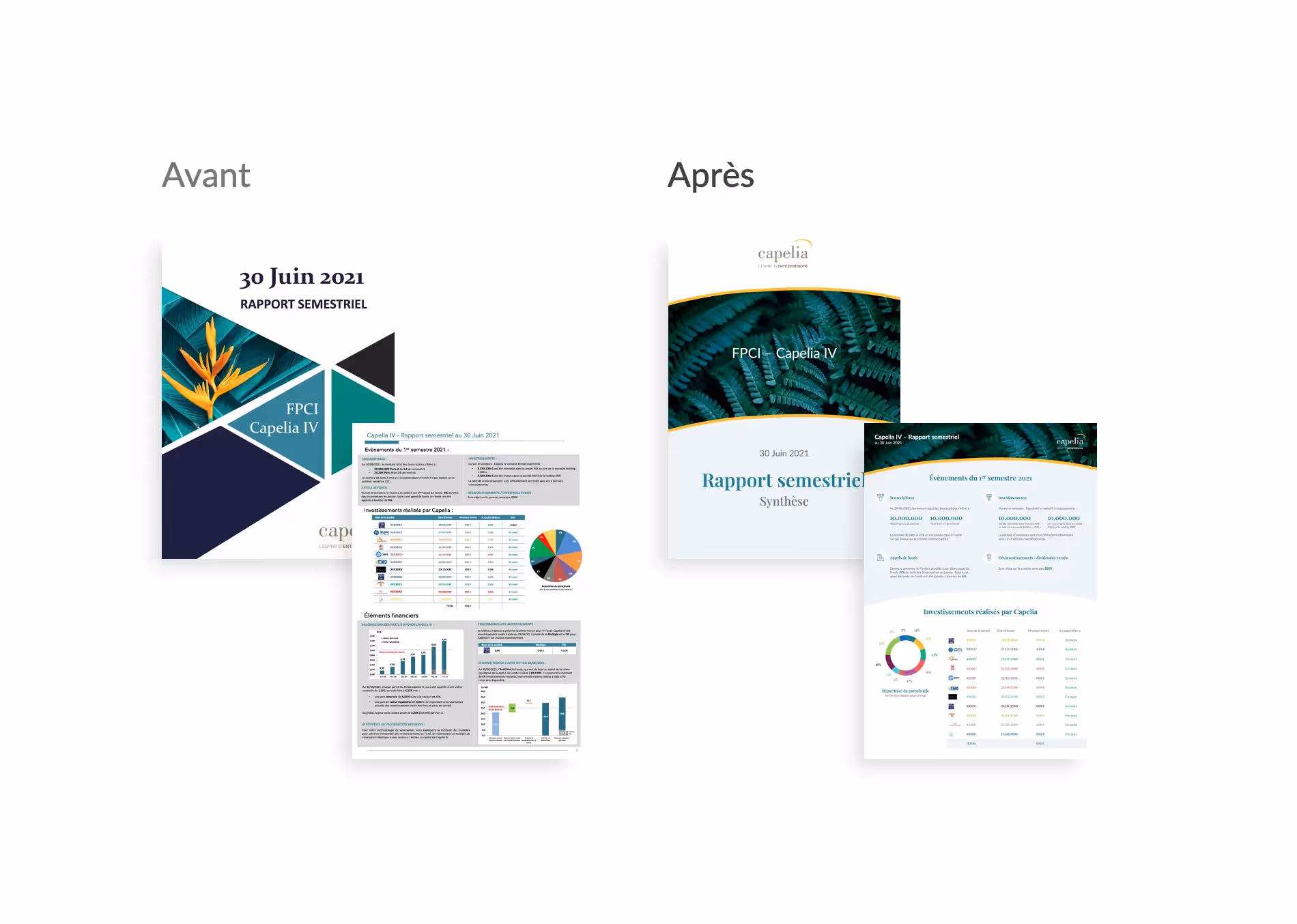
- their summary report PowerPoint template,
- their annual investment report,
- and their corporate presentation.
Last June, a new chapter in this collaboration was opened, this is the subject of our case study.
The beginnings of collaboration
The objective of the project
In search of a more striking and modern image, the Capelia investment team contacted our PowerPoint agency to initiate a visual transformation of two PowerPoint presentation templates. It is a summary report template And of a annual investment report. These supports are intended for their investment customers.
The objective was to obtain a medium that was easy to use, modern, legible and in line with the old identity of the company.
A relationship of trust necessary to develop brand identity
We quickly understood Capelia's aspirations thanks to the close collaboration that our agency established with their teams. The beginnings of the collaboration began with the redesign of these first two supports, which were very successful with the Capelia teams. Moreover, the feedback from the final recipients was also very positive. This has allowed Capelia to support its dynamic of continuous improvement with its customers and to facilitate the task for the teams that use these tools. Saving time is one of the main challenges.
In addition, our graphic designers have been able to innovate in terms of graphic elements. Indeed, historically, the company has always put its identity in the background since its creation.
The Capelia teams trusted us completely and were open to proposals for graphic changes, which allowed us to provide them with advice and to provide them with new visual and identity proposals.
Progressing naturally, the mission was extended to the redesign of the corporate presentation initially, aimed at aligning and deploying Capelia's discourse and identity on the main communication medium.
From one mission to another, or how mprez accompanies you beyond the PowerPoint presentation.
The positive results confirmed Capelia's confidence, encouraging them to entrust our agency with the modernization and total redesign of their visual identity. Capelia realized that the graphic charter had its limits in the application and application of graphic principles to different media. Moreover, she was no longer in tune with the times. The brand identity of companies is becoming more and more important every year. Capelia therefore decided to seize the opportunity to begin redesigning its identity.
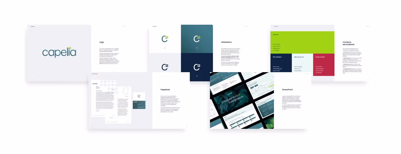
This includes the logo, the color palette, the graphic elements and deployment on various media (word, business card, PowerPoint, etc.). Let's look at that in more detail.

Focus on redesigning the logo
The support consisted of two phases. First, we reworked the Capelia logo. He certainly ticked all the boxes in his sector of activity, but aging, he deserved to be reworked. Bessy Bra, Artistic Director in charge of rebranding, wanted to maintain the very essence of the company: “collaboration, mutual aid and support for entrepreneurs, while being in more modern codes”.
.avif)
The logo symbol revolves around the four diamonds. There are three interconnected light green diamonds (the Capelia investment teams) creating value to give life to the dark green diamond that represents the entrepreneur. Finally, we find the aspect of growth with the light green diamonds that form an upward arrow, synonymous with progress.
“Collaboration, mutual assistance and support for entrepreneurs, while being in line with more modern codes.” Bessy Bra, Art Director in charge of rebranding
Bessy Bra adds: “Originally, Capelia's identity was a very good match for its sector of activity and the company's contacts. A differentiating identity, with solid foundations, strong in messages, values and symbols. For example, we very frequently found the vegetable universe, which illustrates the collaboration between entrepreneurs and investors that makes something happen (reference to growth: the plant needs water and fertile soil to grow and flourish). It also contains the symbols of softness, roundness and envelope (cf. the curve of the old logo), which helps to reassure and highlight an aspect of trust, support and assurance towards a peaceful future.”
A logo translated into a refreshing graphic charter
In a second step, we developed the graphic charter based on the foundations of the new logo and the old identity. We find different shades of green, to express softness, kindness and nature. We have preserved the iconography and the vegetable universe in order to find the lush and flourishing side that symbolize the emulation of entrepreneurs and investors.
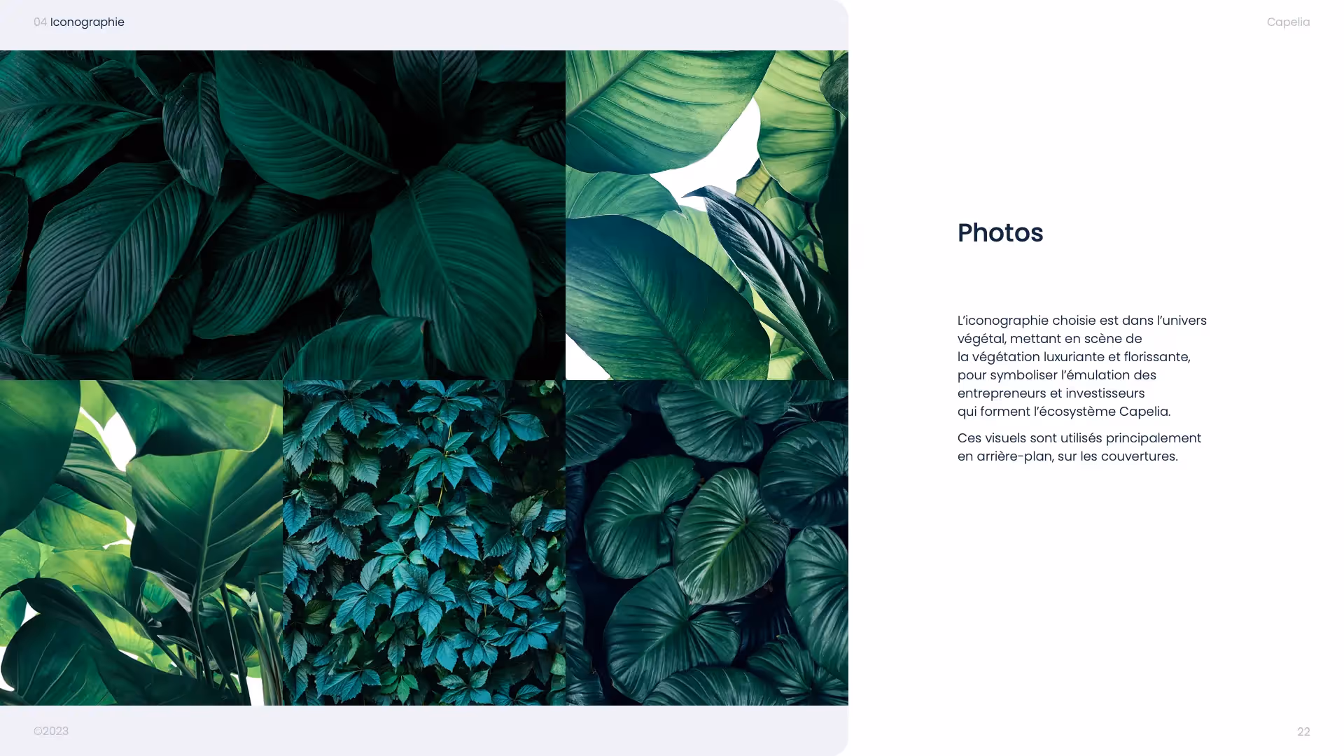
“The iconography chosen is in the vegetable universe, featuring lush and flourishing vegetation, to symbolize the emulation of entrepreneurs and investors who form the Capelia ecosystem.” Bessy Bra, Art Director in charge of rebranding
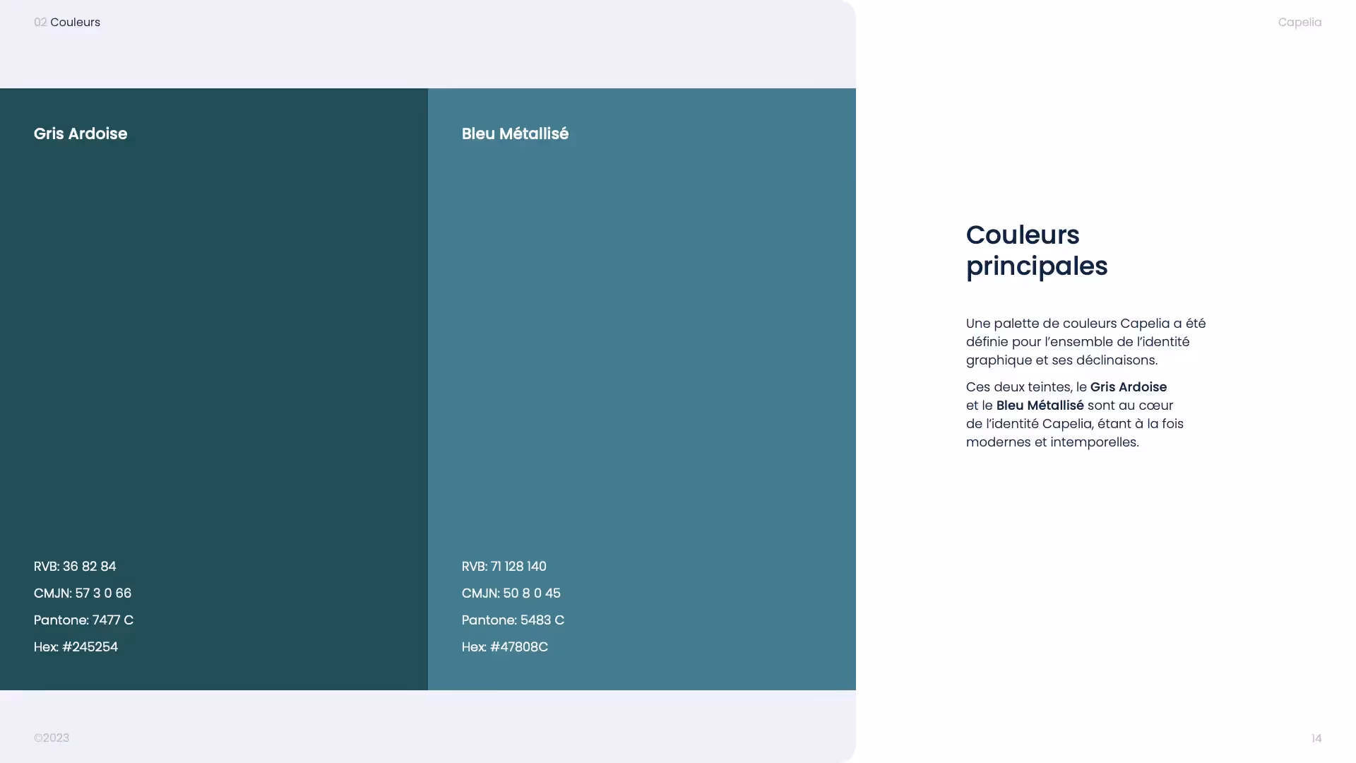
This new charter consists of soft and relaxing colors. However, we added anise green, which brings a bit of spice and a digital touch.
Regarding the background of the supports, we used the logo symbol in order to develop a checkerboard system that can refer to chess (strategy and thinking) and that is inspired by luxury codes (Louis-Vuitton checkerboard).
All put together, this allows us to create a very rich, refreshing, modern universe that is very simply available both on print and on the web.
6 months later: new projects have emerged
A new website based on the new graphic charter
6 months after the start of our first collaboration, Capelia went a step further by requesting a web agency to audit and redesign its website. The successful launch of the new site, integrating the new visual identity, marked the conclusion of this transformation. Capelia now benefits from a coherent, operational, scalable brand platform, and an online presence in line with its renewed image, offering an optimized user experience.
A full-service creative agency, beyond a simple PowerPoint
This case study illustrates the progression of collaboration, starting with a specific mission and evolving towards a complete transformation of Capelia's visual identity and website. The progressive and collaborative approach has made it possible to realize Capelia's aspirations, thus strengthening its impact on the market and its commitment to stakeholders. At present, Capelia is part of a drive for modernity, in line with its sector of activity and has a strong and evolving identity that will be able to last over time.
A project? Contact us!
See you soon with the Kings of La Prez 👑
Ce qu'il faut retenir
- A long-standing partnership and a great relationship of trust
- The redesign of a logo to adapt to the requirements of the sector
- Iconographic and colorimetric choices to meet the values of the company