The process to produce your presentations more effectively
Time is money! So don't waste it dissecting your presentations and learn how to become more effective!

It's Friday evening, your colleagues are already after work or enjoying their family, but you are still on your screen... and for a long time to come! Because yes, you still haven't finished formatting your ppt for your meeting next week.
However, you are not the type to be overwhelmed by your todo list... After dozens of hours of painstaking work between collecting information, reflections and meetings, all the content of your presentation is finally ready. You have been working on this presentation for a long time, and you are a bit frustrated at having to work overtime despite all the time you have already invested in it.
What if you had underestimated the time to format your mass of information?
At M PREZ, we produce high-stakes presentations for more than 700 managers spread over more than 500 companies, from the latest fin-tech start-ups to the largest groups such as LVMH, Total or BNP.
With more than 40,000 slides under our belt, we have developed a simple and effective methodology that you can replicate at the office in order to format your slides more quickly, in order to invest these few precious hours saved in a more relaxing activity and thus arrive at your defense with better energy.
Phase 1 | Content & wireframing

We always recommend starting with the outline of your presentation and then providing it in detail. Whether it's a corporate presentation or a pitch, design will always start with a good structure built around a summary tree structure or a classic storytelling scheme for example.
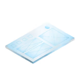
Since your content is distributed within your presentation, you can now start wireframing it, i.e. distributing it over the different areas of your slides according to their functions: title area, main information, side notes, etc.
Once your content is ready, organized, structured and validated once and for all, and only once these steps have been completed, then you can move on to phase 2: AD.
Phase2 | art direction

Before going headlong into your formatting, you need to create your masks or Templates. This will allow you to be able to do your smoothing much more quickly thanks to your pre-configured slides. You can also rely on your banks of illustrations and icons directly integrated into your Template.
Is it essential to go through this stage?
If it is for external communication, yes it is completely essential. Indeed, this is your brand image, in other words the reputation of your company and therefore its perceived value in an increasingly digital ecosystem which thus gives more and more importance to your graphic assets.
If it's for an internal presentation, we think that since the graphic aspect of your presentation plays a key role in the image it will convey, then it becomes a vector of your corporate culture. Think about it: what image do you want to convey to your interlocutors, in this case your employees? You are not necessarily told to spend too much time on fitness (this could be frowned upon in certain positions or missions), but presenting clean slides that respect your brand's guidelines and therefore contributes to the dissemination of its cultural values within your teams are all arguments that weigh favorably in the use of the guidelines that you have been provided with or that you should ask for.
Indeed, very often, your business already has Templates ready to use. Inquire with your management or your communication/branding department or partner. They will be delighted if you ask them for these types of resources.
To summarize, at this stage you must have at least these pre-made slides before moving on to the next step:
⟶ Cover
⟶ Summary
⟶ Interlayer
⟶ A title + text slide
⟶ A title + text + visual slide
⟶ A slide title + chart
If you do not have your own Business Template, you can ask our agency to produce it in due form.
Phase3 | declination

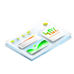
Often the most laborious to produce, especially if it is a long presentation, this step consists in applying your graphic charter defined in phase 2, on all your slides and their content. At this stage, having the precious Template (or masks) mentioned in phase 2 will save a lot of time for the person in charge of the implementation, whether it is an employee, a service provider or yourself.
Editor's note: find the M PREZ x GreenFlex case study here, 230 PowerPoint in 30 days ⟶
Phase 4 | animation

Finally, this last phase will be necessary or not depending on the type of presentation.
If you want to animate your slides and/or make transitions, this must be done last, as any content modification will potentially lead to breaks in animation lines and timelines.
Think about it!
And above all, don't forget to enjoy animating your slides or discovering your presentation set in motion by a team of professional graphic designers.
There you go, we hope that this 4-step process will save you time and quality during your next slide creations. And if you need more help or need to take your presentation material to the next level, you can always count on our agency .
See you soon!
Ce qu'il faut retenir
What you need to remember:
- 4 key steps for a successful presentation.
- Think content before form.
- To bring dynamism and flexibility, think of animation and variations!


