Should we present ourselves as Steve Jobs or Nancy Duarte?
Clash of the titans: minimalistic presentation vs detailed presentation
“You are not born a great orator, you become one.”, mprez (because Erasmus is not the only one who has the right to create maxims).
The art of presentation is a complex discipline that has two fundamental aspects: oral presentation and visual presentation. In other words, a presentation requires oratory talent on the part of the person who hosts it, as well as stimulating visual support, and this is all the more true in our digital and immediate age, in which humans are constantly looking for stimuli.
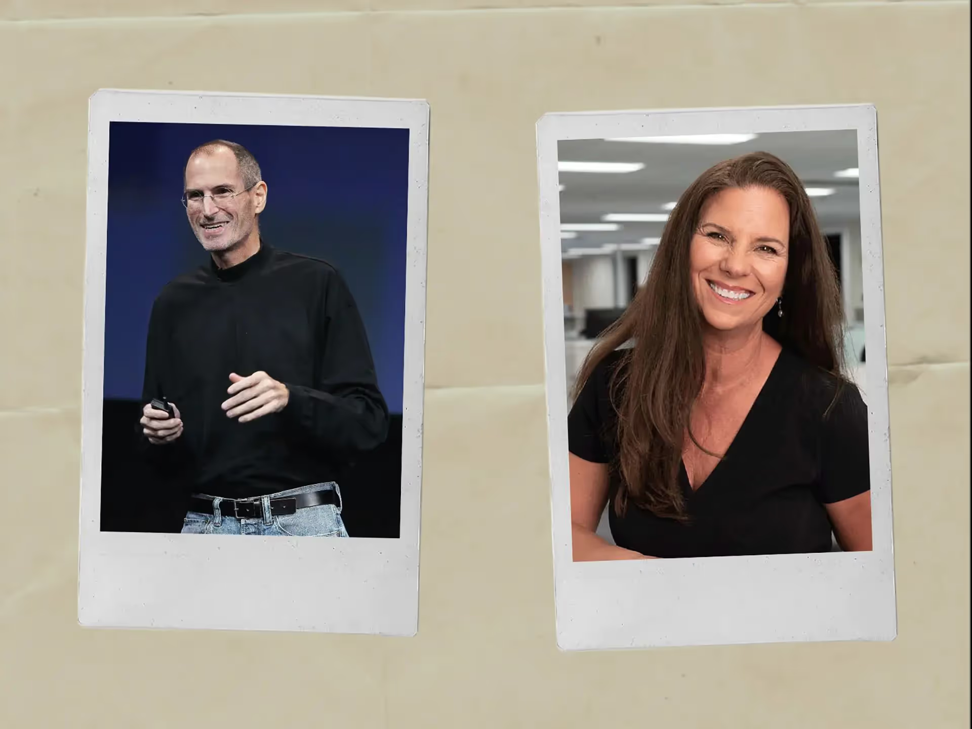
Let's evaluate together two ways of presenting, put into practice by two strong personalities: Steve Jobs and Nancy Duarte.
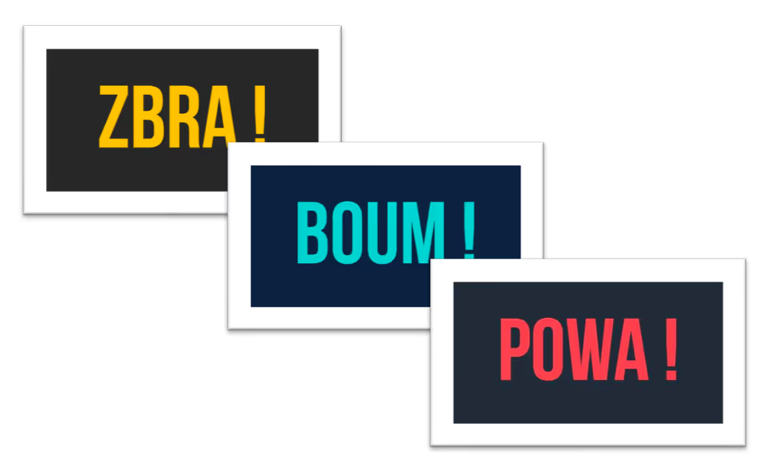
The minute culture presentation
Steve Jobs
Aka (Also Known as) the father of Apple, is an American entrepreneur who created the famous apple brand in 1976, with Steve Wozniak and Ronald Wayne. He created a digital empire thanks to his easy-to-use products such as the iPod, the Mac, or the iPhone. These digital tools reflect his idealistic vision of a world that is refined and accessible to all. We also find this vision and this trend of minimalism in his famous Keynotes, the conferences during which he announced the release of new devices.
Nancy Duarte
Aka the mother of SlideDocs, is an American entrepreneur and writer, theorist of persuasive presentation practices and creator of a communication agency specializing in presentations for businesses and organizations. She also participates in TEDx, multiple conferences and organizes coaching and consulting sessions for people who want to improve their presentation performances.
Their approach to presentation
Their presentation theories are diametrically opposed.
Jobs' minimalist approach
For Steve Jobs, a presentation should be minimalistic, simple, even simplistic, because it is neither a support nor an additional source of information for the audience. He believed that the presentation was inseparable from its presenter and that it did not have to be understood without him.
That's why he used presentations with a lot of slides, but that, on each of them, there was only one icon, one sentence or one drawing, never more. He therefore spent very little time on each slide, which increased the pace given to the presentation and the simplicity of the information transmitted. The audience was more interested in what he said and less interested in what he showed.
If you provide all the information on your slides, your presence is no longer relevant.
Steve Jobs' last Keynote conference in 2011 - Minimalist presentation icon.
Duarte's SlideDocs approach
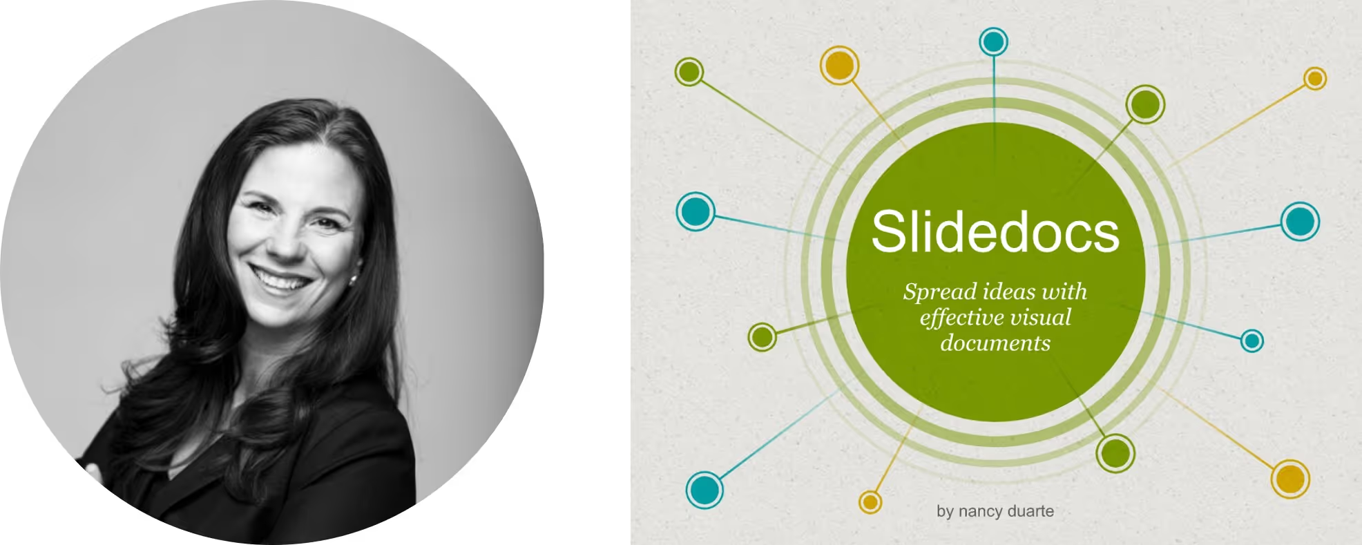
On the other hand, Nancy Duarte favors detailed presentations that are provided. She believes that visual presentation is a tool in its own right and that it conveys the discourse as much as the presenter. According to her, a presentation should be able to be read without the commentator,. As a result, she uses it as a commercial argument, since she can, after her interventions, communicate her presentation to the audience so that the audience can deepen certain topics and focus on the points discussed more precisely. She thus combines two uses during her conferences: a clear oral presentation and a written file to be submitted later. Not all documents are intended to be presented orally, but are good analytical tools. In addition, it is also a time-saver for inter-team coordination and understanding, since all business and corporate documents, such as financial reports, strategic recommendation notes, or even Pitch Decks of fundraising, are closely linked to PowerPoint. The agility of the tool allows finance and management teams to collaborate effectively on these topics.
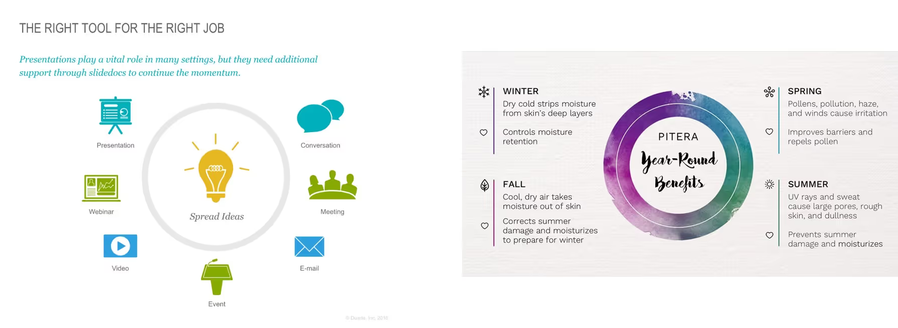
All these documents are not intended to be presented orally, but are analytical supports without necessarily requiring a person to accompany the reading. Thus, there will be no difficulty in creating highly written documents, with a lot of content, since they will meet a specific objective and a particular type of use of PowerPoint.
And in practice?
In order to be able to arbitrate on this question of the density of the content on Slides, so always think first about the context in which the presentation is being used. Eventually, two versions of the same presentation, an oral version, and its written equivalent, can be complementary and used for complex purposes, depending on the context of the presentation. This is very useful especially in appointments business, in order to leave your interlocutor with documentation that is sufficiently detailed so that it can be understood without you, especially if it is required to pass through several hands.
However, some presentations can only be for “single use” and, in this case, you must be able to adapt your presentation in the best possible way and try to be impacting your audience.
So, if you are preparing a Brief customer, a Masterclass, a Webinar or a course, it is best to opt for Nancy Duarte's method, so that your content is as comprehensive as possible and that clear examples are included. Thanks to this type of presentation, you will also have enough to provide informed support to your students, customers or spectators, which will increase your legitimacy and professionalism.
Conversely, if you want to organize a seminar, a one-off event or any other presentation during which you want your audience to be 100% attentive to your speech, then the Steve Jobs method will pay more. It will allow you, if you work correctly on your speaking posture, to capture the attention of your audience and to punctuate the presentation by your presence and emotions alone. If you choose this medium, it is more your speech that will have to be worked on, so that it is captivating and memorable.
The alternative method: the interactive Powerpoint
Obviously, the world is not Manichean, and there are not only two solutions to the art of presentations. It's not black or white, Jobs vs Duarte.
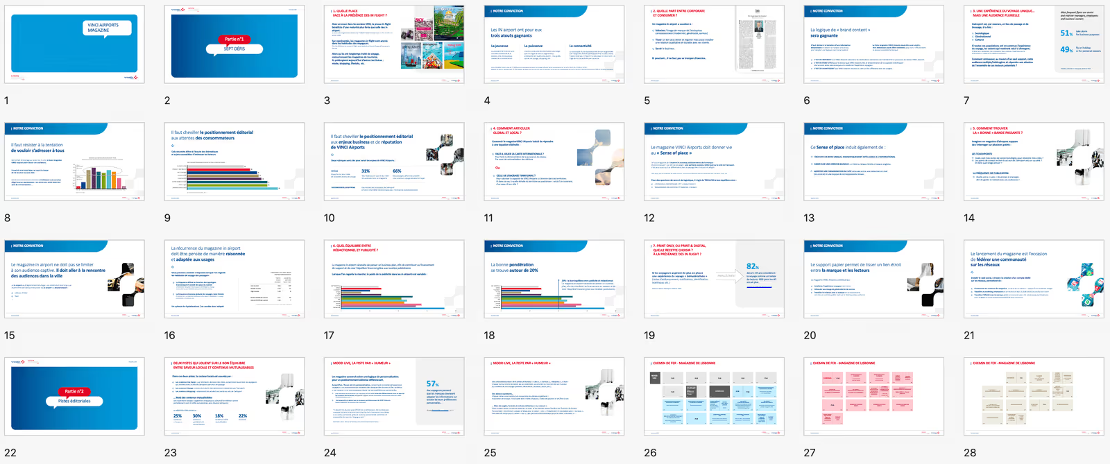
An alternative method can reconcile the two and adopt the advantages of both types of presentation. This is the interactive Powerpoint, also called “the Powerpoint website”.
Do you find Powerpoint presentations too common? Would you like to navigate through different tabs depending on the person you are talking to and the subject, a bit like on a website? It is possible, and even via the Powerpoint tool, by the way!
The interactive Powerpoint allows you to create a 100% adaptable and 100% moving presentation, according to your speech, your desires or the context! A true two in one, it allows you to surf your presentation, easily going from a minimalist and simple aspect to a more advanced and detailed presentation, and vice versa, at will. The most? You can transmit your presentation to your interlocutors easily and let them wander around at their leisure on your support, in a simple and fun way!
Simpler and less expensive to set up than an ephemeral website, this solution is the perfect combination of pace and information.
If you are interested in this third aspect of presentation, we invite you to consult our dedicated article.
Tired of rowing through your presentations? Don't panic, Mprez gets you out of the water and takes care of everything for you! Presentations à la Steve Jobs or à la Nancy Duarte, Powerpoints interactive or a mix adapted to your needs and desires, no worries, our experts are capable of anything!
Ce qu'il faut retenir
What you need to remember:
- Two diametrically opposed approaches to presentation.
- Flexibility and adaptability to the context: the key word!
- An alternative solution: interactive presentation!

